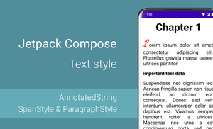
Introduction
Every mobile application shows a lot of text information on the screen. Even if the application mostly shows media content, like images or video, the text is an essential part of any mobile application. Fortunately, we have many customization options for text with Jetpack Compose.
In this article, we will explore the possibilities of a Text composable function and how we can apply multiple styles to text with the AnnotatedString.
This article is a part of Jetpack Compose series:
The content of this article is based on the 1.0.0-rc02 version of Jetpack Compose.
Introduction to the "Text" composable function
I want to start with an overview of the Text composable function along with a description and examples of the following properties:
textDecoration: TextDecoration?overflow: TextOverflowstyle: TextStyleinlineContent: Map<String, InlineTextContent>
If you are already familiar with it, feel free to skip this section and move on to the next one.
We have two Text composable functions with different parameters. Let us explore the signature of one of these functions and find the different parameters.
@Composable
fun Text(
    text: String,
    modifier: Modifier = Modifier,
    color: Color = Color.Unspecified,
    fontSize: TextUnit = TextUnit.Unspecified,
    fontStyle: FontStyle? = null,
    fontWeight: FontWeight? = null,
    fontFamily: FontFamily? = null,
    letterSpacing: TextUnit = TextUnit.Unspecified,
    textDecoration: TextDecoration? = null,
    textAlign: TextAlign? = null,
    lineHeight: TextUnit = TextUnit.Unspecified,
    overflow: TextOverflow = TextOverflow.Clip,
    softWrap: Boolean = true,
    maxLines: Int = Int.MAX_VALUE,
    onTextLayout: (TextLayoutResult) -> Unit = {},
    style: TextStyle = LocalTextStyle.current
)
The main difference between these two functions is the type of the "text" parameter (text: String vs text: AnnotatedString). We will explore the AnnotatedString in the next section.
Let's take a look at few parameters:
textDecoration: TextDecoration?overflow: TextOverflowstyle: TextStyle
The "textDecoration" property
The textDecoration: TextDecoration? property allows us to paint decorations on top of the text. By default, the following options are available:
- None
- Underline (text)
- LineThrough (
text)
In addition to this, we can combine multiple text decorators with the combine and plus functions.
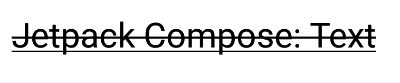
Text(
    text = "Jetpack Compose: Text",
    textDecoration = TextDecoration.combine(
        listOf(
            TextDecoration.Underline,
            TextDecoration.LineThrough
        )
    )
)
If we want to combine only two decorators, we can use the plus function:
Text(
    text = "Jetpack Compose: Text",
    textDecoration = TextDecoration.Underline
           .plus(TextDecoration.LineThrough)
)
The "overflow" property
The overflow: TextOverflow property allows us to change the default behavior for visual overflow. By default, the following options are available:
- Clip (Clip the overflowing text to fix its container.)
- Ellipsis (Use an ellipsis to indicate that the text has overflowed.)
- Visible (When overflow is visible, text may be rendered outside the bounds of the composable displaying the text)
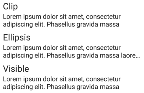
val text = "Lorem ipsum dolor sit amet, consectetur adipiscing elit. Phasellus gravida massa laoreet ultrices porttitor."

Column(
    Modifier.padding(8.dp)
) {
    Text(text = "Clip", fontSize = 24.sp)
    Text(
        text = text,
        overflow = TextOverflow.Clip,
        maxLines = 2,
        fontSize = 18.sp
    )
    Spacer(modifier = Modifier.height(8.dp))

    Text(text = "Ellipsis", fontSize = 24.sp)
    Text(
        text = text,
        overflow = TextOverflow.Ellipsis,
        maxLines = 2,
        fontSize = 18.sp
    )
    Spacer(modifier = Modifier.height(8.dp))

    Text(text = "Visible", fontSize = 24.sp)
    Text(
        text = text,
        overflow = TextOverflow.Visible,
        maxLines = 2,
        fontSize = 18.sp
    )
}
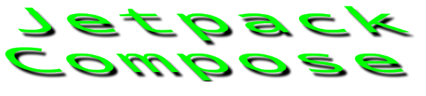
The "style" property
The style: TextStyle property allows us to configure the style of the text, like the color, font, direction, shadow, etc.
Text(
    text = "Jetpack Compose",
    style = TextStyle(
        color = Color.Green,
        fontSize = 24.sp,
        fontFamily = FontFamily.Monospace,
        letterSpacing = 4.sp,
        textAlign = TextAlign.Center,
        shadow = Shadow(
            color = Color.Black,
            offset = Offset(8f, 8f),
            blurRadius = 4f
        ),
        textGeometricTransform = TextGeometricTransform(
            scaleX = 2.5f,
            skewX = 1f
        )
    ),
    modifier = Modifier.width(300.dp)
)
Exploring AnnotatedString
The AnnotatedString provides a possibility to apply multiple styles to the text. Let's start with a short overview of the AnnotatedString class.
@Immutable
class AnnotatedString internal constructor(
    val text: String,
    val spanStyles: List<Range<SpanStyle>> = emptyList(),
    val paragraphStyles: List<Range<ParagraphStyle>> = emptyList(),
    internal val annotations: List<Range<out Any>> = emptyList()
) : CharSequence {
    ...
}
The spanStyles: List<Range<SpanStyle>> provides a possibility to style the text span. We can change the font attributes, and color, add text decorations, etc.
The paragraphStyles: List<Range<ParagraphStyle>> configures the style for the paragraph, such as text alignment, direction, indents, and height of the line.
To combine multiple AnnotatedString we can use the plus or buildAnnotatedString functions. Let's start with the plus function:
Text(
    text = AnnotatedString(
        text = "Red",
        spanStyle = SpanStyle(Color.Red)
    ).plus(
        AnnotatedString(
            text = "Green",
            spanStyle = SpanStyle(Color.Green)
        )
    ).plus(
        AnnotatedString(
            text = "Blue",
            spanStyle = SpanStyle(Color.Blue)
        )
    )
)
We can also use the buildAnnotatedString function to combine AnnotatedString objects:
Text(
    text = buildAnnotatedString {
        append(
            AnnotatedString("Red", spanStyle = SpanStyle(Color.Red))
        )
        append(
            AnnotatedString("Green", spanStyle = SpanStyle(Color.Green))
        )
        append(
            AnnotatedString("Blue", spanStyle = SpanStyle(Color.Blue))
        )
    }
)
The buildAnnotatedString allows us to apply methods from the AnnotatedString.Builder class.
inline fun buildAnnotatedString(
    builder: (Builder).() -> Unit
): AnnotatedString = Builder().apply(builder).toAnnotatedString()
This approach allows us to use many build-in features for adding a style to AnnotatedString objects.
The append method allows us to append Char, String or AnnotatedString to the existing AnnotatedString.
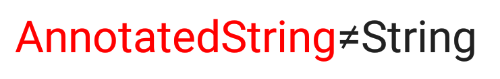
Text(
    text = buildAnnotatedString {
        append(
            AnnotatedString("AnnotatedString", spanStyle = SpanStyle(Color.Red))
        )
        append('≠')
        append("String")
    },
    fontSize = 24.sp
)
The addStyle method adds a SpanStyle or a ParagraphStyle for a specific range.
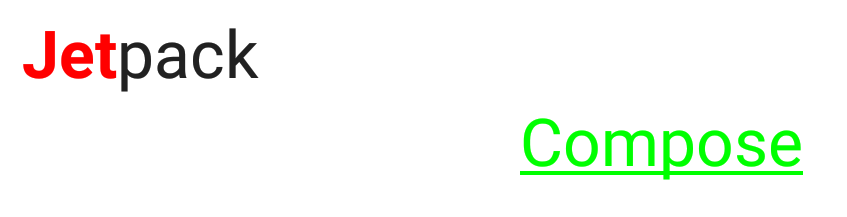
Text(
    text = buildAnnotatedString {
        append("Jetpack Compose")
        addStyle(
            style = SpanStyle(
                color = Color.Red,
                fontWeight = FontWeight.Bold
            ),
            start = 0,
            end = 3
        )
        addStyle(
            style = ParagraphStyle(
                textAlign = TextAlign.End
            ),
            start = 8,
            end = 15
        )
        addStyle(
            style = SpanStyle(
                color = Color.Green,
                textDecoration = TextDecoration.Underline
            ),
            start = 8,
            end = 15
        )
    },
    fontSize = 24.sp,
    modifier = Modifier.width(300.dp)
)
The addStringAnnotation method adds an annotation to a specific range of the text. We can use annotation to execute any action after clicking on a specific part of the text.
The
ClickableTexthandles link on text.
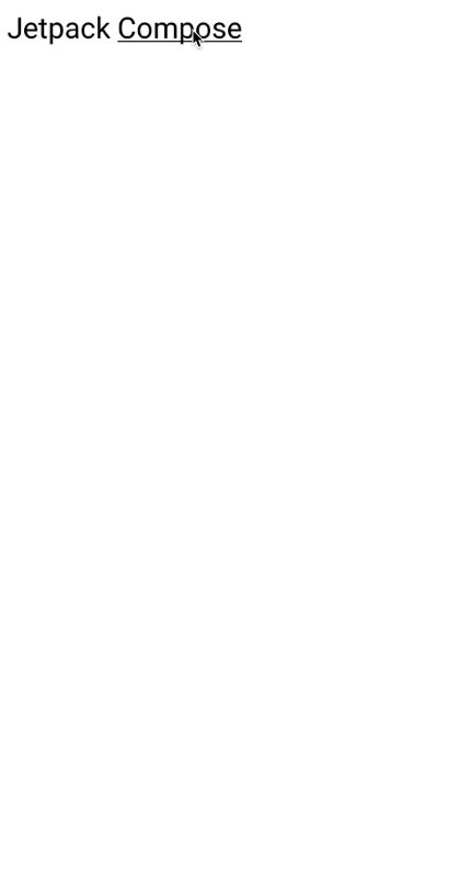
val uriTag = "URI"
val uriHandler = LocalUriHandler.current

val annotatedString = buildAnnotatedString {
	append("Jetpack Compose")
	addStyle(
	    style = SpanStyle(
	        textDecoration = TextDecoration.Underline
	    ),
	    start = 8,
	    end = 15
	)
	addStringAnnotation(
	    tag = uriTag,
	    annotation = "https://developer.android.com/jetpack/compose",
	    start = 8,
	    end = 15
	)
}

ClickableText(
	text = annotatedString,
	onClick = { position ->
	    // find annotations by tag and current position
	    val annotations = annotatedString.getStringAnnotations(uriTag, start = position, end = position)
	    annotations.firstOrNull()?.let {
	        uriHandler.openUri(it.item)
	    }
	},
	style = TextStyle(
	    fontSize = 24.sp
	),
    modifier = Modifier.padding(8.dp)
)
The addTtsAnnotation method adds a "Text To Speech" annotation to a specific range of the text.
This method marked with an
@ExperimentalTextApiannotation.
The pushStyle method applies a SpanStyle or ParagraphStyle to all appended text until the pop method is called.
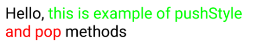
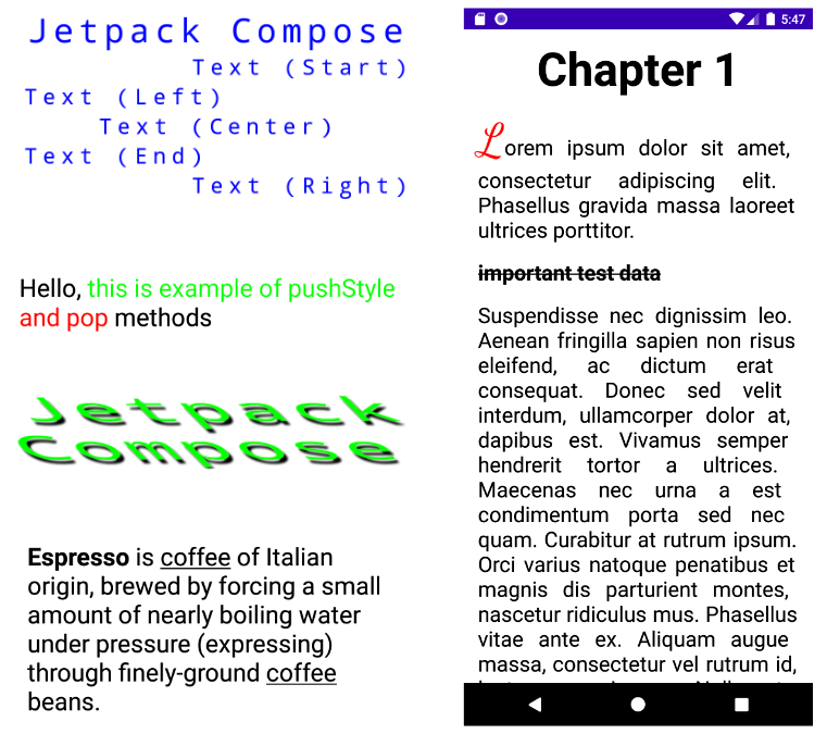
Text(
    text = buildAnnotatedString {
        append("Hello, ")

        pushStyle(style = SpanStyle(color = Color.Green))
        append("this ")
        append("is ")
        append("example ")
        append("of ")
        append("pushStyle ")
        pop()

        pushStyle(style = SpanStyle(color = Color.Red))
        append("and ")
        append("pop ")
        pop()

        append("methods")
    },
    fontSize = 24.sp
)
The SpanStyle
The SpanStyle provides a possibility to style the text span.
@Immutable
class SpanStyle(
    val color: Color = Color.Unspecified,
    val fontSize: TextUnit = TextUnit.Unspecified,
    val fontWeight: FontWeight? = null,
    val fontStyle: FontStyle? = null,
    val fontSynthesis: FontSynthesis? = null,
    val fontFamily: FontFamily? = null,
    val fontFeatureSettings: String? = null,
    val letterSpacing: TextUnit = TextUnit.Unspecified,
    val baselineShift: BaselineShift? = null,
    val textGeometricTransform: TextGeometricTransform? = null,
    val localeList: LocaleList? = null,
    val background: Color = Color.Unspecified,
    val textDecoration: TextDecoration? = null,
    val shadow: Shadow? = null
)
The textGeometricTransform: TextGeometricTransform allows us to define the geometric transformation applied to text.
The “shadow: Shadow” gives us the ability to apply a shadow to the text. The shadow effect is based on the following parameters:
- color
- offset
- blur radius
Text(
    text = "Jetpack Compose",
    style = TextStyle(
        color = Color.Green,
        fontSize = 24.sp,
        fontFamily = FontFamily.Monospace,
        letterSpacing = 4.sp,
        textAlign = TextAlign.Center,
        shadow = Shadow(
            color = Color.Black,
            offset = Offset(8f, 8f),
            blurRadius = 4f
        ),
        textGeometricTransform = TextGeometricTransform(
            scaleX = 2.5f,
            skewX = 1f
        )
    ),
    modifier = Modifier.width(300.dp)
)
The ParagraphStyle
The ParagraphStyle configures the style of the paragraph.
@Immutable
class ParagraphStyle constructor(
    val textAlign: TextAlign? = null,
    val textDirection: TextDirection? = null,
    val lineHeight: TextUnit = TextUnit.Unspecified,
    val textIndent: TextIndent? = null
)
The textIndent: TextIndent sets the indent applied to the first line and other lines.
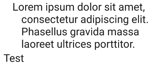
val text = "Lorem ipsum dolor sit amet, consectetur adipiscing elit. Phasellus gravida massa laoreet ultrices porttitor."

Text(
    text = buildAnnotatedString {
        append(
            AnnotatedString(
                text = text,
                paragraphStyle = ParagraphStyle(
                    textIndent = TextIndent(
                        firstLine = 20.sp,
                        restLine = 40.sp
                    )
                )
            )
        )
        append("Test")
    },
    fontSize = 24.sp,
    modifier = Modifier.padding(8.dp)
)
Example: Style substrings
Let's imagine that we have an application with a list of coffee drinks and detailed information about each coffee. The CoffeeDrinkDetailsScreen has name and description parameters.
So, let's apply a style to the description based on the following requirements:
- The substring with the first appearance of a specific coffee drink in the description should be bold.
- All "coffee" substrings in the description should be underlined.
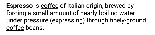
The first step is to create a function that finds all substrings in a string and returns a List<IntRange>. For the sake of simplicity, I implemented one of the simplest solutions.
fun getSubstrings(substring: String, text: String): List<IntRange> {
    return substring.toRegex()
        .findAll(text)
        .map { it.range }
        .toList()
}
The final step is to create a composable function with styled text.
val name = "Espresso"
val italicSubstring = "coffee"
val description = "Espresso is coffee of Italian origin, brewed by forcing a small amount of nearly boiling water under pressure (expressing) through finely-ground coffee beans."

val substrings = getSubstrings(italicSubstring, description)
val nameIndex = description.indexOf(name)

Text(
    text = buildAnnotatedString {
        append(description)
        addStyle(
            style = SpanStyle(
                fontWeight = FontWeight.Bold
            ),
            start = nameIndex,
            end = nameIndex + name.length
        )

        for (substringRange in substrings) {
            addStyle(
                style = SpanStyle(textDecoration = TextDecoration.Underline),
                start = substringRange.first,
                end = substringRange.last + 1
            )
        }
    }
)
Source code of this example.
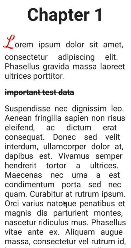
Example: Capitalize the first letter of a book chapter
Let's try to build the main screen of the application for reading books with multiple chapters. We can move between chapters by swiping to the left and right. The first letter of every chapter should have a font size of 52 sp (scale-independent pixels), and the color should be Red.
I will use the HorizontalPager composable function from the "Accompanist" library.
The "Accompanist" library is a group of libraries that aim to supplement Jetpack Compose with features that are commonly required by developers but not yet available.
val testData = "important test data"

val content = listOf(
    listOf(
        "Lorem ipsum dolor sit amet, consectetur adipiscing elit. Phasellus gravida massa laoreet ultrices porttitor.",
        ...
    ),
    listOf(...),
    listOf(...)
)

val pagerState = rememberPagerState(pageCount = content.size)
HorizontalPager(
    state = pagerState,
    modifier = Modifier.fillMaxSize()
) { page ->
    LazyColumn {
        val pageText = content[page]

        item {
            Text(
                text = "Chapter ${page + 1}",
                textAlign = TextAlign.Center,
                style = TextStyle(
                    fontWeight = FontWeight.Bold,
                    fontSize = 52.sp,
                ),
                modifier = Modifier
                    .fillMaxWidth()
                    .padding(horizontal = 16.dp, vertical = 8.dp),
            )

            for (index in pageText.indices) {
                Text(
                    text = buildAnnotatedString {
                        append(pageText[index])
                        if (index == 0) {
                            addStyle(
                                style = SpanStyle(
                                    color = Color.Red,
                                    fontSize = 52.sp,
                                    fontFamily = FontFamily.Cursive
                                ),
                                start = 0,
                                end = 1
                            )
                        }
                        if (pageText[index] == testData) {
                            addStyle(
                                style = SpanStyle(
                                    fontWeight = FontWeight.Bold,
                                    textDecoration = TextDecoration.LineThrough
                                ),
                                start = 0,
                                end = testData.length
                            )
                        }
                    },
                    modifier = Modifier
                        .fillMaxWidth()
                        .padding(horizontal = 16.dp, vertical = 8.dp),
                    fontSize = 24.sp,
                    style = TextStyle(
                        textAlign = TextAlign.Justify
                    )
                )
            }
        }
    }
}
Source code of this example.
Summary
The Text composable function provides possibilities for applying multiple styles to text. The AnnotatedString can be a good friend if you need to do it.
We explored features available to the Text composable function together with the AnnotatedString type.
- The
SpanStyleconfigures the style for the text span. We can change the font attributes and color, add text decorations, etc. - The
ParagraphStyleconfigures the style for a paragraph, such as text alignment, direction, indents, and line height.
Combining SpanStyle with ParagraphStyle we can achieve great results in text styling.
Source code of all examples in this article.
Do not hesitate to ping me on Twitter if you have any questions.

