Introduction
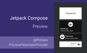
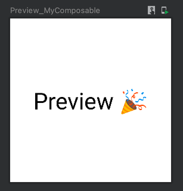
The preview functionality of Jetpack Compose is one of the key parts of development UI with this technology because the infrastructure for preview changes in composable code is integrated into Android Studio. However, you can often see that developers don't use all the features that the @Preview annotation provides. This is the most famous example of using the @Preview annotation.
@Preview
@Composable
fun Preview_MyComposable() {
    ...
}
So, which cases can be covered with the @Preview annotation, and what can we render inside Android Studio?
This article is a part of Jetpack Compose series:
- Jetpack Compose: Layouts
- Jetpack Compose: Theme and Typography
- Jetpack Compose: style Text
- Jetpack Compose: RadioButton
- Jetpack Compose: Building Grids
The content of this article is based on the 1.0.5 version of Jetpack Compose.
In this article, I will show how to use a preview functionality for the following cases:
- rendering composable function for different devices
- how to group multiple previews
- how to preview composable functions with different font sizes and display scales
- how to preview composable functions that use different themes, locales, screen orientations (portrait and landscape), layout directions (Left-To-Right and Right-To-Left), etc.
- how to create multiple preview functions with the
@PreviewParameterannotation - which tools can be used for creating screenshot tests for preview functions
If you are familiar with the parameters of the @Preview annotation, an interaction mode saving rendered screenshot of the preview function, I recommend that you skip the next section and move on to more advanced examples.The @Preview annotation
The @Preview annotation is needed to preview your composable function inside Android Studio. This annotation should be added together with the @Composable one.
@Preview
@Composable
fun Preview_MyComposable() {
    ...
}
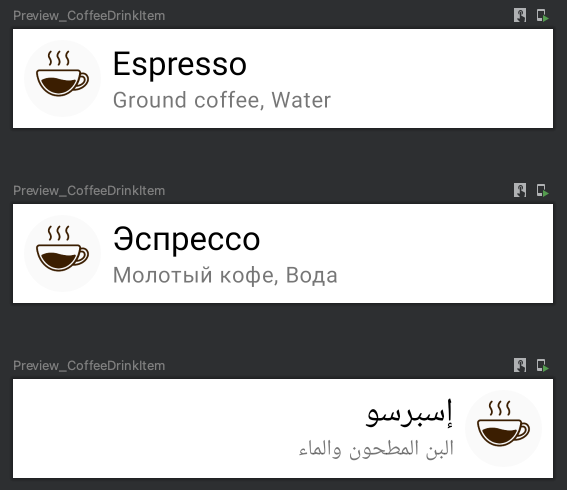
We can add multiple @Preview annotations to a @Composable function to preview the same @Composable function with different preview parameters. One of the helpful cases of using multiple annotations is to render multiple previews for UI components for different locales.
@Preview(locale = "en", showBackground = true)
@Preview(locale = "ru", showBackground = true)
@Preview(locale = "ar", showBackground = true)
@Composable
fun Preview_CoffeeDrinkItem() {
    CoffeeDrinkItem(
        title = stringResource(R.string.espresso_title),
        ingredients = stringResource(R.string.espresso_ingredients),
        icon = R.drawable.espresso_small
    )
}
Parameters
The @Preview annotation supports many customization options which can be passed as parameters.
annotation class Preview(
    val name: String = "",
    val group: String = "",
    @IntRange(from = 1) val apiLevel: Int = -1,
    val widthDp: Int = -1,
    val heightDp: Int = -1,
    val locale: String = "",
    @FloatRange(from = 0.01) val fontScale: Float = 1f,
    val showSystemUi: Boolean = false,
    val showBackground: Boolean = false,
    val backgroundColor: Long = 0,
    @UiMode val uiMode: Int = 0,
    @Device val device: String = Devices.DEFAULT
)
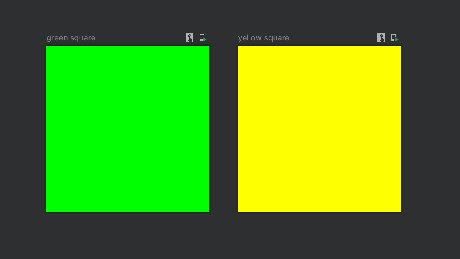
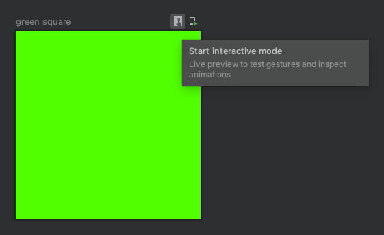
The name: String parameter allows you to set the name of the preview in the panel.
@Preview(name = "green square")
@Composable
fun Preview_GreenSquare() {
    ColorSquare(Color.Green)
}

@Preview(name = "yellow square")
@Composable
fun Preview_YellowSquare() {
    ColorSquare(Color.Yellow)
}

@Composable
fun ColorSquare(
    color: Color
) {
    Box(
        modifier = Modifier.size(400.dp)
            .background(color)
    )
}
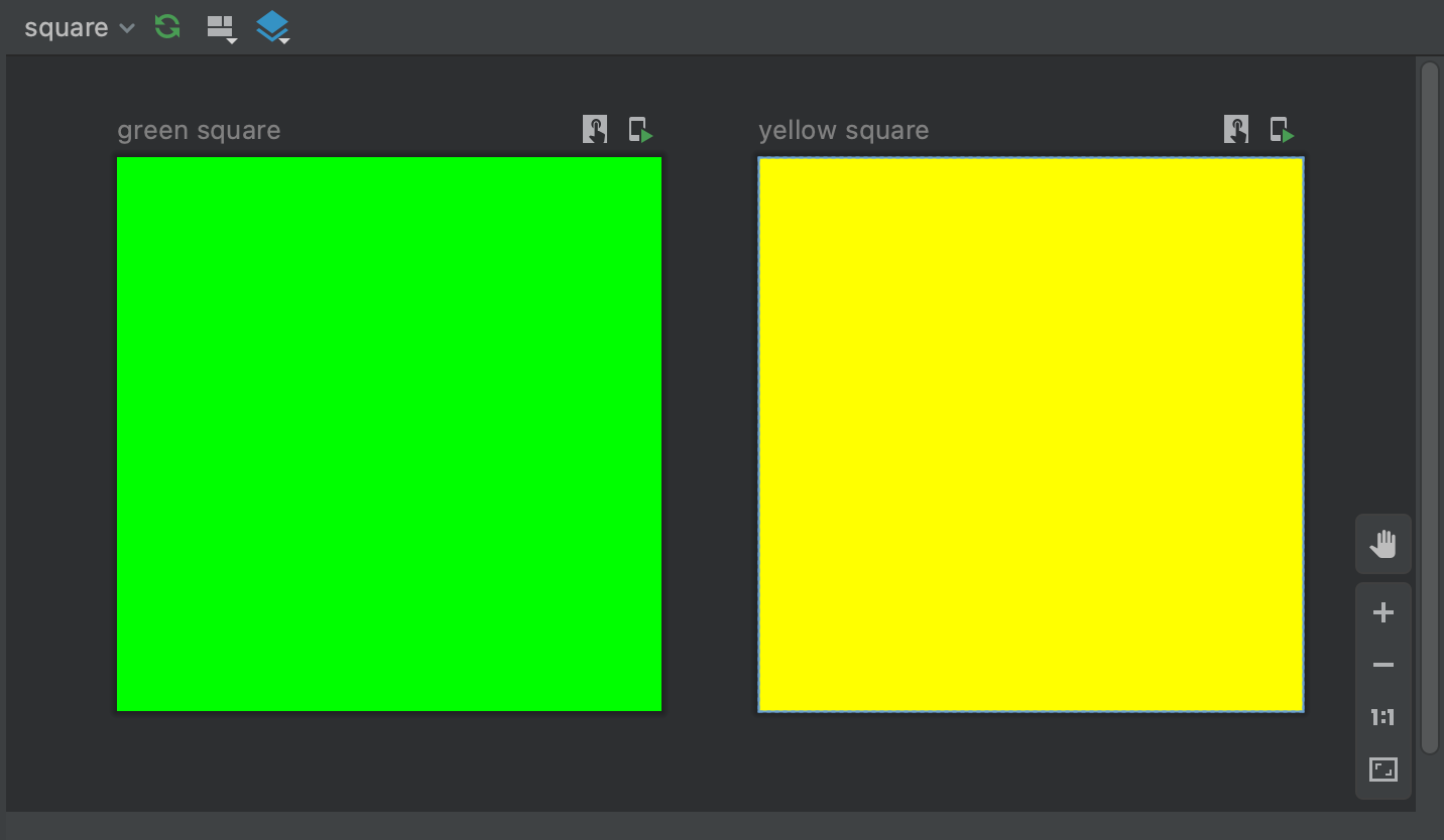
The group: String parameter allows us to group previews into different categories.
@Preview(name = "green square", group = "square")
@Composable
fun Preview_GreenSquare() {
    ColorSquare(Color.Green)
}

@Preview(name = "yellow square", group = "square")
@Composable
fun Preview_YellowSquare() {
    ColorSquare(Color.Yellow)
}

@Composable
fun ColorSquare(
    color: Color
) {
    Box(
        modifier = Modifier.size(400.dp)
            .background(color)
    )
}
The @IntRange(from = 1) val apiLevel: Int represents the API level to be used to render the @Composable function.
The widthDp: Int and heightDp: Int parameters are used to specify width and height for rendering @Composable function.
The locale: String parameter allows us to set the locale for the rendering the @Composable function, corresponding to the locale resource qualifier. This parameter can be very helpful when you use strings from resources, and different preview functions can render the @Composable function for different languages.
@Preview(locale = "en", showBackground = true)
@Preview(locale = "ru", showBackground = true)
@Preview(locale = "ar", showBackground = true)
@Composable
fun Preview_CoffeeDrinkItem() {
    CoffeeDrinkItem(
        title = stringResource(R.string.espresso_title),
        ingredients = stringResource(R.string.espresso_ingredients),
        icon = R.drawable.espresso_small
    )
}
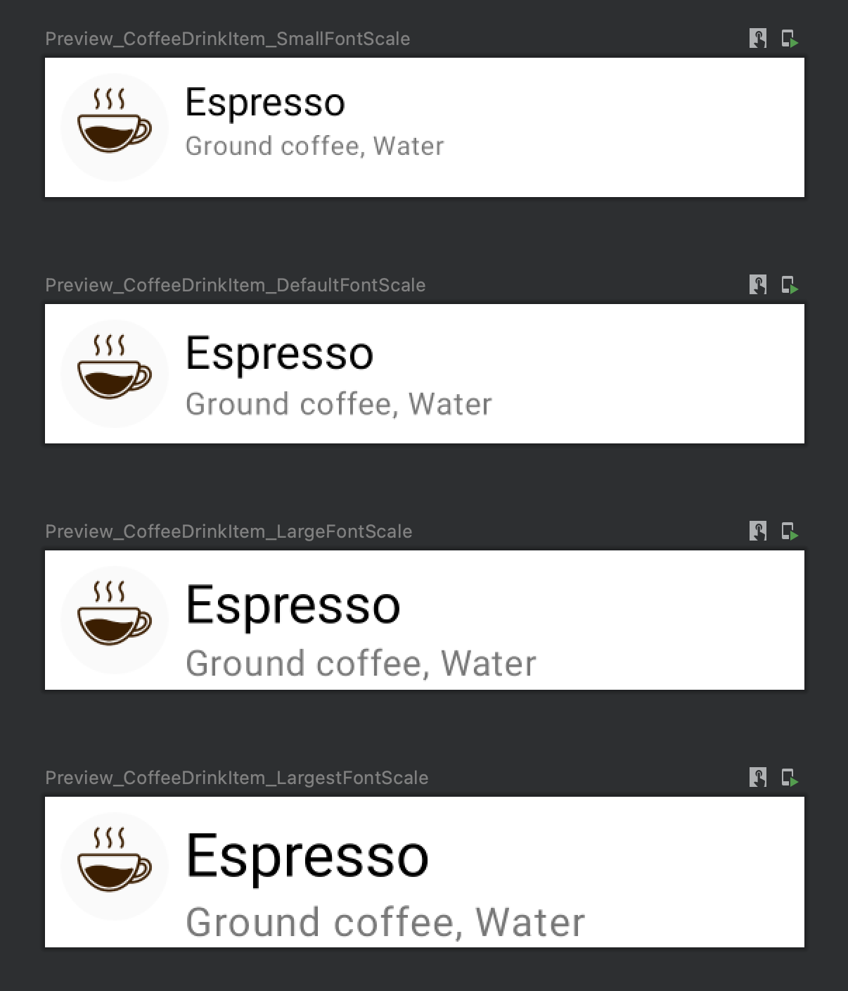
The @FloatRange(from = 0.01) val fontScale: Float parameter represents the scaling factor for fonts, relative to the base density scaling. The fontScale represents the "Font size" accessibility settings. We will explore it with additional details in the "Font Scale" section.
We can have the following font sizes with corresponding fontScale values:
- Small (
fontScale = 0.85) - Default (
fontScale = 1.00) - Large (
fontScale = 1.15) - Largest (
fontScale = 1.30)
@Preview(fontScale = 0.85f, showBackground = true)
@Composable
fun Preview_CoffeeDrinkItem_SmallFontScale() {
    CoffeeDrinkItem(
        title = "Espresso",
        ingredients = "Ground coffee, Water",
        icon = R.drawable.espresso_small
    )
}
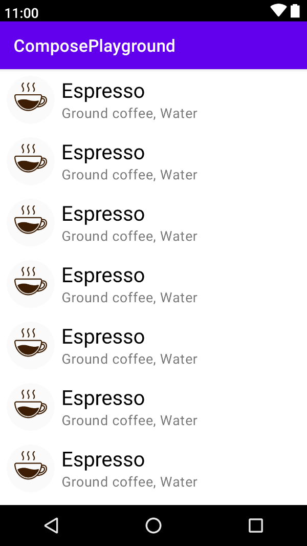
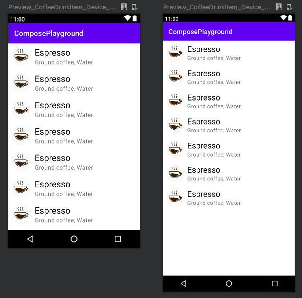
The showSystemUi: Boolean parameter defines whether the @Composable function will be rendered in the context of Activity (status bar and action bar of the device will be displayed).
@Preview(showSystemUi = true)
@Composable
fun Preview_Preview_CoffeeDrinkItem_ShowSystemUI() {
    Column {
        repeat(7) {
            CoffeeDrinkItem(
                title = "Espresso",
                ingredients = "Ground coffee, Water",
                icon = R.drawable.espresso_small
            )
        }
    }
}
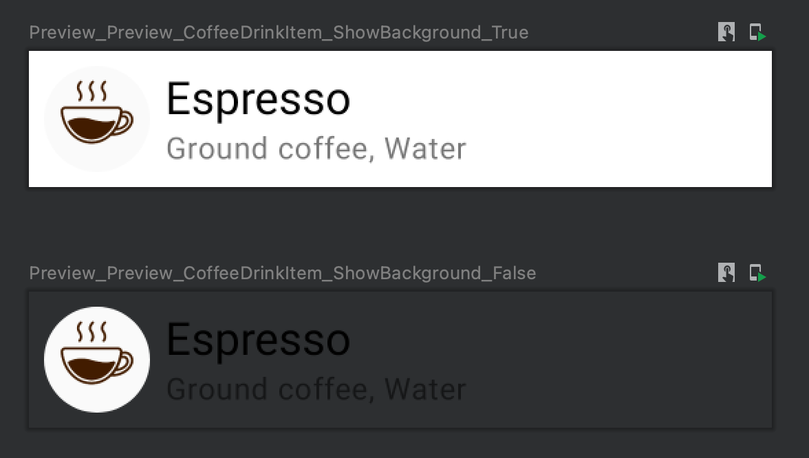
The showBackground: Boolean parameter defines whether the @Composable function will use the default background color.
@Preview(showBackground = true)
@Composable
fun Preview_CoffeeDrinkItem_ShowBackground_True() {
    CoffeeDrinkItem(
        title = "Espresso",
        ingredients = "Ground coffee, Water",
        icon = R.drawable.espresso_small
    )
}

@Preview(showBackground = false)
@Composable
fun Preview_CoffeeDrinkItem_ShowBackground_False() {
    CoffeeDrinkItem(
        title = "Espresso",
        ingredients = "Ground coffee, Water",
        icon = R.drawable.espresso_small
    )
}
The backgroundColor: Long represents the 32-bit ARGB color int for the background.
The @UiMode val uiMode: Int parameter defines the bit mask for specific the UiMode. We can use one of the following values.
@IntDef(
    value = [
        UI_MODE_TYPE_MASK,
        UI_MODE_TYPE_UNDEFINED,
        UI_MODE_NIGHT_NO,
        UI_MODE_NIGHT_YES,
        UI_MODE_TYPE_APPLIANCE,
        UI_MODE_TYPE_CAR,
        UI_MODE_TYPE_DESK,
        UI_MODE_TYPE_NORMAL,
        UI_MODE_TYPE_TELEVISION,
        UI_MODE_TYPE_VR_HEADSET,
        UI_MODE_TYPE_WATCH,
        UI_MODE_NIGHT_MASK,
        UI_MODE_NIGHT_UNDEFINED,
        UI_MODE_NIGHT_NO,
        UI_MODE_NIGHT_YES
    ]
)
Let's compare the UI_MODE_NIGHT_NO and UI_MODE_NIGHT_YES options.
@Preview(uiMode = UI_MODE_NIGHT_NO, showBackground = true)
@Composable
fun Preview_CoffeeDrinkItem_UiModeNightNo() {
    PlaygroundTheme {
        CoffeeDrinkItem(
            title = "Espresso",
            ingredients = "Ground coffee, Water",
            icon = R.drawable.espresso_small
        )
    }
}

@Preview(uiMode = UI_MODE_NIGHT_YES, showBackground = true)
@Composable
fun Preview_CoffeeDrinkItem_UiModeNightYes() {
    PlaygroundTheme {
        CoffeeDrinkItem(
            title = "Espresso",
            ingredients = "Ground coffee, Water",
            icon = R.drawable.espresso_small
        )
    }
}
The PlaygroundTheme is the theme of the application.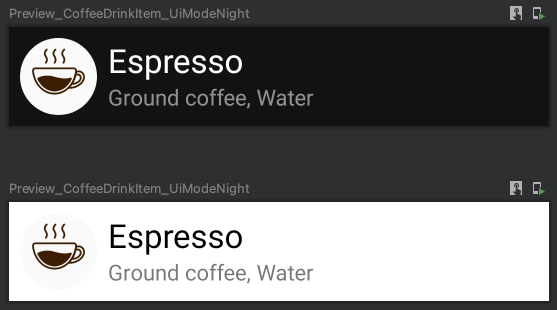
The @Device val device: String indicates the device to use for preview functionality. The following devices are available:
@StringDef(
    open = true,
    value = [
        Devices.DEFAULT,

        Devices.NEXUS_7,
        Devices.NEXUS_7_2013,
        Devices.NEXUS_5,
        Devices.NEXUS_6,
        Devices.NEXUS_9,
        Devices.NEXUS_10,
        Devices.NEXUS_5X,
        Devices.NEXUS_6P,
        Devices.PIXEL_C,
        Devices.PIXEL,
        Devices.PIXEL_XL,
        Devices.PIXEL_2,
        Devices.PIXEL_2_XL,
        Devices.PIXEL_3,
        Devices.PIXEL_3_XL,
        Devices.PIXEL_3A,
        Devices.PIXEL_3A_XL,
        Devices.PIXEL_4,
        Devices.PIXEL_4_XL,

        Devices.AUTOMOTIVE_1024p
    ]
)
Let's create preview functions for NEXUS_5 and PIXEL_4 devices.
@Preview(showSystemUi = true, device = Devices.NEXUS_5)
@Composable
fun Preview_CoffeeDrinkItem_Device_Nexus5() {
    ...
}

@Preview(showSystemUi = true, device = Devices.PIXEL_4)
@Composable
fun Preview_CoffeeDrinkItem_Device_Pixel4() {
    ...
}
Interaction mode
We can interact with previews in Android Studio, similarly to devices and emulators. There are a few limitations of interacting with previews inside Android Studio:
- No network access
- No file access
- Some API based on
Contextcan be unavailable
To enable "Interaction mode" for preview, we need to open "Preferences / Experimental" and select "Enable interactive and animation preview tools".
Afterward, you can find the "Start interactive mode" icon.
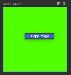
Copy rendered preview image
We can copy the rendered preview inside Android Studio and paste it as an image. To do this, we need to right-click on the rendered preview and select the "Copy Image" option.
Advanced use cases
The @Preview annotation allows us to customize multiple parameters for preview functionality. However, the preview functionality can be extended even more by creating custom providers for our preview functions.
The @PreviewParameter allows us to provide data to the composable function with the @Preview annotation. We can create such data by creating a class that implements the PreviewParameterProvider interface.
The PreviewParameterProvider interface
Let's take a look at the PreviewParameterProvider interface.
interface PreviewParameterProvider<T> {
    val values: Sequence<T>
    val count get() = values.count()
}
- The
valuesproperty returns a sequence of values, which will be passed to the preview function.
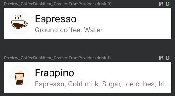
Let's imagine that we want to preview a @Composable function that renders a "Coffee Drink Item". This UI element shows the full name and list of ingredients if the component has enough space; otherwise, the name and/or ingredient list is ellipsized.
Let's create a data holder class that stores information about the content of the item. (You most probably, already passed a similar object to the @Composable function.)
data class CoffeeDrink(
    val name: String,
    val ingredients: String,
    @DrawableRes val icon: Int
)
The next step is creating a custom provider that implements the PreviewParameterProvider interface.
class CoffeeDrinkProvider : PreviewParameterProvider<CoffeeDrink> {
    override val values = sequenceOf(
        CoffeeDrink(
            "Espresso",
            "Ground coffee, Water",
            R.drawable.espresso_small
        ),
        CoffeeDrink(
              "Frappino",
              "Espresso, Cold milk, Sugar, Ice cubes, Irish Cream flavoured syrup, Whipped cream, Chocolate sauce",
              R.drawable.frappino_small
            )
    )
}
To preview the CoffeeDrinkItem(drink: CoffeeDrink) component with data from the CoffeeDrinkProvider, we need to customize the preview function.
@Preview(showBackground = true)
@Composable
fun Preview_CoffeeDrinkItem_ContentFromProvider(
    @PreviewParameter(CoffeeDrinkProvider::class) drink: CoffeeDrink
) {
    CoffeeDrinkItem(
        drink.name,
        drink.ingredients,
        drink.icon
    )
}

Let's take a look at the @PreviewParameter annotation.
annotation class PreviewParameter(
    val provider: KClass<out PreviewParameterProvider<*>>,
    val limit: Int = Int.MAX_VALUE
)
- The
val provider: KClass<out PreviewParameterProvider<*>>allows us to inject values to the annotated parameter - The
val limit: Int = Int.MAX_VALUErepresents the max number of values from the provider parameter.
The second parameter helps us to reduce the number of previews.
Combining multiple providers
Let's create a set of preview functions for the following scenarios:
- Coffee drink item with short text and the large font scale
- Coffee drink item with long text and small font scale
When we have a long text for a coffee drink name and list of ingredients, these fields should be ellipsized.
First of all, we need to create two classes that implements the PreviewParameterProvider interfaces:
- The
CoffeeDrinkItemProviderreturns a sequence ofCoffeeDrinkItemobjects for short and long coffee drink names of the list of ingredients. - The
FontScaleProviderreturns a sequence ofFloatvalues representing small and large font scales. You can read more about different font scales and density here. - ADD LINK TO SECTION ABOUT FONT SCALES AND DISPLAY SIZES ABOVE
class CoffeeDrinkProvider : PreviewParameterProvider<CoffeeDrink> {
    override val values = sequenceOf(
        CoffeeDrink(
                "Espresso",
                "Ground coffee, Water",
                R.drawable.espresso_small
            ),
        CoffeeDrink(
              "Frappino",
              "Espresso, Cold milk, Sugar, Ice cubes, Irish Cream flavoured syrup, Whipped cream, Chocolate sauce",
              R.drawable.frappino_small
            )
    )
}

class CoffeeDrinkFontScaleProvider : PreviewParameterProvider<Float> {
    override val values = sequenceOf(
        1.15f,
        0.85f
    )
}

open class PairCombinedPreviewParameter<T1, T2>(
    private val provider: Pair<PreviewParameterProvider<T1>, PreviewParameterProvider<T2>>
) : PreviewParameterProvider<Pair<T1, T2>> {
    override val values: Sequence<Pair<T1, T2>>
        get() = provider.first.values.flatMap { first ->
            provider.second.values.map { second ->
                first to second
            }
        }
}

class CoffeeDrinkToFontScaleProvider : PairCombinedPreviewParameter<CoffeeDrink, Float>(
        CoffeeDrinkProvider() to CoffeeDrinkFontScaleProvider()
)

@Preview(showBackground = true)
@Composable
fun Preview_CoffeeDrinkItem_CoffeeDrinkAndFrontScale(
    @PreviewParameter(CoffeeDrinkToFontScaleProvider::class) coffeeDrinkToFontScale: Pair<CoffeeDrink, Float>
) {
    val currentDensity = LocalDensity.current.density
    CompositionLocalProvider(LocalDensity provides Density(currentDensity, fontScale = coffeeDrinkToFontScale.second)) {
        val coffeeDrink = coffeeDrinkToFontScale.first
        CoffeeDrinkItem(
            coffeeDrink.name,
            coffeeDrink.ingredients,
            coffeeDrink.icon
        )
    }
}
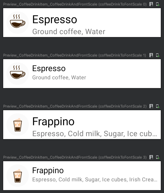
ThePairCombinedPreviewParameter#valuesreturns theSequence<Pair<T1, T2>>because we want to combine two providers. If you're going to combine more than two providers, you can create a custom data class with the required amount of properties and similarly generate a sequence of values.
The CollectionPreviewParameterProvide interface
The CollectionPreviewParameterProvide allows us to pass a collection of elements instead of overriding values in the instance of the class that implements the PreviewParameterProvider interface.
Let's use the CollectionPreviewParameterProvide instead of PreviewParameterProvider for the CoffeeDrinkProvider class.
class CoffeeDrinkProvider : CollectionPreviewParameterProvider<CoffeeDrink>(
    listOf(
        CoffeeDrink("Espresso", "Ground coffee, Water", R.drawable.espresso_small),
        CoffeeDrink("Cappuccino", "Espresso, Steamed milk foam", R.drawable.cappuccino_small),
        CoffeeDrink("Latte", "Espresso, Steamed milk", R.drawable.latte_small)
    )
)

@Preview(group = "CoffeeDrinkItem")
@Composable
fun Preview_CoffeeDrinkItem_ContentFromProvider(
    @PreviewParameter(CoffeeDrinkProvider::class) drink: CoffeeDrink
) {
    CoffeeDrinkItem(
        drink.name,
        drink.ingredients,
        drink.icon
    )
}
Preview for different locales
The @Preview annotation has the locale parameters, and we can specify the locale for preview.
@Preview(locale = "en")
@Composable
fun Preview_CoffeeDrinkItem() {
        CoffeeDrinkItem(
        title = stringResource(R.string.espresso_title),
        ingredients = stringResource(R.string.espresso_ingredients),
        icon = R.drawable.espresso_small
    )
}
We can apply more than one @Preview annotation to a composable function to generate a few rendered previews.
@Preview(locale = "en", showBackground = true)
@Preview(locale = "ru", showBackground = true)
@Preview(locale = "ar", showBackground = true)
@Composable
fun Preview_CoffeeDrinkItem() {
    CoffeeDrinkItem(
        title = stringResource(R.string.espresso_title),
        ingredients = stringResource(R.string.espresso_ingredients),
        icon = R.drawable.espresso_small
    )
}
Preview for different colors
Many applications support only "Light" and "Dark" themes, depending on the device's system setting. In addition to it, we have an application that supports more than two themes for applications. Let's explore both of these cases and find ways of creating preview annotations for both cases.
Let's start with a situation where we want to support only light and dark themes, depending on the system settings. We can use the following values for uiMode parameter for the @Preview annotation:
- The
Configuration.UI_MODE_NIGHT_YESactivates night mode - The
Configuration.UI_MODE_NIGHT_NOdeactivates night mode
@Preview(uiMode = UI_MODE_NIGHT_YES, showBackground = true)
@Preview(uiMode = UI_MODE_NIGHT_NO, showBackground = true)
@Composable
fun Preview_CoffeeDrinkItem_UiModeNightYes() {
    PlaygroundTheme {
        CoffeeDrinkItem(
            title = "Espresso",
            ingredients = "Ground coffee, Water",
            icon = R.drawable.espresso_small
        )
    }
}
Alternatively, we can create a custom ColorsProvider which implements the PreviewParameterProvider<Colors> interface.
class ColorsProvider : PreviewParameterProvider<Colors> {
    override val values: Sequence<Colors>
        get() = sequenceOf(DarkColorPalette, LightColorPalette)
}
Finally, we can create a preview function that renders multiple previews.
@Preview(showBackground = true)
@Composable
fun Preview_CoffeeDrinkItem_DarkAndLightColors(@PreviewParameter(ColorsProvider::class) color: Colors) {
    MaterialTheme(color) {
        CoffeeDrinkItem(
            title = "Espresso",
            ingredients = "Ground coffee, Water",
            icon = R.drawable.espresso_small
        )
    }
}
This approach can be used to preview the @Composable function with any number of the Colors objects.
Preview for different orientations
By default, all previews are rendered in the portrait orientation. There are multiple ways to preview rendering @Composable functions for portrait and landscape orientations. We can use the combination of device, widthDp, and heightDp parameters for the @Preview annotations, or we can use the LocalConfiguration inside the @Composable function.
Let's start with creating a @Composable function that displays the coffee drink's name, icon, and list of ingredients for both landscape and portrait orientations.
@Composable
fun CoffeeDrinkItem2(
    title: String,
    ingredients: String,
    @DrawableRes icon: Int
) {
    val configuration = LocalConfiguration.current
    if (configuration.orientation == Configuration.ORIENTATION_LANDSCAPE) {
        CoffeeDrinkItemLandscape(title, ingredients, icon)
    } else {
        CoffeeDrinkItemPortrait(title, ingredients, icon)
    }
}
Full source code can be found here.
We have a @Composable function that displays different UI for other orientations; we can preview this function for landscape and portrait orientations.
Let's explore different ways of creating preview functions.
Combining "device", "widthDp" and "heightDp" parameters of @Preview
The @Preview annotation has many helpful parameters which we will use for achieving a preview for different orientations: landscape and portrait. We will use the following parameters:
devicewidthDpheightDp
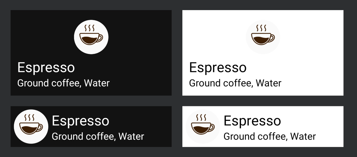
If we want to preview@Composablefunction for landscape orientation, we need to use thedevice = Devices.AUTOMOTIVE_1024pfor@Previewannotation, otherwise the preview for portrait orientation will be rendered.
Afterwards, we can customize the size of the screen with thewidthDpandheightDpparameters.
@Preview(showBackground = true, device = Devices.AUTOMOTIVE_1024p, widthDp = 480)
@Preview(showBackground = true, widthDp = 420)
@Composable
fun Preview_CoffeeDrinkItem_LandscapeAndPortraitAnnotation() {
    CoffeeDrinkItem2(
        title = "Espresso",
        ingredients = "Ground coffee, Water",
        icon = R.drawable.espresso_small
    )
}
Using LocalConfiguration inside @Composable
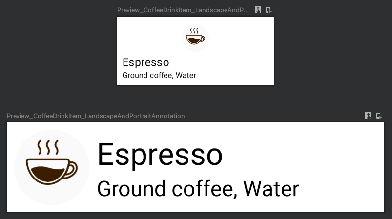
This approach requires using the CompositionLocalProvider functions and setting the Configuration with predefined orientation.
It can be helpful when we want to merge multiple PreviewParameterProviders.
class ScreenOrientationProvider : PreviewParameterProvider<Int> {
    override val values: Sequence<Int>
        get() = sequenceOf(
            Configuration.ORIENTATION_LANDSCAPE,
            Configuration.ORIENTATION_PORTRAIT
        )
}

@Preview(group = "CoffeeDrinkItem-LandscapeAndPortrait-Provider", showBackground = true)
@Composable
fun Preview_CoffeeDrinkItem_LandscapeAndPortraitProvider(
    @PreviewParameter(ScreenOrientationProvider::class) screenOrientation: Int
) {
    val configuration = Configuration().apply { orientation = screenOrientation }
    CompositionLocalProvider(LocalConfiguration provides Configuration(configuration)) {
        CoffeeDrinkItem2(
            title = "Espresso",
            ingredients = "Ground coffee, Water",
            icon = R.drawable.espresso_small
        )
    }
}
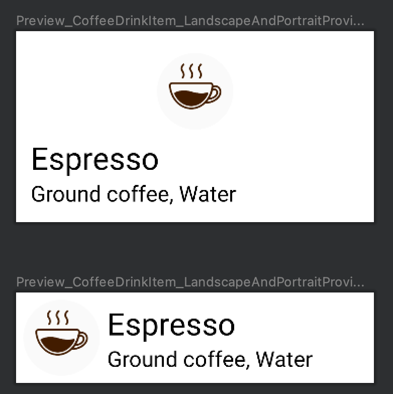
Preview for RTL and LTR
There are multiple ways of previewing the @Composable function for both "Left-To-Right" (LTR) and "Right-To-Left" (RTL).
Using the "locale" parameter of @Preview
The locale parameter of the @Preview annotation allows us to set locale for rendered preview.
If we want to preview multiple languages, we can add a few@Previewannotations with different locales to the@Composablefunction.
The @Preview(locale = "ar") helps us to render the previews in "Right-To-Left" (RTL) layout direction.
@Preview(locale = "en", showBackground = true)
@Preview(locale = "ru", showBackground = true)
@Preview(locale = "ar", showBackground = true)
@Composable
fun Preview_CoffeeDrinkItem() {
    CoffeeDrinkItem(
        title = stringResource(R.string.espresso_title),
        ingredients = stringResource(R.string.espresso_ingredients),
        icon = R.drawable.espresso_small
    )
}
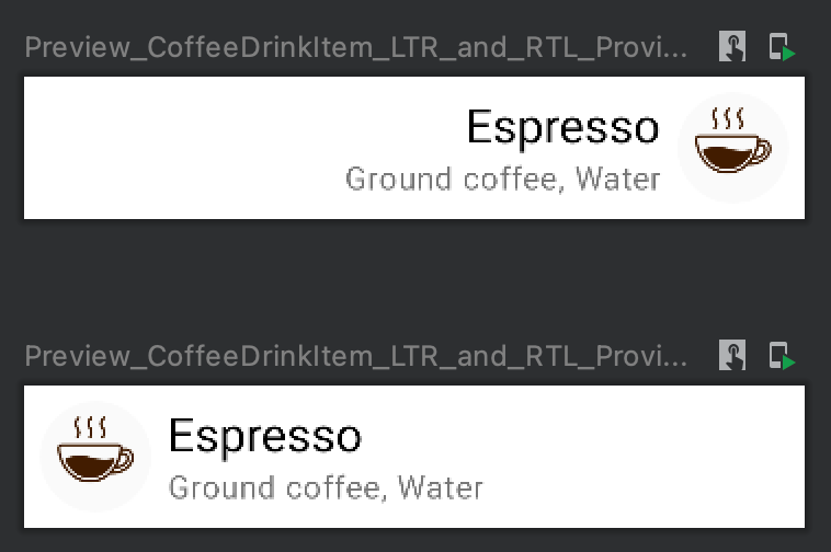
Using the LocalLayoutDirection inside @Composable
This approach requires using the LocalLayoutDirection functions and setting the Configuration with predefined orientation.
It can be helpful when we want to merge multiple PreviewParameterProviders.
class LayoutDirectionProvider : PreviewParameterProvider<LayoutDirection> {
    override val values: Sequence<LayoutDirection>
        get() = sequenceOf(
            LayoutDirection.Rtl,
            LayoutDirection.Ltr
        )
}

@Preview(showBackground = true)
@Composable
fun Preview_CoffeeDrinkItem_LTR_and_RTL_Provider(
    @PreviewParameter(LayoutDirectionProvider::class) layoutDirection: LayoutDirection
) {
    CompositionLocalProvider(LocalLayoutDirection provides layoutDirection) {
        CoffeeDrinkItem(
            title = "Espresso",
            ingredients = "Ground coffee, Water",
            icon = R.drawable.espresso_small
        )
    }
}
Preview for different font sizes and densities
We want to provide the best experience for users, including when they want to change "Font Size" and "Display scaling" settings.
Both of these settings can be changed in "Settings/System/Accessibility" or "Settings/Accessibility/Text and Display". It depends on the version of Android OS.
We can change both font size and density using the LocalDensity object.
CompositionLocalProvider(
    LocalDensity provides Density(
        density = 3.375f, // Largest
        fontScale = 1.3f  // Largest
    )
) {
    ...
}
Let's explore values of the density and fontScale parameters:
- The
densityparameter represents the logical density of the display; when the user changes the "Display Scale", thedensityvalue will be updated. - The
fontScaleparameter represents the scaling factor of the font.
To get the current value of the density and fontScale, we can use the LocalDensity.current.density and LocalDensity.current.fontScale respectively.
Font size
The "Font size" feature allows us to use different font scales for the Android OS. It means the font size will be changed for all applications. When we release the application, we want to be sure that it will work well for all users, independent of the font and display settings. We can change it manually on the device/emulator in "Font Size" settings.
Let's compare available values with a scale:
- Small (scale: 0.85)
- Default (scale: 1.00)
- Large (scale: 1.15)
- Larger (scale 1.30)
Density
The density represents the logical density of the display. This is a scaling factor for the Dp unit.
We can get the current density of the screen using LocalDensity.current.
Unfortunately, the density value depends on the devices and can be different on different devices. You can always alter the value manually and check updated density using LocalDensity.current.density.Let's compare density values for different devices.
| Pixel 5 | Pixel 3 | |
|---|---|---|
| Small | 2.3375f |
2.125f |
| Default | 2.75f |
2.5f |
| Large | 3.0625f |
2.7875f |
| Larger | - | 3.075f |
| Largest | 3.375f |
3.375 |
Combining FontScaleProvider and DisplayScaleProvider providers
Let's create providers for both "Density" and "Font Size" settings.
We will use only Small, Default and Large font scales and display scales settings. That's a reason why the following providers don't have all values.
class FontScaleProvider : PreviewParameterProvider<Float> {
    override val values = sequenceOf(
        0.85f,    // Small
        1.0f,     // Default
        1.15f,    // Large
    )
}

class DensityProvider : PreviewParameterProvider<Float> {
    override val values = sequenceOf(
        2.125f,   // Small
        2.5f,     // Default
        2.7875f,  // Large
    )
}
The next step is to create the DensityToFontScaleProvider based on the custom PairCombinedPreviewParameter class.
open class PairCombinedPreviewParameter<T1, T2>(
    private val provider: Pair<PreviewParameterProvider<T1>, PreviewParameterProvider<T2>>
) : PreviewParameterProvider<Pair<T1, T2>> {
    override val values: Sequence<Pair<T1, T2>>
        get() = provider.first.values.flatMap { first ->
            provider.second.values.map { second ->
                first to second
            }
        }
}

class DensityToFontScaleProvider : PairCombinedPreviewParameter<Float, Float>(
    DensityProvider() to FontScaleProvider()
)
The last step is to create a preview function.
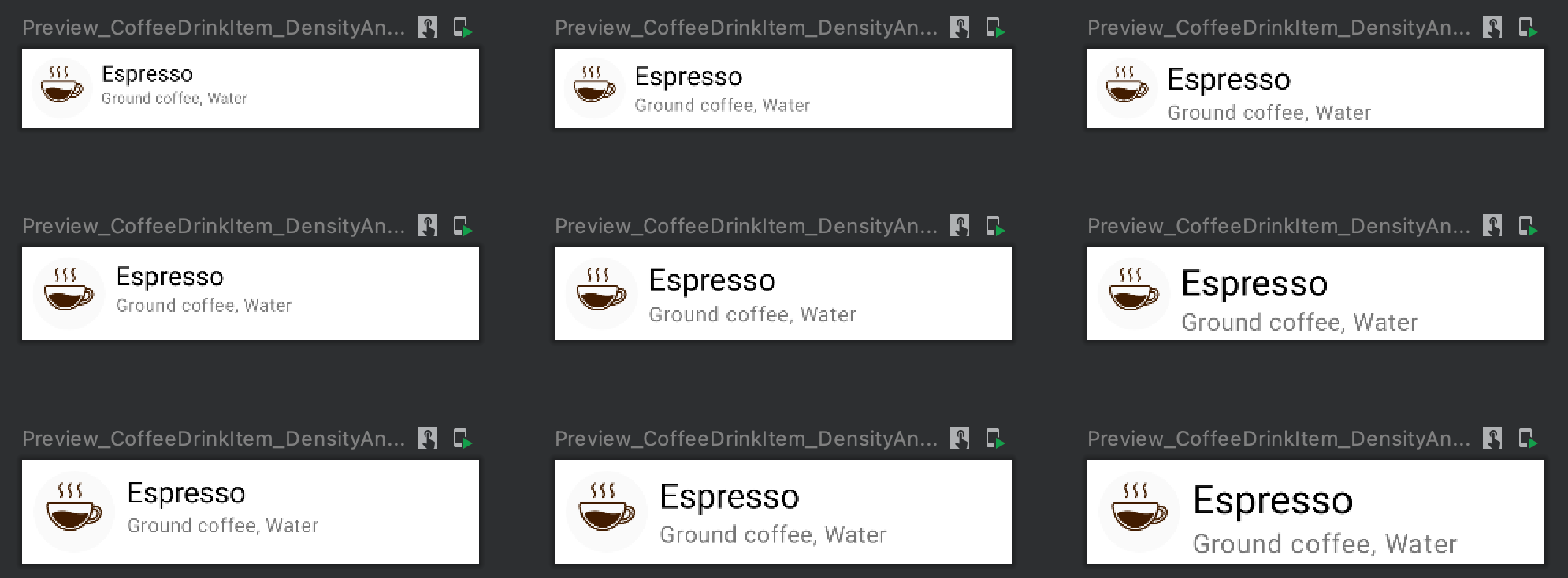
@Preview(showBackground = true, widthDp = 320)
@Composable
fun Preview_CoffeeDrinkItem_DensityAndFontScale_Provider(
    @PreviewParameter(DensityToFontScaleProvider::class) densityToFontScale: Pair<Float, Float>
) {

    CompositionLocalProvider(
        LocalDensity provides Density(
            density = densityToFontScale.first,
            fontScale = densityToFontScale.second
        )
    ) {
        CoffeeDrinkItem(
            title = "Espresso",
            ingredients = "Ground coffee, Water",
            icon = R.drawable.espresso_small
        )
    }
}
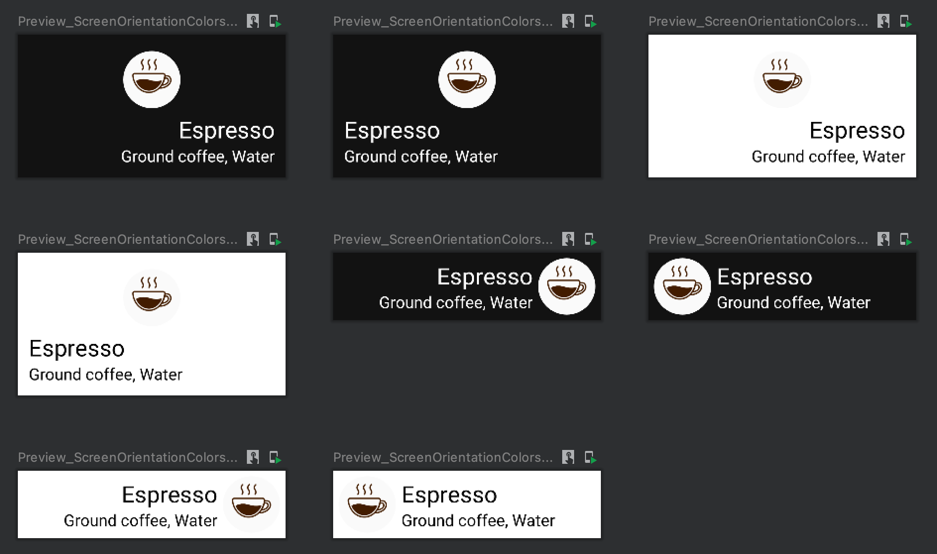
Preview for screen orientation together and colors
When we develop the UI of the application, we want to be sure that the new UI component or screen looks great in portrait and landscape with all supported themes. Let's imagine that we support only dark and light themes for the sake of simplicity.
To create previews that render screens with different themes, we can use multiple approaches because we set both light/dark theme and screen orientation via parameter for @Preview annotations or create custom providers.
Parameters of the @Preview annotation
Let's create a preview function with a dark theme for the device in landscape orientation. We can use the following parameters for @Preview annotations:
uiMode = Configuration.UI_MODE_NIGHT_YESdevice = Devices.AUTOMOTIVE_1024p
If we want to create multiple previews, we can use multiple @Preview annotations.Let's create a @Composable function that renders previews for the following cases:
- portrait orientation & light theme
- portrait orientation & dark theme
- landscape orientation & light theme
- landscape orientation & dark theme
@Preview(uiMode = UI_MODE_NIGHT_YES, device = Devices.AUTOMOTIVE_1024p, widthDp = 480, showBackground = true)
@Preview(uiMode = UI_MODE_NIGHT_YES, device = Devices.PIXEL_4, showBackground = true)
@Preview(uiMode = UI_MODE_NIGHT_NO, device = Devices.AUTOMOTIVE_1024p, widthDp = 480, showBackground = true)
@Preview(uiMode = UI_MODE_NIGHT_NO, device = Devices.PIXEL_4, showBackground = true)
@Composable
fun Preview_CoffeeDrinkItem_NightModeAndDevice() {
    PlaygroundTheme {
        CoffeeDrinkItem2(
            title = "Espresso",
            ingredients = "Ground coffee, Water",
            icon = R.drawable.espresso_small
        )
    }
}
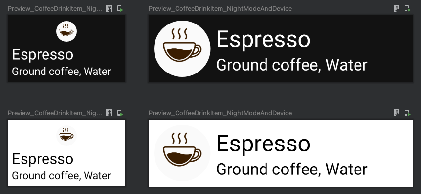
The main problem of this approach is that uiMode allows us to choose if we want a dark or light theme, and we cannot configure a custom theme. If we want to configure it, we need to use the next approach.
Combining custom ColorProvider and ScreenOrientationProvider providers
This approach is much more generic because we will combine multiple providers.
Let's take a look at the MaterialTheme composable function, which is usually used to set the theme of the application.
fun MaterialTheme(
    colors: Colors = MaterialTheme.colors,
    typography: Typography = MaterialTheme.typography,
    shapes: Shapes = MaterialTheme.shapes,
    content: @Composable () -> Unit
)
The first parameter returns the Colors type. So, we need to create a PreviewParameterProvider<Colors>.
class ColorProvider : PreviewParameterProvider<Colors> {
    override val values: Sequence<Colors>
        get() = sequenceOf(DarkColorPalette, LightColorPalette)
}
The ColorProvider returns only two Colors objects, but we can easily extend the amount.
The next step is to create a ScreenOrientationProvider class which returns the PreviewParameterProvider<Int>.
class ScreenOrientationProvider : PreviewParameterProvider<Int> {
    override val values: Sequence<Int>
        get() = sequenceOf(
              Configuration.ORIENTATION_LANDSCAPE,
              Configuration.ORIENTATION_PORTRAIT
          )
}
After, we can combine these providers using a custom PairCombinedPreviewParameter.
open class PairCombinedPreviewParameter<T1, T2>(
    private val provider: Pair<PreviewParameterProvider<T1>, PreviewParameterProvider<T2>>
) : PreviewParameterProvider<Pair<T1, T2>> {
    override val values: Sequence<Pair<T1, T2>>
        get() = provider.first.values.flatMap { first ->
            provider.second.values.map { second ->
                first to second
            }
        }
}

class ScreenOrientationToColorProvider : PairCombinedPreviewParameter<Int, Colors>(
    ScreenOrientationProvider() to ColorProvider()
)
The last step is to add the preview function.
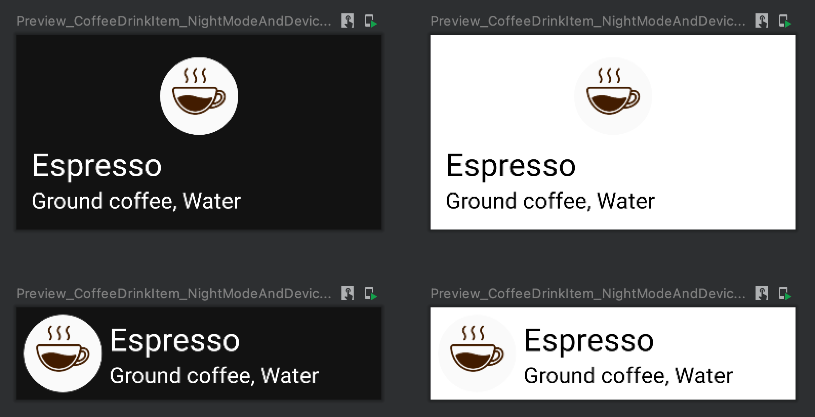
@Preview(group = "CoffeeDrinkItem-NightModeAndDevice-Provider")
@Composable
fun Preview_CoffeeDrinkItem_NightModeAndDevice_Provider(
    @PreviewParameter(ScreenOrientationToColorProvider::class) orientationToColor: Pair<Int, Colors>
) {
    val configuration = Configuration().apply { orientation = orientationToColor.first }
    CompositionLocalProvider(LocalConfiguration provides Configuration(configuration)) {
        MaterialTheme(orientationToColor.second) {
            CoffeeDrinkItem2(
                title = "Espresso",
                ingredients = "Ground coffee, Water",
                icon = R.drawable.espresso_small
            )
        }
    }
}
Preview for layout direction, themes and orientation
Let's create a preview that will display render the @Composable function for the following cases:
- portrait orientation & light theme & LTR
- portrait orientation & light theme & RTL
- landscape orientation & light theme & LTR
- landscape orientation & light theme & RTL
- portrait orientation & dark theme & LTR
- portrait orientation & dark theme & RTL
- landscape orientation & dark theme & LTR
- landscape orientation & dark theme & RTL
This article has already explored all these cases in isolation and combination with each other.
Let's take a look at the PairCombinedPreviewParameter class, which we used in preview examples:
open class PairCombinedPreviewParameter<T1, T2>(
    private val provider: Pair<PreviewParameterProvider<T1>, PreviewParameterProvider<T2>>
) : PreviewParameterProvider<Pair<T1, T2>> {
    override val values: Sequence<Pair<T1, T2>>
        get() = provider.first.values.flatMap { first ->
            provider.second.values.map { second ->
                first to second
            }
        }
}
Here, we use the Pair of providers, which is ok when we have two providers, but is not enough when we have three providers, which we will use in this case. We will use the Triple instead of the Pair.
private open class TripleCombinedPreviewParameter<T1, T2, T3>(
    private val provider: Triple<PreviewParameterProvider<T1>, PreviewParameterProvider<T2>, PreviewParameterProvider<T3>>
) : PreviewParameterProvider<Triple<T1, T2, T3>> {
    override val values: Sequence<Triple<T1, T2, T3>>
        get() = provider.first.values.flatMap { first ->
            provider.second.values.flatMap { second ->
                provider.third.values.map { third ->
                    Triple(first, second, third)
                }
            }
        }
}
The next step is to create providers for screen orientation, colors, and layout directions.
class ScreenOrientationColorsAndLayoutDirectionsProvider : TripleCombinedPreviewParameter<Int, Colors, LayoutDirection>(
    Triple(
        ScreenOrientationProvider(),
        ColorProvider(),
        LayoutDirectionProvider()
    )
)
The final step is to create a preview function.
@Preview
@Composable
fun Demo_ScreenOrientationAndColorsAndLayoutDirections(@PreviewParameter(ScreenOrientationColorsAndLayoutDirectionsProvider::class) config: Triple<Int, Colors, LayoutDirection>
) {
    val configuration = Configuration().apply { orientation = config.first }
    CompositionLocalProvider(LocalConfiguration provides Configuration(configuration)) {
        CompositionLocalProvider(LocalLayoutDirection provides config.third) {
            MaterialTheme(colors = config.second) {
                DemoComponent(
                    title = "Espresso",
                    ingredients = "Ground coffee, Water",
                    icon = R.drawable.espresso_small
                )
            }
        }
    }
}
Screenshot testing of @Preview functions
The previews can be helpful during the development of UI components or screens. In addition to it, we can use them for verification specific test cases, which is pretty often covered with screenshot tests:
- How UI component looks with light and dark themes
- How UI component looks with RTL and LTR
- And more
We can use the Showkase library for making screenshot tests for @Preview annotations. You can find details about integrating the "Showkase" library here.
I highly recommend defining an approach of using screenshot tests for @Preview functions because maybe we don't want to create such test cases for all previews.
If you already use one of the screenshot testing frameworks, such as Shot, you'll probably want to continue to use it for all cases and not use another approach for preview functions.
Summary
Jetpack has a powerful mechanism of creating previews for @Composable functions, which can be extended with custom PreviewParameterProvider.
The @Preview annotation has many parameters for changing locale, fontScale, uiMode, etc.
In this article, we've covered many use cases that can enhance the preview functions, including a preview for dark mode, RTL, landscape screen orientation, etc.
The PreviewParameterProvider interface allows us to cover many more cases bypassing providers' data to our composable functions and using different CompositionLocalProvider for layout directions, screen orientations, etc.
The @Preview annotation is not a replacement for UI and screenshot tests. We can integrate screenshot testing with preview functions and cover many cases or create screenshot tests independently of our previews.
Do not hesitate to ping me on Twitter if you have any questions.

