Introduction
You can find many applications that arrange content in a grid. This is a popular way to represent data for apps like image galleries, media apps, spreadsheet apps, etc.
There are two common approaches for displaying grids on the screen:
- Scrollable horizontal grid (spreadsheet apps)
- Non-scrollable horizontal grid (media galleries)
This article will explore how we can arrange content in a grid that can have both of these displays.
This article is a part of Jetpack Compose series:
The content of this article is based on the 1.0.2 version of Jetpack Compose.
We will create the following demos in this article:
We can build grids in Jetpack Compose using two approaches:
- The
LazyVerticalGridcomposable function - The dynamic grids using
RowandColumnlayouts
The "LazyVerticalGrid"
Overview
The LazyVerticalGrid composable function allows us to create a lazy grid layout.
This function is marked as experimental in the Jetpack Compose 1.0.2 release.
@Composable
fun LazyVerticalGrid(
    cells: GridCells,
    modifier: Modifier = Modifier,
    state: LazyListState = rememberLazyListState(),
    contentPadding: PaddingValues = PaddingValues(0.dp),
    content: LazyGridScope.() -> Unit
) { ... }
The grid can be created based on the cells: GridCells parameter. Let's take a look at the GridCells sealed class. It has two options:
- The
Fixed(val count: Int)builds a grid using the amount of a column. - The
Adaptive(val minSize: Dp)builds a grid that uses a column's minimum size.
The last parameter of the LazyVerticalGrid composable function is the content: LazyGridScope.() -> Unit, and it has a LazyGridScope type as a receiver in lambda. This means that we can use the following functions to add content to the grid:
itemadds an itemitemsadds multiple itemsitemsIndexedadds multiple items where the content of an item is aware of its index
Let's try to build a few grid examples with both of the GridCells options.
The "GridCells.Fixed" option
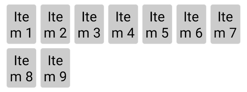
To build a grid with three columns, we can use the GridCells.Fixed(3) value for the cells parameter.
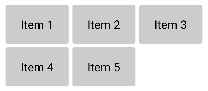
val data = listOf("Item 1", "Item 2", "Item 3", "Item 4", "Item 5")

LazyVerticalGrid(
    cells = GridCells.Fixed(3),
    contentPadding = PaddingValues(8.dp)
) {
    items(data) { item ->
        Card(
            modifier = Modifier.padding(4.dp),
            backgroundColor = Color.LightGray
        ) {
            Text(
                text = item,
                fontSize = 24.sp,
                textAlign = TextAlign.Center,
                modifier = Modifier.padding(24.dp)
            )
        }
    }
}
The "GridCells.Adaptive" option
We can use the GridCells.Adaprive with the minSize: Dp parameter to build a grid with an adaptive column number.
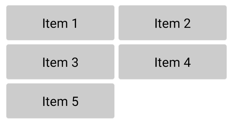
val data = listOf("Item 1", "Item 2", "Item 3", "Item 4", "Item 5")

LazyVerticalGrid(
    cells = GridCells.Adaptive(160.dp),
    contentPadding = PaddingValues(8.dp)
) {
    items(data) { item ->
        Card(
            modifier = Modifier.padding(4.dp),
            backgroundColor = Color.LightGray
        ) {
            Text(
                text = item,
                fontSize = 24.sp,
                textAlign = TextAlign.Center,
                modifier = Modifier.padding(16.dp)
            )
        }
    }
}
Example: Emoji Gallery
Let's build the emoji gallery using the LazyVerticalGrid composable function with three columns. To render a grid with three columns, we can use the GridCells.Fixed(3) value for the cells parameter.

val data = listOf("☕️", "🙂", "🥛", "🎉", "📐", "🎯", "🧩", "😄", "🥑")

LazyVerticalGrid(
    cells = GridCells.Fixed(3),
    contentPadding = PaddingValues(8.dp)
) {
    items(data) { item ->
        Card(
            modifier = Modifier.padding(4.dp),
            backgroundColor = Color(
                red = Random.nextInt(0, 255),
                green = Random.nextInt(0, 255),
                blue = Random.nextInt(0, 255)
            )
        ) {
            Text(
                text = item,
                fontSize = 42.sp,
                textAlign = TextAlign.Center,
                modifier = Modifier.padding(24.dp)
            )
        }
    }
}
Limitations of the "LazyVerticalGrid"
The LazyVerticalGrid composable function provides an easy way to create non-scrollable horizontal grids. If you want to build something like an image gallery or any other component with a few columns that are displayed on the screen without horizontal scrolling, this function is a great choice. However, if you want to create a grid that can be scrolled horizontally, this component is not suitable.
The dynamic grids using "Row" and "Column" layouts
Overview
The other approach for building grids in Jetpack Compose is to use the Row/LazyRow and Column/LazyColumn composable functions. One of the benefits of this approach is that such grids can be scrollable horizontally and vertically.
You can read about layouts in Jetpack Compose here.
The main difference between the
RowandLazyRowfunctions is that theLazyRowcreates a horizontally scrollable list of content.The
LazyRowandLazyColumnallow us to use the following functions to add content to it:
itemadds an itemitemsadds multiple itemsitemsIndexedadds multiple items where the content of an item is aware of its index
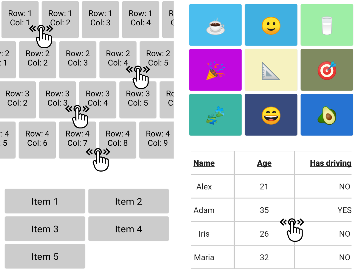
Example: Horizontally scrollable grid with independent rows
To build a grid that allows us to independently scroll through rows horizontally, we can use the Row and Column layouts. Such layouts are often used in music players together with a section name before each row.
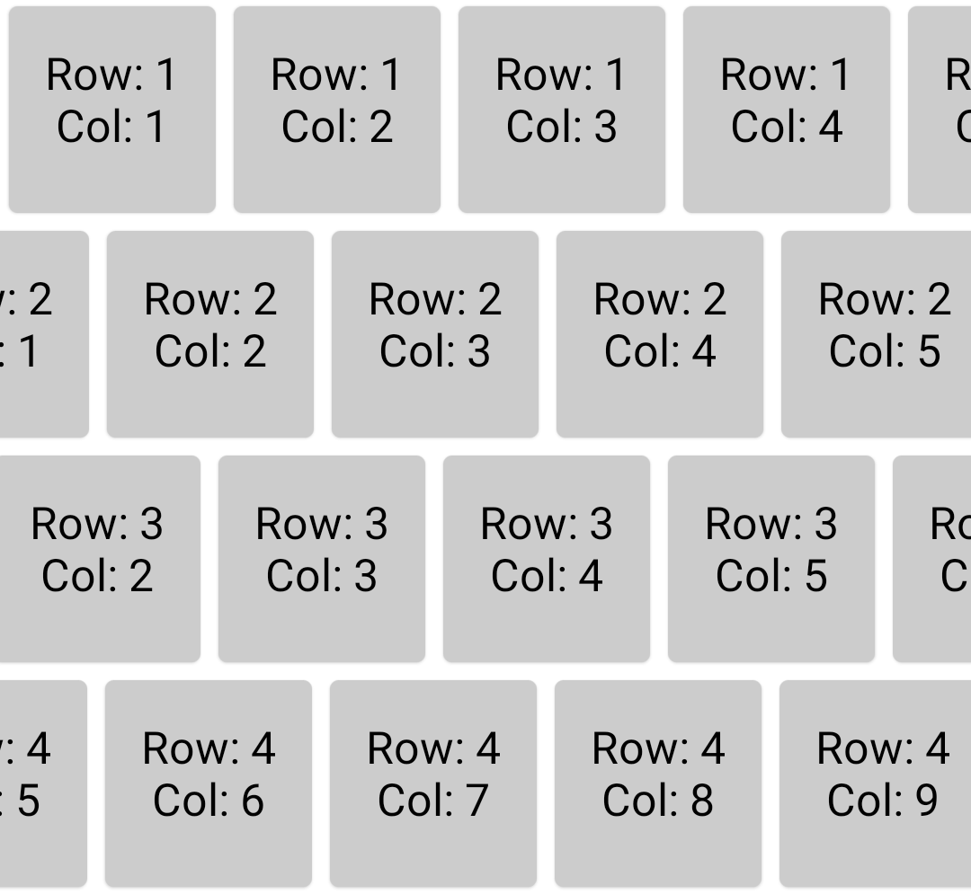
val list = (1..10).map { it.toString() }

LazyColumn {
    itemsIndexed((1..5).map { it.toString() }) { _, row ->
        LazyRow {
            itemsIndexed(list) { _, column ->

                Card(
                    backgroundColor = Color.LightGray,
                    modifier = Modifier
                        .size(100.dp)
                        .padding(4.dp)
                ) {
                    Text(
                        text = "Row: $row\nCol: $column",
                        fontSize = 20.sp,
                        textAlign = TextAlign.Center,
                        modifier = Modifier.padding(16.dp)
                    )
                }
            }
        }
    }
}
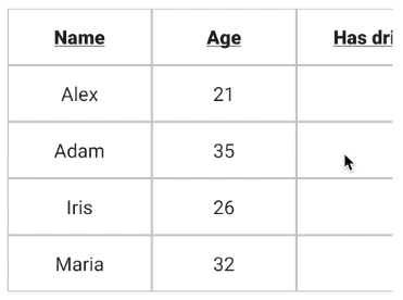
Example: Table
Let's build a table where we can scroll horizontally across the whole table instead of specific rows.
I propose to create a Table composable function with the following signature of the functions:
/**
 * The horizontally scrollable table with header and content.
 *
 * @param columnCount the count of columns in the table
 * @param cellWidth the width of the column can be configured based on an index of the column
 * @param data the data to populate a table
 * @param modifier the modifier to apply to this layout node
 * @param headerCellContent a block that describes the header cell content
 * @param cellContent a block that describes the cell content
 */
@Composable
fun <T> Table(
    columnCount: Int,
    cellWidth: (index: Int) -> Dp,
    data: List<T>,
    modifier: Modifier = Modifier,
    headerCellContent: @Composable (index: Int) -> Unit,
    cellContent: @Composable (index: Int, item: T) -> Unit,
)
/**
 * The horizontally scrollable table with header and content.
 * @param columnCount the count of columns in the table
 * @param cellWidth the width of column, can be configured based on index of the column.
 * @param data the data to populate table.
 * @param modifier the modifier to apply to this layout node.
 * @param headerCellContent a block which describes the header cell content.
 * @param cellContent a block which describes the cell content.
 */
@Composable
fun <T> Table(
    columnCount: Int,
    cellWidth: (index: Int) -> Dp,
    data: List<T>,
    modifier: Modifier = Modifier,
    headerCellContent: @Composable (index: Int) -> Unit,
    cellContent: @Composable (index: Int, item: T) -> Unit,
) {
    Surface(
        modifier = modifier
    ) {
        LazyRow(
            modifier = Modifier.padding(16.dp)
        ) {
            items((0 until columnCount).toList()) { columnIndex ->
                Column {
                    (0..data.size).forEach { index ->
                        Surface(
                            border = BorderStroke(1.dp, Color.LightGray),
                            contentColor = Color.Transparent,
                            modifier = Modifier.width(cellWidth(columnIndex))
                        ) {
                            if (index == 0) {
                                headerCellContent(columnIndex)
                            } else {
                                cellContent(columnIndex, data[index - 1])
                            }
                        }
                    }
                }
            }
        }
    }
}

@Composable
fun Demo_Table() {
    val people = listOf(
        Person("Alex", 21, false, "alex@demo-email.com"),
        Person("Adam", 35, true, "adam@demo-email.com"),
        Person("Iris", 26, false, "iris@demo-email.com"),
        Person("Maria", 32, false, "maria@demo-email.com")
    )

    val cellWidth: (Int) -> Dp = { index ->
        when (index) {
            2 -> 250.dp
            3 -> 350.dp
            else -> 150.dp
        }
    }
    val headerCellTitle: @Composable (Int) -> Unit = { index ->
        val value = when (index) {
            0 -> "Name"
            1 -> "Age"
            2 -> "Has driving license"
            3 -> "Email"
            else -> ""
        }

        Text(
            text = value,
            fontSize = 20.sp,
            textAlign = TextAlign.Center,
            modifier = Modifier.padding(16.dp),
            maxLines = 1,
            overflow = TextOverflow.Ellipsis,
            fontWeight = FontWeight.Black,
            textDecoration = TextDecoration.Underline
        )
    }
    val cellText: @Composable (Int, Person) -> Unit = { index, item ->
        val value = when (index) {
            0 -> item.name
            1 -> item.age.toString()
            2 -> if (item.hasDrivingLicence) "YES" else "NO"
            3 -> item.email
            else -> ""
        }

        Text(
            text = value,
            fontSize = 20.sp,
            textAlign = TextAlign.Center,
            modifier = Modifier.padding(16.dp),
            maxLines = 1,
            overflow = TextOverflow.Ellipsis,
        )
    }

    Table(
        columnCount = 4,
        cellWidth = cellWidth,
        data = people,
        modifier = Modifier.verticalScroll(rememberScrollState()),
        headerCellContent = headerCellTitle,
        cellContent = cellText
    )
}
Summary
The grid layouts can be built using Jetpack Compose in multiple ways, with different options having their benefits and limitations.
The LazyVerticalGrid composable function provides options for simply building grid layouts if you don't need a horizontal scroll.
The combination of Row and Column layouts allows us to build grids that support horizontal scrolling. The Table composable function that we created in this article provides the possibility of rendering header and table data where every cell can be a composable function. It gives us many customization options for this component.
You can find the source code of all examples in this article here.
Do not hesitate to ping me on Twitter if you have any questions.


