Introduction
Many Android applications have a complex User Interface because designers invest a lot of effort into adding more features to the apps while still having a simple User Interface. As a result, applications contain custom UI components and color palettes. However, often we have a case where we have multiple places where we can find manually-configured colors and font sizes. When we want to apply a new font to the whole app, it can be time-consuming because we then have to update a lot of places.
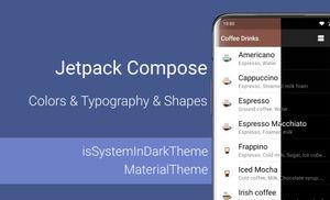
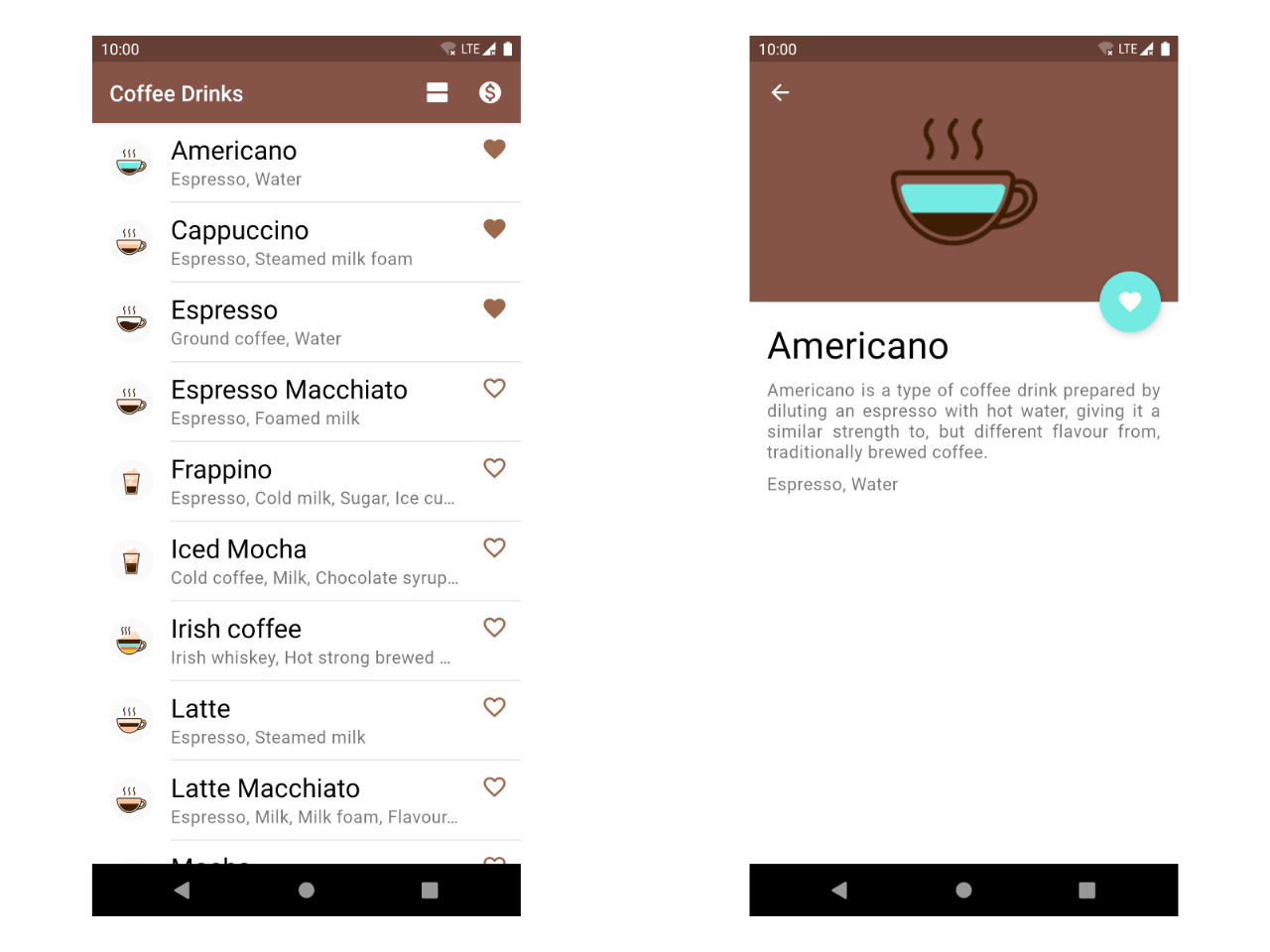
So, let's take a look at Jetpack Compose and try to solve both of these problems with this framework. I propose starting with color palettes and afterwards moving to fonts. Samples in this article will be based on an app from the "CoffeeDrinksWithJetpackCompose" repository. CoffeeDrinks is an Android application which shows a list of coffee drinks with a little bit of information about each of them.
This article is a part of Jetpack Compose series:
The content of this article is based on the 1.0.2 version of Jetpack Compose and this article was updated on 14 September 2021.
Colors
You can easily find a situation when all the colors in an application are extracted to a colors.xml file when the application build with the traditional approach (without Jetpack Compose):
<?xml version="1.0" encoding="utf-8"?>
<resources>
    <color name="colorPrimary">#855446</color>
    <color name="colorAccentPink">#F5B8C9</color>
    <color name="colorAccent">#993215</color>

    <color name="colorGray">#858585</color>
    <color name="colorBottomNavigationInactive">#3d1e04</color>
    ...
</resources>
These colors usually used in the layouts of the application:
<androidx.constraintlayout.widget.ConstraintLayout
    ...

    <androidx.appcompat.widget.Toolbar
        android:id="@+id/toolbar"
        android:layout_width="0dp"
        android:layout_height="wrap_content"
        android:background="@color/colorPrimary"
        ... />
    ...
</androidx.constraintlayout.widget.ConstraintLayout>
The main problem with this approach is that the color palette is not connected to the theme of the application, and when you want to support both Dark and Light modes, you might have a problem.
The material design proposes a list of predefined colors to use them across the application. We can split them into two groups:
- Background colors
- Primary color displayed most frequently across your app's screens and components;
- Primary Variant color is used to distinguish elements using primary colors, such as top app bar and the system bar.
- Secondary color provides more ways to accent and distinguish your product. Having a secondary color is optional, and should be applied sparingly to accent select parts of your UI;
- Secondary Variant color is used to distinguish elements using secondary colours;
- Background color appears behind scrollable content;
- Surface color uses on surfaces of components, like cards and menus;
- Error color used for indicating an error.
- Typography and icon colors
- On Primary color of text and icons displayed on top of the primary color.
- On Secondary color of text and icons displayed on top of the secondary color;
- On Background color of text and icons displayed on top of the background color;
- On Surface color of text and icons displayed on top of the surface color;
- On Error color of text and icons displayed on top of the error color.
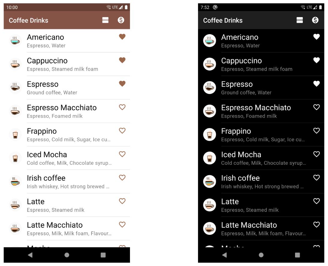
If we apply these colors to our application, we can easily support both light and dark themes. However, this is only one of the options which allows us to simplify working with color palettes.
So, let's move on to Jetpack Compose and try to improve the sample application, which uses colors inside @Composable functions. Jetpack Compose has a MaterialTheme function, and we can wrap another @Composable function, like Crossfade which can be used as navigation between different screens in the app. You can read more about the definitions of the colors in the "The color system" section of Material Design website.
MaterialTheme(
    colors = colorPalette,
    typography = appTypography
) {
    Box(modifier = Modifier.fillMaxSize()) {
        CircularProgressIndicator(
            modifier = Modifier
                .align(Alignment.Center)
                .preferredSize(36.dp)
        )
    }
}
The MaterialTheme function has parameters and allows us to customize the colors and typography of application, and shapes of the component in the hierarchy.
@Composable
fun MaterialTheme(
    colors: Colors = MaterialTheme.colors,
    typography: Typography = MaterialTheme.typography,
    shapes: Shapes = MaterialTheme.shapes,
    content: @Composable () -> Unit
)
The colors parameter allows us to provide a color palette for the application.
The typography parameter allows us to configure the typography system. You can read more about typography in the next section.
The shape parameter allows us to set a shape for componenets in the hierarchy.
So, let’s start with the object of Colors type and create light and dark palettes for the application. The Colors class has properties according to Material Design.
@Stable
class Colors(
    primary: Color,
    primaryVariant: Color,
    secondary: Color,
    secondaryVariant: Color,
    background: Color,
    surface: Color,
    error: Color,
    onPrimary: Color,
    onSecondary: Color,
    onBackground: Color,
    onSurface: Color,
    onError: Color,
    isLight: Boolean
)
In addition to the Colors class we have two additional functions which help us to create color palettes:
darkColorslightColors
The Colors class has an isLight property which is used for some @Composable functions (AppBar and Snackbar, etc.) and can be used for custom components for colors. In addition to this, the "secondary" and the "secondaryVariant" colors are the same for the dark color palette.
So, let’s create both light and dark color palettes for the application.
The dark color palette:
We can easily convert them to light and dark palettes for the Jetpack Compose framework:
val lightThemeColors = lightColors(
    primary = Color(0xFF855446),
    primaryVariant = Color(0xFF9C684B),
    secondary = Color(0xFF03DAC5),
    secondaryVariant = Color(0xFF0AC9F0),
    background = Color.White,
    surface = Color.White,
    error = Color(0xFFB00020),
    onPrimary = Color.White,
    onSecondary = Color.White,
    onBackground = Color.Black,
    onSurface = Color.Black,
    onError = Color.White
)

val darkThemeColors = darkColors(
    primary = Color(0xFF1F1F1F),
    primaryVariant = Color(0xFF3E2723),
    secondary = Color(0xFF03DAC5),
    background = Color(0xFF121212),
    surface = Color.Black,
    error = Color(0xFFCF6679),
    onPrimary = Color.White,
    onSecondary = Color.White,
    onBackground = Color.White,
    onSurface = Color.White,
    onError = Color.Black
)
We can create the Color object in many ways, but let me share the most popular ones:
- The
Color(0xFF121212)creates aColorobject from the ARGB color value. - The
Color(red = 18, green = 18, blue = 18, alpha = 255)creates theColorobject from the red, green, blue and alpha values. All parameters should be in a range between 0 and 255. - The
colorResource(id = R.color.colorAccent)load a Color from resources.
In addition to it, the Jetpack Compose already has predefined colors: Color.Gray, Color.DarkGray, etc.
Usually, the
Colors.ktfile is added when a new Jetpack Compose project is created.
The final step is to add color palettes to the MaterialTheme function and apply it to the colors of our screen. However, the MaterialTheme function has only the colors parameter, meaning we can pass light or dark color palettes. Fortunately, we can easily check the system themes as needed for our application.
MaterialTheme(colors = lightThemeColors) {
    ...
}
We can use any color from the active Colors inside @Composable function.
FloatingActionButton(
    backgroundColor = MaterialTheme.colors.secondary,
    ...
)
The ColorPalette interface allows us to configure multiple palettes, and we can use them depending on the system theme with the isSystemInDarkTheme() function. By default, some of the existing composable functions check if light or dark themes are active and use different properties for them. However, we can check it manually with the following code:
val colorPalette = if (isSystemInDarkTheme()) {
    darkThemeColors
} else {
    lightThemeColors
}

MaterialTheme(colors = colorPalette) {
    ...
}
Typography
The last step for the proper configuration of the theme is to set up the fonts of the application. Jetpack Compose has an API for working with fonts. Android devices from different vendors can have different fonts in the system by default. In this example, I want to add Roboto fonts and apply them to the application. You can download the Roboto font.
The first step is adding fonts to the project. All fonts should be added to module/src/main/res/font/.
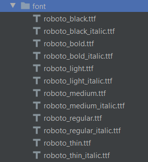
The "-" is not a valid character for the resource folder. When you download a new font, I recommend you rename them to avoid issues with fonts.
The next step is to configure the fonts for the Jetpack Compose framework. We should start by creating a FontListFontFamily object with all fonts, as well as their weights and styles. Let’s create a font family which will be used for the whole application.
private val appFontFamily = FontFamily(
    fonts = listOf(
        Font(
            resId = R.font.roboto_black,
            weight = FontWeight.W900,
            style = FontStyle.Normal
        ),
        Font(
            resId = R.font.roboto_black_italic,
            weight = FontWeight.W900,
            style = FontStyle.Italic
        ),
        Font(
            resId = R.font.roboto_bold,
            weight = FontWeight.W700,
            style = FontStyle.Normal
        ),
        ...
    )
)

private val defaultTypography = Typography()
val appTypography = Typography(
    h1 = defaultTypography.h1.copy(fontFamily = appFontFamily),
    h2 = defaultTypography.h2.copy(fontFamily = appFontFamily),
    h3 = defaultTypography.h3.copy(fontFamily = appFontFamily),
    h4 = defaultTypography.h4.copy(fontFamily = appFontFamily),
    h5 = defaultTypography.h5.copy(fontFamily = appFontFamily),
    h6 = defaultTypography.h6.copy(fontFamily = appFontFamily),
    subtitle1 = defaultTypography.subtitle1.copy(fontFamily = appFontFamily),
    subtitle2 = defaultTypography.subtitle2.copy(fontFamily = appFontFamily),
    body1 = defaultTypography.body1.copy(fontFamily = appFontFamily),
    body2 = defaultTypography.body2.copy(fontFamily = appFontFamily),
    button = defaultTypography.button.copy(fontFamily = appFontFamily),
    caption = defaultTypography.caption.copy(fontFamily = appFontFamily),
    overline = defaultTypography.overline.copy(fontFamily = appFontFamily)
)
The combination of weight and style allows us to cover all cases for the application. You can find information about the weight of each Roboto font here.
In addition to this, we should configure a Typography object with the following parameters:
- h1 is the largest headline, reserved for short and important text.
- h2 is the second-largest headline, reserved for short and important text.
- h3 is the third-largest headline, reserved for short and important text.
- h4 is the fourth-largest headline, reserved for short and important text.
- h5 is the fifth-largest headline, reserved for short and important text.
- h6 is the sixth-largest headline, reserved for short and important text.
- subtitle1 is the largest subtitle and is typically reserved for medium-emphasis text that is shorter in length.
- subtitle2 is the smallest subtitle and is typically reserved for medium-emphasis text that is shorter in length.
- body1 is the largest body and is typically reserved for a long-form text that is shorter in length.
- body2 is the smallest body and is typically reserved for a long-form text that is shorter in length.
- button is reserved for a button text.
- caption is one of the smallest font sizes it reserved for annotating imagery or introduce a headline.
- overline is one of the smallest font sizes.
I recommend checking the "Typography: Type scale" section of the material design website.
The last step is adding the Typography object to MaterialTheme function as a parameter:
MaterialTheme(typography = appTypography) {
    ...
}
Note: I recommend configuring all @Preview functions in the same way to have a correct preview.
So, let's rework the ingredients text for coffee list item.
@Composable
private fun CoffeeDrinkIngredient(ingredients: String) {
    Text(
        text = ingredients,
        modifier = Modifier.padding(end = 8.dp) +
                Modifier.drawOpacity(0.54f),
        maxLines = 1,
        overflow = TextOverflow.Ellipsis,
        style = MaterialTheme.typography.body1,
        color = MaterialTheme.colors.onSurface
    )
}
As you can see we can easily specify Text functions with the font using MaterialTheme.typography.body1. However, sometimes we need to customize font style and also make changes to the color. We can use the "copy" function to create a new font size object based on an existing one.
Text(
    style = MaterialTheme.typography.h4.copy(
            MaterialTheme.colors.onSurface
    ),
    ...
)
As you can see, we can change the configuration of the typography application and the style of the application will be changed, too.
Shapes
The last thing that we can configure with the MaterialTheme composable function is the shapes: Shapes. Jetpack Compose provides the possibility to configure different shape values in one object, which other composable functions will re-use.
Let's take a look at a Shapes class.
@Immutable
class Shapes(
    val small: CornerBasedShape = RoundedCornerShape(4.dp),
    val medium: CornerBasedShape = RoundedCornerShape(4.dp),
    val large: CornerBasedShape = RoundedCornerShape(0.dp)
)
As you can see, we have three values:
- The
smallis used by small components, likeButton,Snackbar, etc. - The
mediumis used by medium components, likeCard,AlertDialog, etc. - The
largeused by large components, likeModalDrawerorModalBottomSheetLayout.
We can apply any of these shape types to many existing components (if we want to make a button that looks different from others) or apply it to our custom component.
Let's take a look at the example of building AlertDialog.
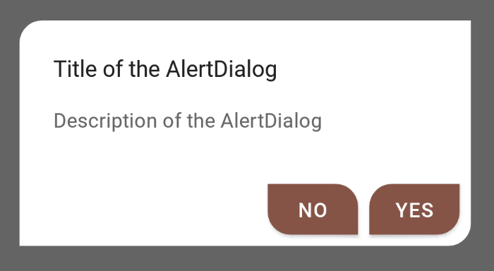
AlertDialog(
    onDismissRequest = { showDialog = false },
    title = {
       Text(text = "Title of the AlertDialog")
    },
    text = {
        Text(text = "Description of the AlertDialog")
    },
    confirmButton = {
        Button(
            onClick = { ... },
            shape = MaterialTheme.shapes.large
        ) {
            Text(text = "YES")
        }
    },
    dismissButton = {
        Button(
            onClick = { ... },
            shape = RoundedCornerShape(
                topStart = 0.dp,
                topEnd = 16.dp,
                bottomStart = 16.dp,
                bottomEnd = 0.dp
            )
        ) {
            Text(text = "NO")
        }
    },
    shape = MaterialTheme.shapes.large
)
Bonus: Opacity
We can apply different opacity levels to composable functions instead of creating a new color in our themes.
Card(
    modifier = Modifier
        .fillMaxWidth()
        .padding(16.dp)
) {
    Row(
        modifier = Modifier
            .fillMaxWidth()
            .padding(8.dp)
    ) {
        Image(
            painter = painterResource(id = R.drawable.espresso_small),
            contentDescription = "...",
            modifier = Modifier.size(60.dp)
        )

        Column {
            Text(
                text = "Super important information",
                style = MaterialTheme.typography.body1
            )

            CompositionLocalProvider(LocalContentAlpha provides ContentAlpha.medium) {
                Text(
                    text = "Less important note 1",
                    style = MaterialTheme.typography.body1
                )
            }

            CompositionLocalProvider(LocalContentAlpha provides ContentAlpha.disabled) {
                Text(
                    text = "Less important note 2",
                    style = MaterialTheme.typography.body1
                )
            }
        }
    }
}
The ContentAlpha provides predefined values with different opacity levels:
- The
highrepresent a high level of content alpha (highContrastContentAlpha = 1.0f,lowContrastContentAlpha = 0.87f)
Themediumrepresent a medium level of content alpha (highContrastContentAlpha = 0.74f,lowContrastContentAlpha = 0.60f)
Thedisabledrepresent a low level of content alpha (highContrastContentAlpha = 0.38f,lowContrastContentAlpha = 0.38f)
Summary
Jetpack Compose has a powerful mechanism for working with color palettes, shapes and fonts. We can easily configure them with Colors, Shapes and Typography objects which will be used for the MaterialTheme function to customize colors, shapes and font styles for child @Composable functions.
The Colors interface allows us to configure multiple palettes, and we can use them depending on the system theme with the isSystemInDarkTheme() function. By default, some of the existing composable functions check if light or dark themes are active and use different properties for them.
The Shapes class allows us to create three predefined shapes that @Composable functions will reuse. Many default components, like Button, Snackbar, already use the MaterialTheme.shapes.small value.
The Typography object allows us to configure fonts and font styles to set up fonts in the whole application from a single source of truth. Both the Colors interface and the Typography data class are based on Material Design guidelines and use terms described in the specification, which can simplify the designing and development processes.
Do not hesitate to ping me on Twitter if you have any questions.

