Introduction
Pull to refresh is a widespread User Interface pattern that is used to refresh data on the screen. The "Material" library for the Jetpack Compose contains the "pullRefresh" modifier and the "PullRefreshIndicator" composable function.
In this article, we will explore:
- How to add pull to refresh to the Android app with Jetpack Compose?
- How to customize the indicator for pull to refresh?
- How to trigger pull to refresh action in UI tests?
The content of this article is based on the "material" library of the "androidx.compose:compose-bom:2023.05.01". ThepullRefreshmodifier and thePullRefreshIndicatorcomposable function are still in the experimental stage.
Box(
    modifier = Modifier
        .fillMaxSize()
        .pullRefresh(pullRefreshState)
        .verticalScroll(rememberScrollState())
) { ... }
Adding the Pull to Refresh to an app
Let's start with creating a demo application which will emulate getting data from the network. For the sake of simplicity, we will add items to the list after a small delay instead of request to the server.
The next steps is to a add dependency:
dependencies {
    ...
    implementation "androidx.compose.material:material:$material_version"
    // Needed to get a view model reference in Jetpack Compose
    implementation "androidx.lifecycle:lifecycle-viewmodel-compose:$lifecycle_version"
}
The demo application shows the list of orders. So, let's start with adding the Order class:
data class Order(
    val title: String,
    val price: Double
)
After it, we can create an OrderViewModel which will provide the orders and the loading state.
data class OrderScreenState(
    val isLoading: Boolean = false,
    val orders: List<Order> = emptyList()
)

class OrderViewModel : ViewModel() {
    private val _state = mutableStateOf(OrderScreenState())
    val state: State<OrderScreenState> = _state

    init {
        loadOrders()
    }

    fun loadOrders() {
        viewModelScope.launch {
            _state.value = _state.value.copy(isLoading = true)
            delay(1_000L)
            _state.value = _state.value.copy(
                isLoading = false,
                orders = _state.value.orders.toMutableList().also {
                    it.add(
                        index = 0,
                        element = Order(
                            title = "Order #${it.size + 1}",
                            price = Random.nextDouble(10.0, 100.0)
                        )
                    )
                }
            )
        }
    }
}
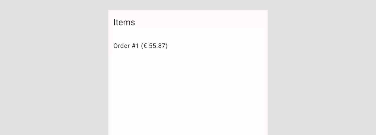
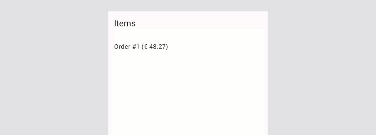
Finally, we can add the UI of the screen.
@OptIn(ExperimentalMaterial3Api::class, ExperimentalMaterialApi::class)
@Preview
@Composable
fun OrderScreen() {
    val viewModel = viewModel<OrderViewModel>()
    val state by viewModel.state
    val pullRefreshState = rememberPullRefreshState(
        refreshing = state.isLoading,
        onRefresh = viewModel::loadOrders
    )

    Scaffold(
        topBar = { TopAppBar(title = { Text("Items") }) }
    ) { padding ->
        Box(
            modifier = Modifier
                .fillMaxSize()
                .padding(padding)
                .pullRefresh(pullRefreshState)
        ) {
            LazyColumn {
                items(state.orders) {
                    ListItem(
                        headlineContent = { Text(text = "${it.title} (€ ${"%.2f".format(it.price)})" ) },
                    )
                }
            }

            PullRefreshIndicator(
                refreshing = viewModel.state.value.isLoading,
                state = pullRefreshState,
                modifier = Modifier.align(Alignment.TopCenter),
                backgroundColor = if (viewModel.state.value.isLoading) Color.Red else Color.Green,
            )
        }
    }
}
Pull to Refresh customization
We can customize the refresh threshold, background and content color of the pull to refresh indicator.
Customizing the Pull to Refresh state
Let's start with exploring customization options from the rememberPullRefreshState function, which creates the instance of the PullRefreshState class.
@Composable
@ExperimentalMaterialApi
fun rememberPullRefreshState(
    refreshing: Boolean,
    onRefresh: () -> Unit,
    refreshThreshold: Dp = PullRefreshDefaults.RefreshThreshold,
    refreshingOffset: Dp = PullRefreshDefaults.RefreshingOffset,
): PullRefreshState { ... }
The refreshThreshold allows us to define the minimum values which should be achieved to trigger the onRefresh function. By default, this value to set to 80.dp (val RefreshThreshold = 80.dp).
The refreshingOffset allows us to define the offset for rendering the pull to refresh indicator. By default, this value to set to 56.dp (val RefreshingOffset = 56.dp).
Customizing the Pull to Refresh indicator
We can customize the background and content colors of the pull to refresh indicator with the backgroundColor and the contentColor parameters. If we want to combine the backgroundColor (or contentColor) with the refreshing state, we can have different colors for the refreshing and non-refreshing states of the indicator.
...
PullRefreshIndicator(
    refreshing = isLoading,
    state = pullRefreshState,
    modifier = Modifier.align(Alignment.TopCenter),
    backgroundColor = if (isLoading) Color.Red else Color.Green,
)
...
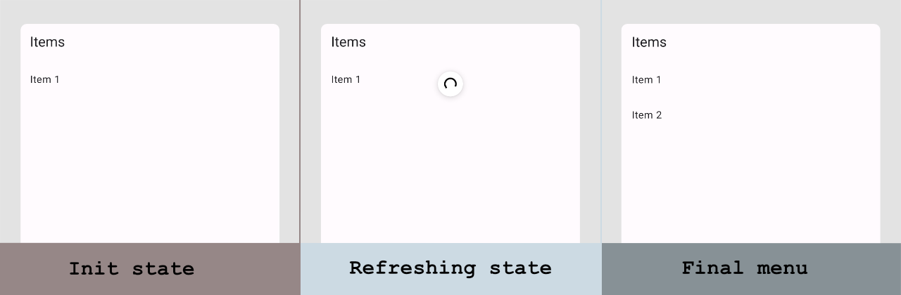
Testing Pull to Refresh state
Let's explore how to trigger update content use pull to refresh.
We will test a screen that shows "Item 1" by default, and "Item 1" and "Item 2" after a pull to refresh action.
Here is the source code of the screen:
@OptIn(ExperimentalMaterial3Api::class, ExperimentalMaterialApi::class)
@Composable
private fun DemoPullToRefresh() {
    val coroutineScope = rememberCoroutineScope()
    val listItems = remember { mutableListOf("Item 1") }
    var isRefreshing by remember { mutableStateOf(false) }
    val pullRefreshState = rememberPullRefreshState(
        refreshing = isRefreshing,
        onRefresh = {
            isRefreshing = true
            coroutineScope.launch {
                listItems.add("Item ${listItems.size + 1}")
                isRefreshing = false
            }
        }
    )
    Scaffold(
        topBar = { TopAppBar(title = { Text("Items") }) }
    ) { padding ->
        Box(
            modifier = Modifier
                .padding(padding)
                .pullRefresh(pullRefreshState)
        ) {
            LazyColumn(Modifier.fillMaxSize()) {
                items(listItems) {
                    ListItem(headlineContent = { Text(text = it) })
                }
            }

            PullRefreshIndicator(
                refreshing = isRefreshing,
                state = pullRefreshState,
                modifier = Modifier.align(Alignment.TopCenter)
            )
        }
    }
}
To trigger pull to refresh action, we need to use the .performTouchInput { swipeDown() } action on scrollable node. We can find a scrollable node on the screen using the hasScrollToIndexAction() or hasScrollToIndexAction() semantic matcher.
Let's create a test case for the following scenario:
- Initially "Item 1" is displayed and "Item 2" is not displayed
- Trigger pull to refresh action
- Verify that "Item 2" is displayed on the screen
@Test
fun shouldDisplaySecondItemAfterPullToRefresh() {
    composeTestRule.apply {
        setContent {
            DemoPullToRefresh()
        }

        onNodeWithText("Item 1")
            .assertIsDisplayed()

        onNodeWithText("Item 2")
            .assertDoesNotExist()

        onNode(hasScrollToIndexAction())
            .performTouchInput { swipeDown() }

        onNodeWithText("Item 2")
            .assertIsDisplayed()
    }
}
Conclusion
The "Material" library for Jetpack Compose provides the pullRefresh modifier and the PullRefreshIndicator component. They allow us to implement the pull to refresh UI patter in a screen which is built with Jetpack Compose.
When we want to trigger pull to refresh action in UI tests, we need to find a scrollable node and execute the swipeDown() action.

