Introduction
A Switch user interface component changes value from checked to unchecked. This component is commonly used in the settings screen, where the user can enable or disable a specific feature. For example, you can enable biometric authentication when you log in to the application.
In this article, we will explore:
- How to create and customize the
Switchcomponent in Jetpack Compose - The differences between
Switchcomponents in the "Material" and "Material 3" libraries - How to interact and verify the state of the
Switchcomponent in UI tests
The content of this article is based on the Switch component from the "Material 3" library.More information about differences between the Switch components in "Material" and "Material 3" libraries can be found here.
Creating a Switch Component
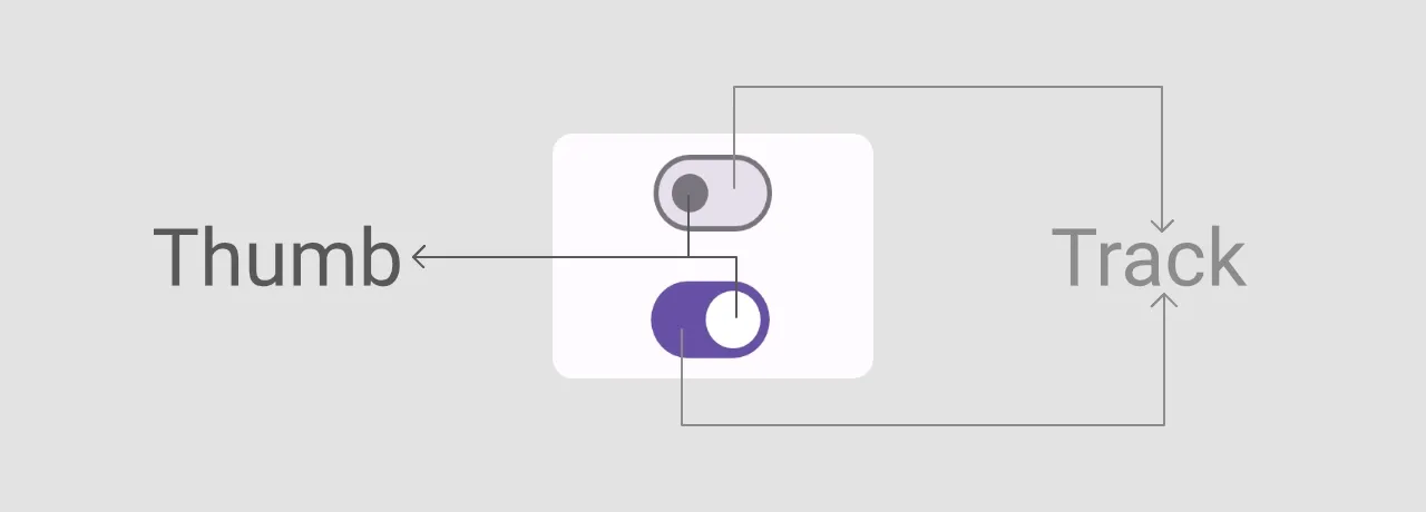
The Switch component has two parts: thumb and track. The "Material 3" implementation of this component allows us to customize both parts.
To create a base version of the Switch component, we need to provide values for the checked and onCheckedChange parameters.
@Composable
fun Demo_SwitchComponent() {
    var switchCheckedState by remember { mutableStateOf(false) }

    Box(
        modifier = Modifier.fillMaxSize(),
        contentAlignment = Alignment.Center
    ) {
        Switch(
            checked = switchCheckedState,
            onCheckedChange = { switchCheckedState = it }
        )
    }
}
We can also define if the component is enabled or disabled with the enabled: Boolean parameter.
Customizing the Switch Component
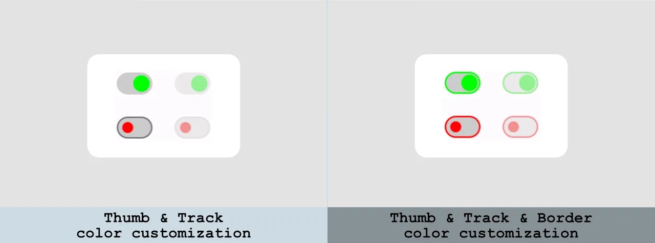
The Switch component from the "Material 3" library allows us to customize the color of the different parts of the component and the thumb content.
If you use the component from the "Material" library, you can customize only the colors of the thumb and track. More information about the differences between the Switch components in "Material" and "Material 3" libraries can be found here.
Color customization
We can customize the colors for both enabled and disabled states for the following parts of the Switch component:
- track (checked & unchecked states)
- thumb (checked & unchecked states)
- thumb icon (checked & unchecked states; Note: You need to add an icon use the
thumbContentproperty. You can find an example in the next section.) - border (checked & unchecked states)
Let's customize all these properties and take a look at the final result.
@Composable
fun Demo_SwitchComponent() {
    var switchCheckedState by remember { mutableStateOf(false) }

    Box(
        modifier = Modifier.fillMaxSize(),
        contentAlignment = Alignment.Center
    ) {
        Switch(
            checked = switchCheckedState,
            onCheckedChange = { switchCheckedState = it },
            /*
            The "checkedIconColor" and "uncheckedIconColor" excluded from this list
            because you need to set an icon first, use the "thumbContent" parameter.
            You can find an example in the next section.
             */
            colors = SwitchDefaults.colors(
                checkedThumbColor = Color.Green,
                checkedTrackColor = Color.LightGray,
                checkedBorderColor = Color.Green,
                uncheckedThumbColor = Color.Red,
                uncheckedTrackColor = Color.LightGray,
                uncheckedBorderColor = Color.Red,
                disabledCheckedThumbColor = Color.Green.copy(alpha = ContentAlpha.disabled),
                disabledCheckedTrackColor = Color.LightGray.copy(alpha = ContentAlpha.disabled),
                disabledCheckedBorderColor = Color.Green.copy(alpha = ContentAlpha.disabled),
                disabledUncheckedThumbColor = Color.Red.copy(alpha = ContentAlpha.disabled),
                disabledUncheckedTrackColor = Color.LightGray.copy(alpha = ContentAlpha.disabled),
                disabledUncheckedBorderColor = Color.Red.copy(alpha = ContentAlpha.disabled),
            )
        )
    }
}
Thumb customization
To customize the thumb, we can use the thumbContent: (@Composable () -> Unit)? = null parameter. Let's use custom icons for checked and unchecked states.
@Composable
fun Demo_SwitchComponent() {
    var switchCheckedState by remember { mutableStateOf(false) }

    Box(
        modifier = Modifier.fillMaxSize(),
        contentAlignment = Alignment.Center
    ) {
        Switch(
            checked = switchCheckedState,
            onCheckedChange = { switchCheckedState = it },
            thumbContent = {
                Icon(
                    imageVector = if (switchCheckedState) Icons.Filled.Check else Icons.Filled.Close,
                    contentDescription = null,
                    modifier = Modifier.size(SwitchDefaults.IconSize)
                )
            },
            colors = SwitchDefaults.colors(
                checkedThumbColor = Color.Green,
                checkedIconColor = Color.DarkGray,
                uncheckedThumbColor = Color.Red,
                uncheckedIconColor = Color.LightGray,
                disabledCheckedThumbColor = Color.Green.copy(alpha = ContentAlpha.disabled),
                disabledUncheckedThumbColor = Color.Red.copy(alpha = ContentAlpha.disabled),
            )
        )
    }
}
In addition to that, we can combine it with a color customization from the previous example to achieve better results.

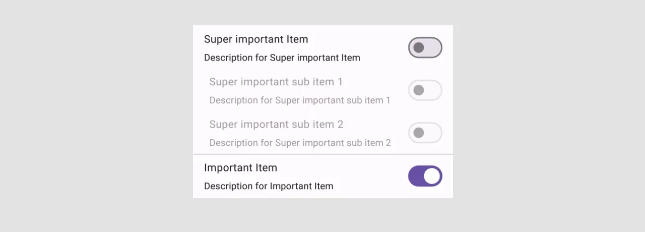
Creating a Setting Switch Item
Before exploring testing of the Switch element, let's take a look at creating a practical example for the component because the Switch element is usually used in combination with text.
Requirement:
- The state of the
Switchcomponent should be updated when the user clicks on the item, not just theSwitchelement.
Let's create a SettingSwitchItem composable function which includes a title, description, and switch component.
@Composable
private fun SettingSwitchItem(
    modifier: Modifier = Modifier,
    checked: Boolean,
    onCheckedChange: (Boolean) -> Unit,
    @StringRes title: Int,
    @StringRes description: Int,
    enabled: Boolean = true,
) {
    Row(
        modifier = modifier
            .fillMaxWidth()
            .padding(horizontal = 16.dp, vertical = 8.dp)
            .toggleable(
                value = checked,
                enabled = enabled,
                role = Role.Switch,
                onValueChange = onCheckedChange
            ),
        verticalAlignment = Alignment.CenterVertically
    ) {
        Column(
            modifier = Modifier.weight(1.0f),
            verticalArrangement = Arrangement.spacedBy(8.dp)
        ) {
            val contentAlpha = if (enabled) ContentAlpha.high else ContentAlpha.disabled

            Text(
                text = stringResource(id = title),
                style = MaterialTheme.typography.bodyLarge,
                maxLines = 1,
                modifier = Modifier.alpha(contentAlpha)
            )
            Text(
                text = stringResource(id = description),
                style = MaterialTheme.typography.bodyMedium,
                modifier = Modifier.alpha(contentAlpha)
            )
        }

        Switch(
            checked = checked,
            onCheckedChange = null,
            enabled = enabled
        )
    }
}
Let's take a look at an important aspect of this function:
- The
toggleablemodifier makes the entire row toggleable, solving the problem when a user should click only on a switch component. In addition to that, an accessibility service used this to describe the element.
We will explore how to test the settings screen in the "Testing the Settings Screen" section.
The Switch component in "Material" and "Material 3" libraries
There are a few differences between the Switch components from "Material" and "Material 3" libraries:
- The implementation from the "Material" library is still in the experimental phase, but the component from the "Material 3" version is already stable.
- The
Switchcomponent from the "Material 3" version allows us to customize the thumb. - The component from the "Material 3" library provides more customization options for colors. We can change the border color and the colors of checked and unchecked icons.
Testing the Switch component
We explored how to create and customize the Switch component. Now, let's take a look at how to interact with and verify such components in UI tests.
In this section, you will find answers to the following questions:
- How to find a
Switchelement in UI tests? - How to interact with this component?
- How to verify the state of the component?
In the "Testing the Settings Screen" section, we will explore how to test a screen with switch items.
Find an element
When we explore the screen with a "Layout Inspector," we can find that every Switch component has a similar value for the role properly equal to a Role.Switch.
Accessibility services might use roles to describe the element or do customizations. Let's take a look at all roles:
@Immutable
@kotlin.jvm.JvmInline
value class Role private constructor(@Suppress("unused") private val value: Int) {
    companion object {
        val Button = Role(0)
        val Checkbox = Role(1)
        val Switch = Role(2)
        val RadioButton = Role(3)
        val Tab = Role(4)
        val Image = Role(5)
        val DropdownList = Role(6)
    }

    override fun toString() = when (this) {
        Button -> "Button"
        Checkbox -> "Checkbox"
        Switch -> "Switch"
        RadioButton -> "RadioButton"
        Tab -> "Tab"
        Image -> "Image"
        DropdownList -> "DropdownList"
        else -> "Unknown"
    }
}
To find component(s) with a specific Role, we can use the expectValue semantic matcher.
The expectValue matcher allows us to find element(s) with a specific SemanticsPropertyKey and value. In our case, we need to use the onAllNodes(expectValue(SemanticsProperties.Role, Role.Switch)) to find all Switch elements on the screen.
When we apply thetoggleablemodifier to the container which has theSwitchcomponent inside, likeRow, it will find the container instead of theSwitch. An example of applying atoggleablemodifier can be found here.
When we find all elements, we can interact with a specific element by index, like onAllNodes(...)[0], but it impairs readability. Usually, any Switch component relates to a specific text. So, we can create an extension function for the SemanticsNodeInteractionsProvider interface, which helps us find a component based on a specific role: Role and @StringRes text: Int.
private fun SemanticsNodeInteractionsProvider.onNodeWithRoleAndText(
    role: Role,
    text: String
) = onNode(
    SemanticsMatcher.expectValue(SemanticsProperties.Role, role)
        .and(hasText(text))
)
This will be helpful for testing the settings screen. We will explore this in one of the following sections.
When you apply the toggleable modifier to the container, remember that all Text components will be merged into the one node. To find a specific node which has all items, we need to pass all strings. Let's create a function which will find the SettingSwitchItem which we created in the "Creating a Setting Switch Item" section.
private fun SemanticsNodeInteractionsProvider.onSettingSwitchItem(
    title: String,
    description: String
) = onNode(
    SemanticsMatcher.expectValue(SemanticsProperties.Role, Role.Switch)
        .and(hasText(title, substring = true))
        .and(hasText(description, substring = true))
)
Interaction with a component
We can interact with a Switch component using the performClick action.
onNode(expectValue(SemanticsProperties.Role, Role.Switch))
    .performClick()
Verifying the state of component
The final step is to verify the state of the Switch component. We can do it with the following functions:
- The
assertIsDisplayedverifies the node exists. - The
assertIsEnabled/assertIsNotEnabledverifies the node is enabled/disabled. - The
assertIsOn/assertIsOffverifies the node is checked or unchecked. - The
assertIsToggleableverifies the node is toggleable. - The
assertDoesNotExistverifies the node does not exist.
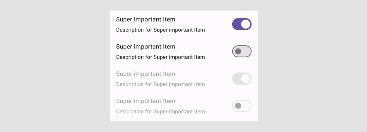
Testing the Settings Screen
Let's take a look at the "Settings" screen.
Implementation of the settings screen:
@ExperimentalMaterial3Api
@Preview
@Composable
fun SettingsScreen() {
    var item1EnabledState by remember { mutableStateOf(false) }
    var item1SubItem1EnabledState by remember { mutableStateOf(false) }
    var item1SubItem2EnabledState by remember { mutableStateOf(false) }
    var item2EnabledState by remember { mutableStateOf(false) }

    Scaffold(
        topBar = {
            TopAppBar(title =  { Text(text = "Settings") })
        }
    ) { paddingValues ->
        Column(
            modifier = Modifier
                .fillMaxWidth()
                .padding(paddingValues)
        ) {
            SettingSwitchItem(
                title = R.string.demoSwitchSettings_super_important_item_title,
                description = R.string.demoSwitchSettings_super_important_item_description,
                checked = item1EnabledState,
                onCheckedChange = { newState ->
                    item1SubItem1EnabledState = false
                    item1SubItem2EnabledState = false
                    item1EnabledState = newState
                }
            )

            SettingSwitchItem(
                title = R.string.demoSwitchSettings_super_important_subitem1_title,
                description = R.string.demoSwitchSettings_super_important_subitem1_description,
                checked = item1SubItem1EnabledState,
                onCheckedChange = { item1SubItem1EnabledState = it },
                enabled = item1EnabledState,
                modifier = Modifier.padding(start = 8.dp)
            )

            SettingSwitchItem(
                title = R.string.demoSwitchSettings_super_important_subitem2_title,
                description = R.string.demoSwitchSettings_super_important_subitem2_description,
                checked = item1SubItem2EnabledState,
                onCheckedChange = { item1SubItem2EnabledState = it },
                enabled = item1EnabledState,
                modifier = Modifier.padding(start = 8.dp)
            )

            Divider()

            SettingSwitchItem(
                title = R.string.demoSwitchSettings_important_item_title,
                description = R.string.demoSwitchSettings_important_item_description,
                checked = item2EnabledState,
                onCheckedChange = { item2EnabledState = it },
            )
        }
    }
}
The next step is to implement UI tests for this screen. Let's create two of them:
- Verify that "Item 2" and "Item 3" are disabled when "Item 1" is unchecked (unchecked by default).
- Verify that "Item 2" and "Item 3" are enabled when "Item 1" is checked (unchecked by default).
We will use the createAndroidComposeRule<T> function to have access to app resources. You can read more about getting access to string resources in UI tests in the "Get String resources in Jetpack Compose Tests" article.
class SwitchTest {

    @get:Rule
    val composeTestRule = createAndroidComposeRule<ComponentActivity>()

        @Test
    fun shouldSubItemsBeDisabled_whenParentItemIsUnchecked() {
        composeTestRule.apply {
            setContent { SettingsScreen() }

            onSettingSwitchItem(
                composeTestRule.activity.getString(R.string.demoSwitchSettings_super_important_item_title),
                composeTestRule.activity.getString(R.string.demoSwitchSettings_super_important_item_description),
            ).assertIsOff()

            onSettingSwitchItem(
                composeTestRule.activity.getString(R.string.demoSwitchSettings_super_important_subitem1_title),
                composeTestRule.activity.getString(R.string.demoSwitchSettings_super_important_subitem1_description),
            ).assertIsNotEnabled()

            onSettingSwitchItem(
                composeTestRule.activity.getString(R.string.demoSwitchSettings_super_important_subitem2_title),
                composeTestRule.activity.getString(R.string.demoSwitchSettings_super_important_subitem2_description),
            ).assertIsNotEnabled()
        }
    }

    @Test
    fun shouldSubItemsBeEnabled_whenParentItemIsChecked() {
        composeTestRule.apply {
            setContent { SettingsScreen() }

            onSettingSwitchItem(
                composeTestRule.activity.getString(R.string.demoSwitchSettings_super_important_item_title),
                composeTestRule.activity.getString(R.string.demoSwitchSettings_super_important_item_description),
            ).performClick()

            onSettingSwitchItem(
                composeTestRule.activity.getString(R.string.demoSwitchSettings_super_important_subitem1_title),
                composeTestRule.activity.getString(R.string.demoSwitchSettings_super_important_subitem1_description),
            ).assertIsEnabled()

            onSettingSwitchItem(
                composeTestRule.activity.getString(R.string.demoSwitchSettings_super_important_subitem2_title),
                composeTestRule.activity.getString(R.string.demoSwitchSettings_super_important_subitem2_description),
            ).assertIsEnabled()
        }
    }
}

private fun SemanticsNodeInteractionsProvider.onSettingSwitchItem(
    title: String,
    description: String
) = onNode(
    SemanticsMatcher.expectValue(SemanticsProperties.Role, Role.Switch)
        .and(hasText(title, substring = true))
        .and(hasText(description, substring = true))
)
Conclusion
The Switch UI element allows users to change between checked and unchecked states. We can change the thumb of the Switch component if we use the components from the "Material 3" library.
In addition to this, we can modify colors of components both for components from the "Material" and "Material 3" libraries, but component from the "Material 3" libraries provide more customization options.
Every Switch component uses the predefined role (Role.Switch) which simplifies UI testing as we can find elements based on this role.

