Introduction
Divider is a widespread component used to separate content.
In this article, we will explore:
- What is the difference between dividers in the "Material 2" and "Material 3" libraries?
- How to use horizontal and vertical dividers in Jetpack Compose?
- How to customize dividers from the "Material 3" library?
- How to create a custom divider?
Jetpack Compose Divider
Let’s start by exploring the differences between dividers from the "Material 2" and "Material 3" libraries.
The Divider component from the "Material 2" library uses the Box container to display a divider on the screen.
Here is the source code of the Divider component from the "Material 2" library.
@Composable
fun Divider(
    modifier: Modifier = Modifier,
    color: Color = MaterialTheme.colors.onSurface.copy(alpha = DividerAlpha),
    thickness: Dp = 1.dp,
    startIndent: Dp = 0.dp
) {
    ...
    Box(
        modifier.then(indentMod)
            .fillMaxWidth()
            .height(targetThickness)
            .background(color = color)
    )
}
The HorizontalDivider and VerticalDivider components from the "Material 3" library draw a line on a Canvas.
@Composable
fun VerticalDivider(
    modifier: Modifier = Modifier,
    thickness: Dp = DividerDefaults.Thickness,
    color: Color = DividerDefaults.color,
) = Canvas(modifier.fillMaxHeight().width(thickness)) {
    drawLine(
        color = color,
        strokeWidth = thickness.toPx(),
        start = Offset(thickness.toPx() / 2, 0f),
        end = Offset(thickness.toPx() / 2, size.height),
    )
}
All the following examples will be based on the "Material 3" implementation.
Both horizontal and vertical dividers have the modifier, thickness, and color parameters. By default, they have the following values:
thickness:1.dpcolor:MaterialTheme.colorScheme.outlineVariant
Horizontal Divider
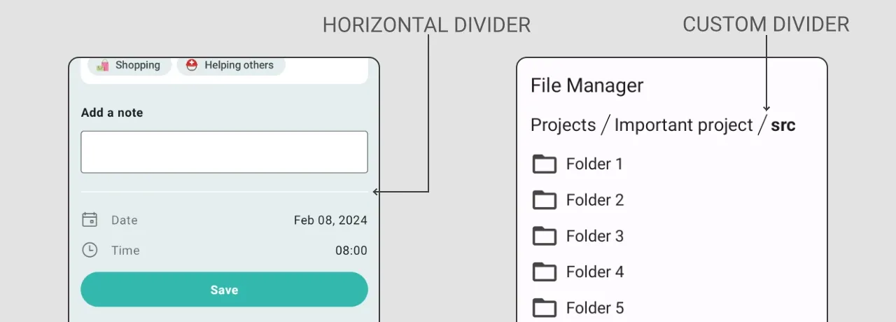
The HorizontalDivider represents a thin horizontal line that splits different elements. By default, it uses all available width.

@Composable
fun Demo_HorizontalDivider() {
    Column(
        modifier = Modifier.padding(16.dp),
        verticalArrangement = Arrangement.spacedBy(8.dp)
    ) {
        Text("Item 1", fontSize = 18.sp)
        HorizontalDivider()
        Text("Item 2", fontSize = 18.sp)
    }
}
Vertical Divider
The VerticalDivider represents a thin vertical line that splits different elements. By default, it uses all available height, which is why we need to specify the height of the Row container. I recommend using .height(IntrinsicSize.Min) because it will properly render all children inside the Row using the minimum possible height.
The VerticalDivider doesn’t add any space before and after the divider.

@Composable
fun Demo_VerticalDivider() {
    Row(
        modifier = Modifier.padding(16.dp)
            .height(IntrinsicSize.Min)
    ) {
        Text("Item 1", fontSize = 18.sp)
        VerticalDivider(
            modifier = Modifier.padding(horizontal = 16.dp),
            thickness = 1.dp,
            color = Color.DarkGray
        )
        Text("Item 2", fontSize = 18.sp)
    }
}
Customizing the Divider
Both HorizontalDivider and VerticalDivider have relatively limited customization options, as they have only the following parameters:
modifier: Modifierthickness: Dpcolor: Color
If we want to change the size of a divider or add padding, we need to use the modifier: Modifier parameter for it.
Adjusting Divider Colors
To set a color, we need to pass it via a parameter. We can use the Jetpack Compose Color type or pass a color from the colors.xml file using colorResource(id = R.color.myColor).
@Composable
fun Demo_HorizontalDivider() {
    Column(
        modifier = Modifier.padding(16.dp),
        verticalArrangement = Arrangement.spacedBy(8.dp)
    ) {
        Text("Item 1", fontSize = 18.sp)
        HorizontalDivider(color = Color.DarkGray)
        Text("Item 2", fontSize = 18.sp)
    }
}

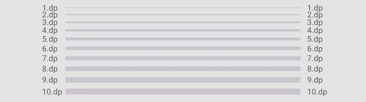
Changing Divider Thickness
To specify the thickness of the horizontal and vertical dividers, we need to pass the value for the thickness: Dp parameter.
@Composable
fun Demo_HorizontalDivider_thickness() {
    Column(
        modifier = Modifier.fillMaxWidth(),
        verticalArrangement = Arrangement.spacedBy(10.dp)
    ) {
        for (thicknessValue in 1..10) {
            HorizontalDivider(
                thickness = thicknessValue.dp
            )
        }
    }
}
Creating a Custom Divider
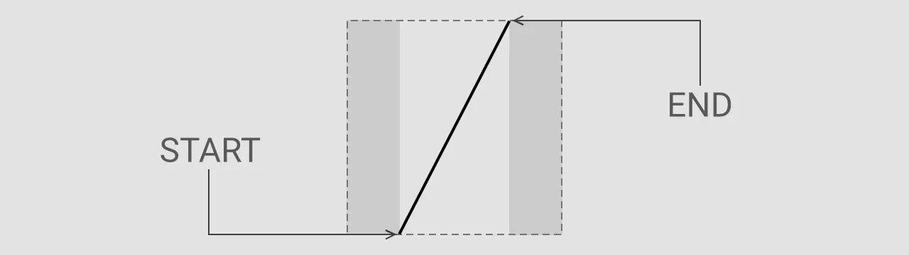
Of course, the HorizontalDivider and VerticalDivider don’t cover all use cases. To create a custom divider, we can adopt a similar approach by drawing on a canvas to suit the specific needs of our application.
Let’s imagine we want to build a file manager application and we need to create a divider component that will separate segments of the path to the file.
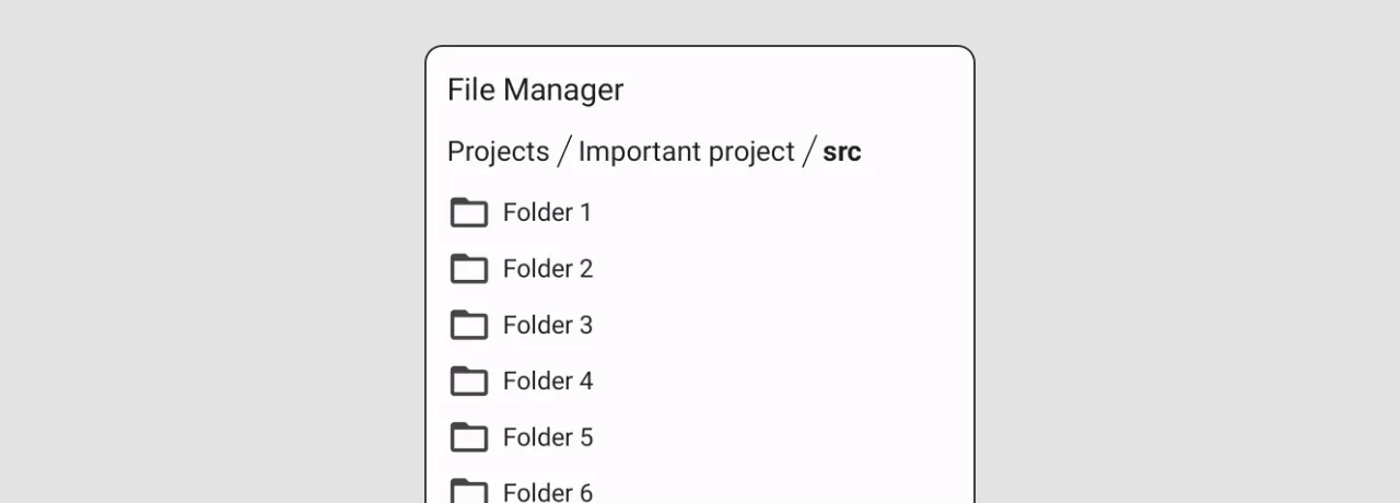
So, let’s create a custom divider that helps us implement a UI similar to what we see above.
@Composable
fun SegmentPathDivider(
    modifier: Modifier = Modifier,
    width: Dp = 20.dp,
    thickness: Dp = DividerDefaults.Thickness,
    color: Color = DividerDefaults.color,
) = Canvas(modifier.fillMaxHeight().width(width)) {
    ...
}
Drawing a diagonal line requires more width than a vertical line, so we need to consider the width parameter. In our case, we will draw a line between 25% and 75% of the width. (By default, the VerticalDivider doesn’t add any additional space before and after the divider.)
@Composable
fun SegmentPathDivider(
    modifier: Modifier = Modifier,
    width: Dp = 20.dp,
    thickness: Dp = DividerDefaults.Thickness,
    color: Color = DividerDefaults.color,
) = Canvas(
    modifier
        .fillMaxHeight()
        .width(width)) {
    drawLine(
        color = color,
        strokeWidth = thickness.toPx(),
        start = Offset(thickness.toPx() / 2 + width.toPx() * 0.25f, size.height),
        end = Offset(thickness.toPx() / 2 + width.toPx() * 0.75f, 0f)
    )
}
The final step is to apply the SegmentPathDivider in the user interface of our application.
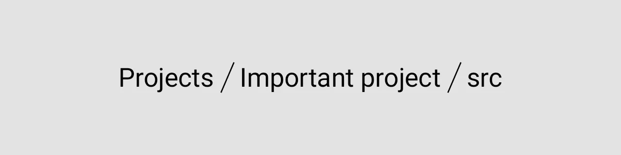
@Composable
fun Demo_SegmentPathDivider() {
    val pathSegments = listOf("Projects", "Important project", "src")
    Row(
        modifier = Modifier
            .padding(16.dp)
            .height(IntrinsicSize.Min)
    ) {
        pathSegments.forEachIndexed { index, segment ->
            Text(text = segment, fontSize = 20.sp)
            if (index < pathSegments.size - 1) {
                SegmentPathDivider(color = Color.Black)
            }
        }
    }
}
Conclusion
As you can see, the HorizontalDivider and VerticalDivider from the "Material 3" library are easy to use, but they are relatively limited in customizations.
Under the hood, this is just a Canvas with a drawn line. So, we can easily create a custom divider and reuse it in many places of our application.

