Introduction
Many mobile applications ask a user to provide data, and RadioButton is one of the components that help developers/designers to simplify the onboarding process and how users can fill the information.
In this article, we will explore
- the possibilities of
RadioButtoncomponents - replacing
RadioButtonwithIconToggleButtonfor replacing "RadioButton" indicator - the possibilities for testing screens with both
RadioButtonandIconToggleButtoncomponents.
This article is a part of Jetpack Compose series:
- Jetpack Compose: Preview
- Jetpack Compose: Layouts
- Jetpack Compose: Theme and Typography
- Jetpack Compose: style Text
- Jetpack Compose: Building Grids
The content of this article is based on the 1.1.1 version of Jetpack Compose.
Overview of RadioButton
I want to start with an overview of the RadioButton composable function along with a description and examples.
If you are already familiar with it, feel free to skip this section and move to the next one.
The RadioButton component can be used for creating a single item (selection indicator with label), or multiple items in a group.
Let's explore the signature of the RadioButton composable function.
@Composable
fun RadioButton(
    selected: Boolean,
    onClick: (() -> Unit)?,
    modifier: Modifier = Modifier,
    enabled: Boolean = true,
    interactionSource: MutableInteractionSource = remember { MutableInteractionSource() },
    colors: RadioButtonColors = RadioButtonDefaults.colors()
)
The "selected" parameter represents the state of the component. The "enabled" parameter indicates if RadioButton is enabled, and we can interact with this component. The "interactionSource" parameter represents the stream of interactions for the RadioButton. The "colors" parameter allows us to configure colors for the different states of the RadioButton components. We will explore the styling of an element in one of the following sections.
The RadioButton doesn't include a label.
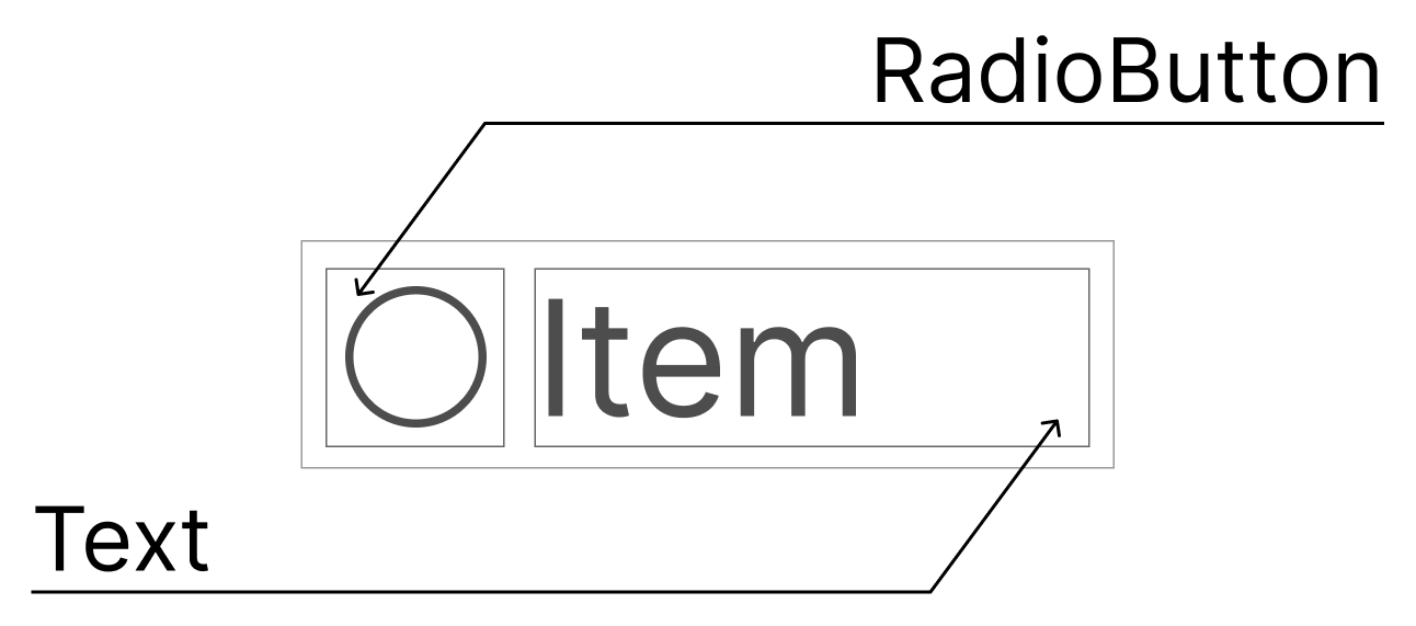
To build a simple RadioButton with a label we can use the following code.

@Preview
@Composable
fun Preview_SingleRadioButton() {
    val selectedValue = remember { mutableStateOf("") }
    val label = "Item"
    Row(
        verticalAlignment = Alignment.CenterVertically
    ) {
        RadioButton(
            selected = selectedValue.value == label,
            onClick = { selectedValue.value = label }
        )
        Text(
            text = label,
            modifier = Modifier.fillMaxWidth()
        )
    }
}
The code above has a problem with selectable components because only the RadioButton component is selectable. We can add a selectable modifier to the Row component to fix this issue.
Let's explore the signature of the selectable modifier.
fun Modifier.selectable(
    selected: Boolean,
    enabled: Boolean = true,
    role: Role? = null,
    onClick: () -> Unit
)
The selected parameter represents the state of the component. The enabled parameter indicates if a selectable area is enabled and we can interact with it. The role parameter represents the type of UI component. Accessibility service used this to describe the element. We have the following roles: Button, Checkbox, Switch, RadioButton, Tab and Image.
@Preview
@Composable
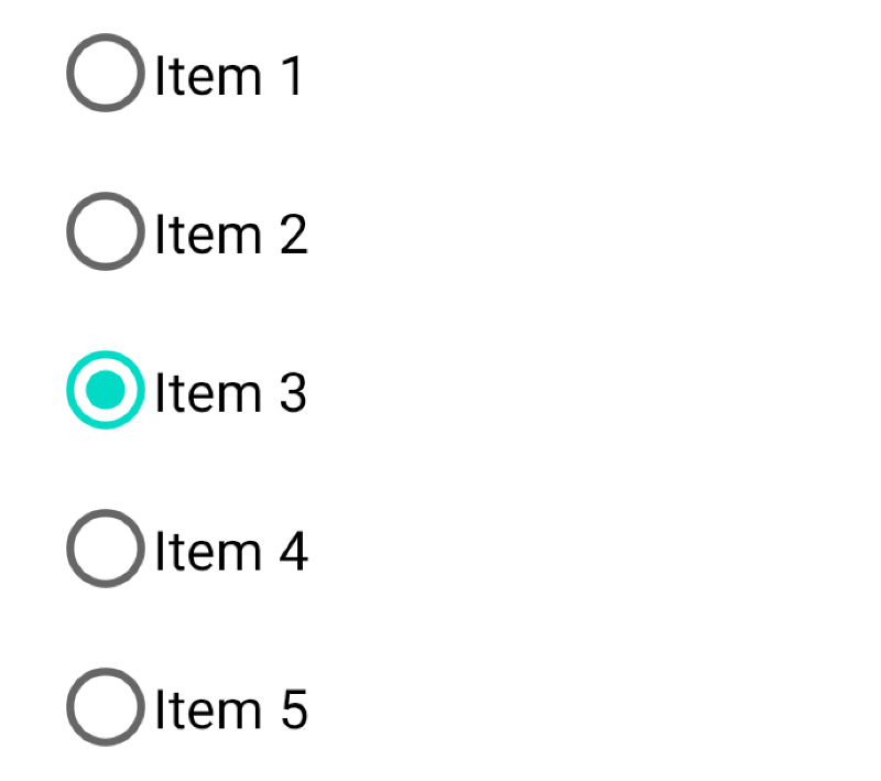
fun Preview_MultipleRadioButtons() {
val selectedValue = remember { mutableStateOf("") }
val isSelectedItem: (String) -> Boolean = { selectedValue.value == it }
val onChangeState: (String) -> Unit = { selectedValue.value = it }
val items = listOf("Item 1", "Item 2", "Item 3", "Item 4", "Item 5")
Column(Modifier.padding(8.dp)) {
Text(text = "Selected value: ${selectedValue.value.ifEmpty { "NONE" }}")
items.forEach { item ->
Row(
verticalAlignment = Alignment.CenterVertically,
modifier = Modifier.selectable(
selected = isSelectedItem(item),
onClick = { onChangeState(item) },
role = Role.RadioButton
).padding(8.dp)
) {
RadioButton(
selected = isSelectedItem(item),
onClick = null
)
Text(
text = item,
modifier = Modifier.fillMaxWidth()
)
}
}
}
}
When we use theonClick = { ... }parameter in theselectablemodifier we can use theonClick = nullin theRadioButtoncomponent.
Styling
There are not many possibilities for customization of RadioButton components. We will explore how to use different colors for states of the RadioButton and how to use different indicators for selected/unselected states (in this case, we will use the IconToggleButton component).
Color customization
We change colors of the RadioButton states:
- selected
- unselected
- disabled
The RadioButtonColors interface allows us to change the "selected" and "unselected" colors of the RadioButton component. However, if we will use the RadioButtonDefaults object, we can change "selected", "unselected", and "disabled" colors.
The RadioButtonDefaults has the colors() function that returns a State<Color> based on the state of the RadioButton. We can see it in the implementation of the DefaultRadioButtonColors class.
@Stable
private class DefaultRadioButtonColors(
    private val selectedColor: Color,
    private val unselectedColor: Color,
    private val disabledColor: Color
) : RadioButtonColors {
    @Composable
     override fun radioColor(enabled: Boolean, selected: Boolean): State<Color> {
        val target = when {
            !enabled -> disabledColor
            !selected -> unselectedColor
            else -> selectedColor
        }

        // If not enabled 'snap' to the disabled state, as there should be no animations between
        // enabled / disabled.
        return if (enabled) {
            animateColorAsState(target, tween(durationMillis = RadioAnimationDuration))
        } else {
            rememberUpdatedState(target)
        }
    }
}
Let's use custom colors for the RadioButton elements.
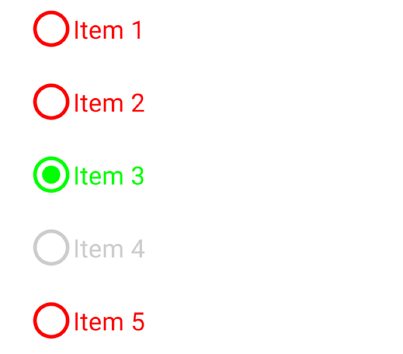
@Preview
@Composable
fun Preview_MultipleRadioButtonsWithCustomColors() {
    val selectedValue = remember { mutableStateOf("") }
    val textToEnableList = listOf(
        "Item 1" to true,
        "Item 2" to true,
        "Item 3" to true,
        "Item 4" to false,
        "Item 5" to true
    )

    val isSelectedItem: (String) -> Boolean = { selectedValue.value == it }
    val onChangeState: (String) -> Unit = { selectedValue.value = it }

    Column(Modifier.padding(8.dp)) {
        Text(text = "Selected value: ${selectedValue.value.ifEmpty { "NONE" }}")
        textToEnableList.forEach { textToEnableState ->
            Row(
                verticalAlignment = Alignment.CenterVertically,
                modifier = Modifier.selectable(
                    selected = isSelectedItem(textToEnableState.first),
                    enabled = textToEnableState.second,
                    onClick = { onChangeState(textToEnableState.first) }
                ).padding(8.dp)
            ) {
                RadioButton(
                    selected = isSelectedItem(textToEnableState.first),
                    onClick = null,
                    colors = RadioButtonDefaults.colors(
                        selectedColor = Color.Green,
                        unselectedColor = Color.Red,
                        disabledColor = Color.LightGray
                    ),
                    enabled = textToEnableState.second
                )
                Text(
                    text = textToEnableState.first,
                    color = when {
                        isSelectedItem(textToEnableState.first) -> Color.Green
                        !textToEnableState.second -> Color.LightGray
                        else -> Color.Red
                    }
                )
            }
        }
    }
}
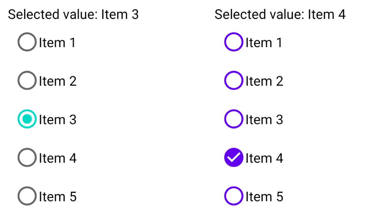
Custom indicator for selection state
Sometimes we want to use a custom indicator instead of the default one for RadioButton in our application. Let's imagine we want to customize our screen and have a result as we have on the image below.
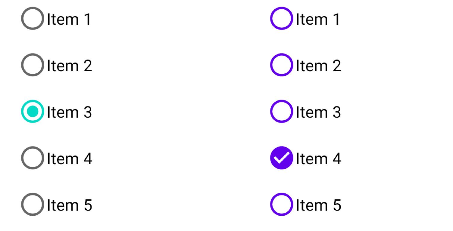
Unfortunately, we cannot build it with the RadioButton component, but we can use IconToggleButton instead.
@Preview
@Composable
fun Preview_CustomRadioButtonIndicator_WithIconToggleButton() {
    MaterialTheme {
        val selectedValue = remember { mutableStateOf("") }
        val items = listOf("Item 1", "Item 2", "Item 3", "Item 4", "Item 5")
        Column(Modifier.padding(8.dp)) {
            Text(text = "Selected value: ${selectedValue.value.ifEmpty { "NONE" }}")
            items.forEach { item ->
                Row(
                    verticalAlignment = Alignment.CenterVertically,
                    modifier = Modifier.selectable(
                        selected = (selectedValue.value == item),
                        onClick = { selectedValue.value = item },
                        role = Role.RadioButton
                    ).padding(8.dp)
                ) {
                    IconToggleButton(
                        checked = selectedValue.value == item,
                        onCheckedChange = { selectedValue.value = item },
                        modifier = Modifier.size(24.dp)
                    ) {
                        Icon(
                            painter = painterResource(
                                if (selectedValue.value == item) {
                                    R.drawable.ic_circle_checked
                                } else {
                                    R.drawable.ic_circle_outline
                                }
                            ),
                            contentDescription = null,
                            tint = MaterialTheme.colors.primary
                        )
                    }
                    Text(
                        text = item,
                        modifier = Modifier.fillMaxWidth()
                    )
                }
            }
        }
    }
}
When we use therole = Role.RadioButtonparameter in theselectablemodifier we can use thecontentDescription = nullin theIconToggleButtoncomponent and accessibility reader will readRowas aRadioButtoncomponent.
Testing
Let's talk about testing RadioButton and IconToggleButton components. Let's explore different possibilities related to UI testing of these components.
Every verification of UI component can contain a few steps (not all of them are needed):
- find an element
- interact with an element
- verify the state of the element
Let's look at possibilities that can be done for every step with pros and cons. We create a test cases for the screen with the question and multiple answers that use RadioButton/IconToggleButton components.
Find an element
When we analyze every selectable component of the screen above, we should remember that it has two components: RadioButton and Text. If both are placed in a container, like Row we can add the testTag modifier or use the role property in the selectable modifier to find/interact/verify the component.
Let's compare both of these options.
The "testTag" modifier
The testTag modifier allows us to find a component in tests by the testTag value. When we find an element by testTag, we can access RadioButton and Text separately. Here we have multiple options:
- Set similar value to
testTagmodifier for allRowelements
val items = listOf("Item 1", "Item 2", "Item 3", "Item 4", "Item 5")
...
Column(Modifier.padding(8.dp)) {
    items.forEach { item ->
        Row(
            verticalAlignment = Alignment.CenterVertically,
            modifier = Modifier.testTag("item")
                .selectable(
                    selected = isItemSelected(item),
                    onClick = { selectedValue.value = item },
                    role = Role.RadioButton
                )
        ) { ... }
    }
}
In this case, we need to use the onAllNodesWithTag(testTag = "...") to get all nodes with a similar tag, and later on, we can interact with a specific component by index of an element.
onAllNodesWithTag("item")[2]
    .performClick()
- Set a label to the
testTagmodifier that we use for theTextcomponent inside theRowcomponent.
val items = listOf("Item 1", "Item 2", "Item 3", "Item 4", "Item 5")
Column(Modifier.padding(8.dp)) {
    items.forEach { item ->
        Row(
            verticalAlignment = Alignment.CenterVertically,
            modifier = Modifier.testTag(item)
                .selectable(
                    selected = isItemSelected(item),
                    onClick = { selectedValue.value = item },
                    role = Role.RadioButton
                )
        ) { ... }
    }
}
In this case, we can use the onNodeWithTag(testTag = "...") and interact with this node. We should remember to always use a similar value for both the testTag modifier and the Text component inside of the Row.
The "role" property in "selectable" modifier
The selectable modifier configures the component to be selectable. It is usually used as part of a group where only one item should be selected.This modifier has the role property, which can be used by accessibility services to describe the element.
inline class Role private constructor(@Suppress("unused") private val value: Int) {
    companion object {
        val Button = Role(0)
        val Checkbox = Role(1)
        val Switch = Role(2)
        val RadioButton = Role(3)
        val Tab = Role(4)
        val Image = Role(5)
    }

    override fun toString() = when (this) {
        Button -> "Button"
        Checkbox -> "Checkbox"
        Switch -> "Switch"
        RadioButton -> "RadioButton"
        Tab -> "Tab"
        Image -> "Image"
        else -> "Unknown"
    }
}
We don't need to use the testTag modifier, and we don't need to sync values between the testTag modifier and the Text component.
Interaction with a component
We can interact with RadioButton, IconToggleButton and Row (which can include RadioButton and Text) using the performClick action.
onNodeWithText("Item 3")
    .performClick()
Verify state of element
The final step is to verify the state of the RadioButton and IconToggleButton components. We can do this with with the following SemanticsNodeInteractions:
- The
assertIsDisplayedverifies the node exists - The
assertIsEnabled/assertIsNotEnabledverifies the node is enabled/disabled - The
assertIsSelected/assertIsNotSelectedverifies the node is selected or not selected - The
assertIsSelectableverifies the node is selectable - The
assertTextContainsverifies the node contains text - The
assertTextEqualsverifies the node contains exact text - The
assertDoesNotExistverifies the node does not exist
Example
Let's take a look at how we can test both screens. One screen uses RadioButton and another uses IconToggleButton. If we use the role = Role.RadioButton property in the selectable modifier, we can test both of these screens with a similar test case.
For the sake of simplicity, we will create one test case which includes verification/action:
- The selectable item with text is selected
- Click on a selectable item
- Check which item is selected
We can create a withRole matcher to avoid code duplication, which find nodes with specific role: Role.
fun withRole(role: Role): SemanticsMatcher {
    return SemanticsMatcher("${SemanticsProperties.Role.name} contains '$role'") {
        it.config.getOrNull(SemanticsProperties.Role) == role
    }
}
We can replace the "withRole" custom matcher with the "SemanticsMatcher.expectValue(...)" function. In case of checking the "Role" semantics properties this function the usage will be next:
SemanticsMatcher.expectValue(SemanticsProperties.Role, role)
In addition, we can create an extension function for the SemanticsNodeInteractionsProvider interface, which helps us find a selectable component based on a specific role: Role and text: String.
fun SemanticsNodeInteractionsProvider.onNodeWithRoleAndText(
    role: Role,
    text: String
) = onNode(
    withRole(role)
        .and(isSelectable())
        .and(isEnabled())
        .and(hasText(text))
)
The final step is to create a test case that can test both of the following screens.
@Test
fun firstItemSelectedByDefaultUseIconToggleButton_whenThirdItemIsSelected_thenSelectedValueDisplayedCorrectly() {
    composeTestRule.apply {
        setContent { DemoScreen() }

        onNodeWithRoleAndText(Role.RadioButton, "Item 1")
            .assertIsSelected()

        onNodeWithText("Item 3")
            .performClick()

        onNodeWithRoleAndText(Role.RadioButton, "Item 3")
            .assertIsSelected()

        onNodeWithText("Selected value: Item 3")
            .assertIsDisplayed()
    }
}
You can find the full source code of test cases here.
Summary
The RadioButton composable function doesn't include a label property. Usually, we need to combine the RadioButton with the Text component. However, the RadioButton has pretty limited customization options, and if we want to change the default RadioButton indicator, we can use the IconToggleButton component.
We can have similar test cases for both the RadioButton and IconToggleButton components if we use the selectable modifier with the role = Role.RadioButton property.
When we use the selectable modifier with the role = Role.RadioButton property, we won't have problems with the accessibility because of the role value used by accessibility services.
Do not hesitate to ping me on Twitter if you have any questions.

