Introduction
Jetpack Compose provides a declarative way of building the UI of the Android app. Layouts are an essential component for creating UI, and Jetpack Compose already supports a few of them.
This article will explore available layouts in Jetpack Compose combined with modifiers, alignments, and arrangements that help to build the UI of Android apps.
This article is a part of Jetpack Compose series:
The content of this article is based on a 1.0.0-rc02 version of Jetpack Compose.
Alignment
I would like to start with Alignment and Arrangement that help us with UI elements’ arrangements.
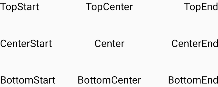
There are nine alignment options that can be applied to child UI elements:
| TopStart | TopCenter | TopEnd |
|---|---|---|
| CenterStart | Center | CenterEnd |
| BottomStart | BottomCenter | BottomEnd |
The alignment is used as one of the parameters for the "Box" layout. We will explore that in the "Layout" section.
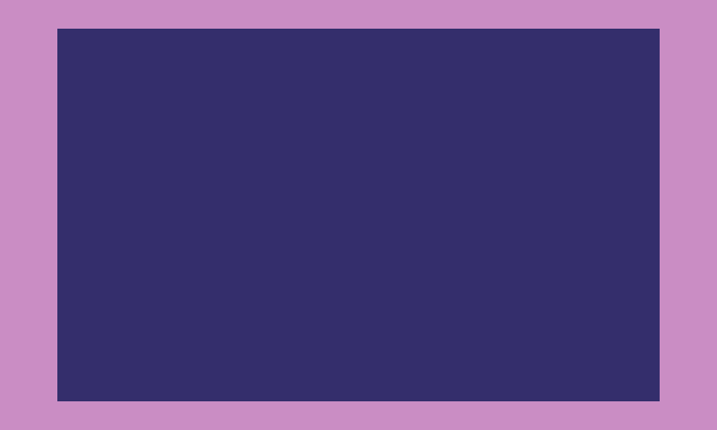
Box(
    contentAlignment = Alignment.BottomEnd,
    modifier = Modifier
        .size(height = 120.dp, width = 200.dp)
        .background(Color(0xFFCA8DC4))
) {
    Box(
        modifier = Modifier
            .padding(8.dp)
            .size(80.dp)
            .background(Color(0xFF342E6C))
    ) {
        ...
    }
}
We also have a set of constants for Alignment.Horizontal and Alignment.Vertical interfaces.
Constants for the Alignment.Horizontal interface:
- Start
- CenterHorizontally
- End
Constants for the Alignment.Vertical interface:
- Top
- CenterVertically
- Bottom
Alignment.Horizontal and Alignment.Vertical are used as a parameter for the "Column and "Row" layouts. We will explore those in the "Layout" section.
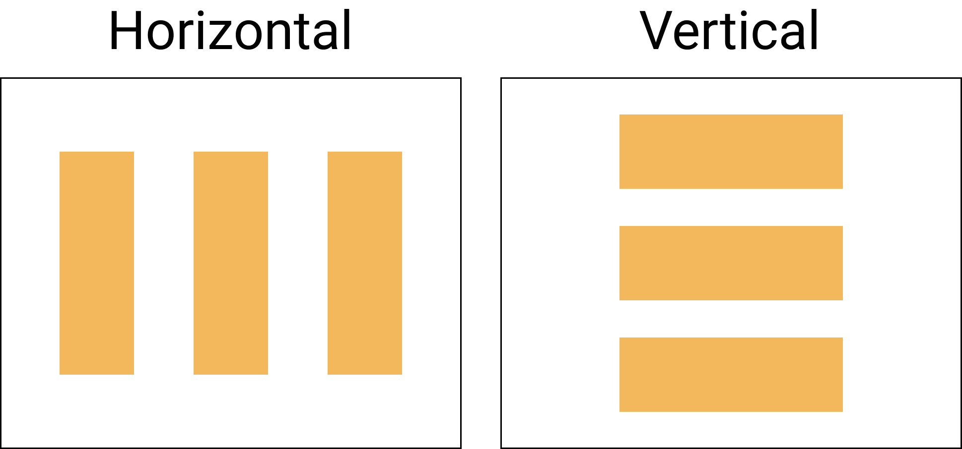
Arrangement
Arrangement is used to specify the arrangement of child elements in "Column" and "Row" layouts in the axis direction (horizontal and vertical).
We have a set of predefined values for horizontal and vertical arrangements:
- Horizontal
- Start
- End
- Center
- SpaceEvenly
- SpaceBetween
- SpaceAround
- Vertical
- Top
- Bottom
- Center
- SpaceEvenly
- SpaceBetween
- SpaceAround
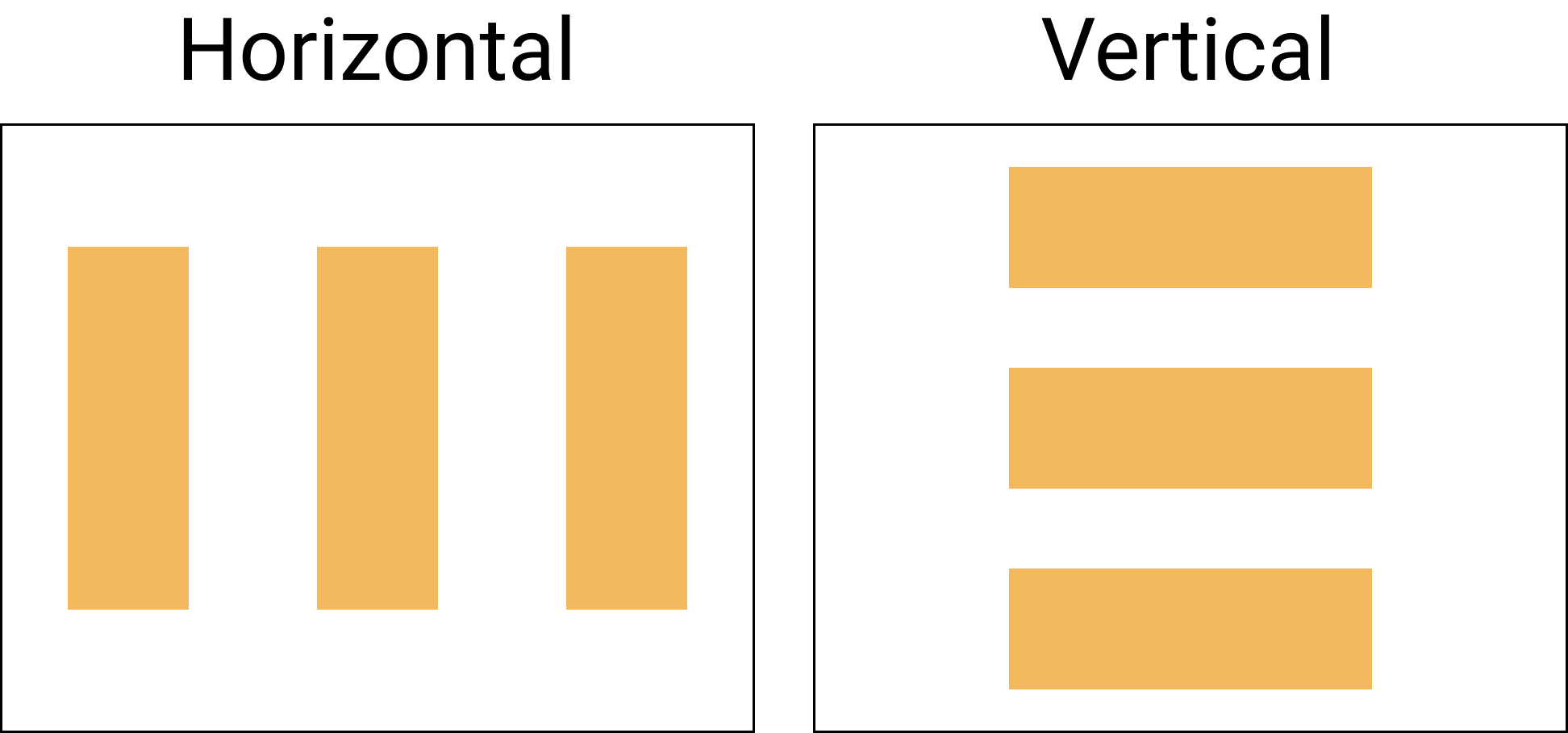
Let's take a look at a visual representation of basic arrangements like "Start", "End", "Center", "Top", and "Bottom".

We also have three arrangements that can be applied as vertical and horizontal arrangements:
- SpaceEvenly
- SpaceBetween
- SpaceAround
The SpaceEvenly arrangement places child elements across the main axis, including free space before the first and after the last child.
The SpaceBetween arrangement places child elements across the main axis without free space before first and after the last child.
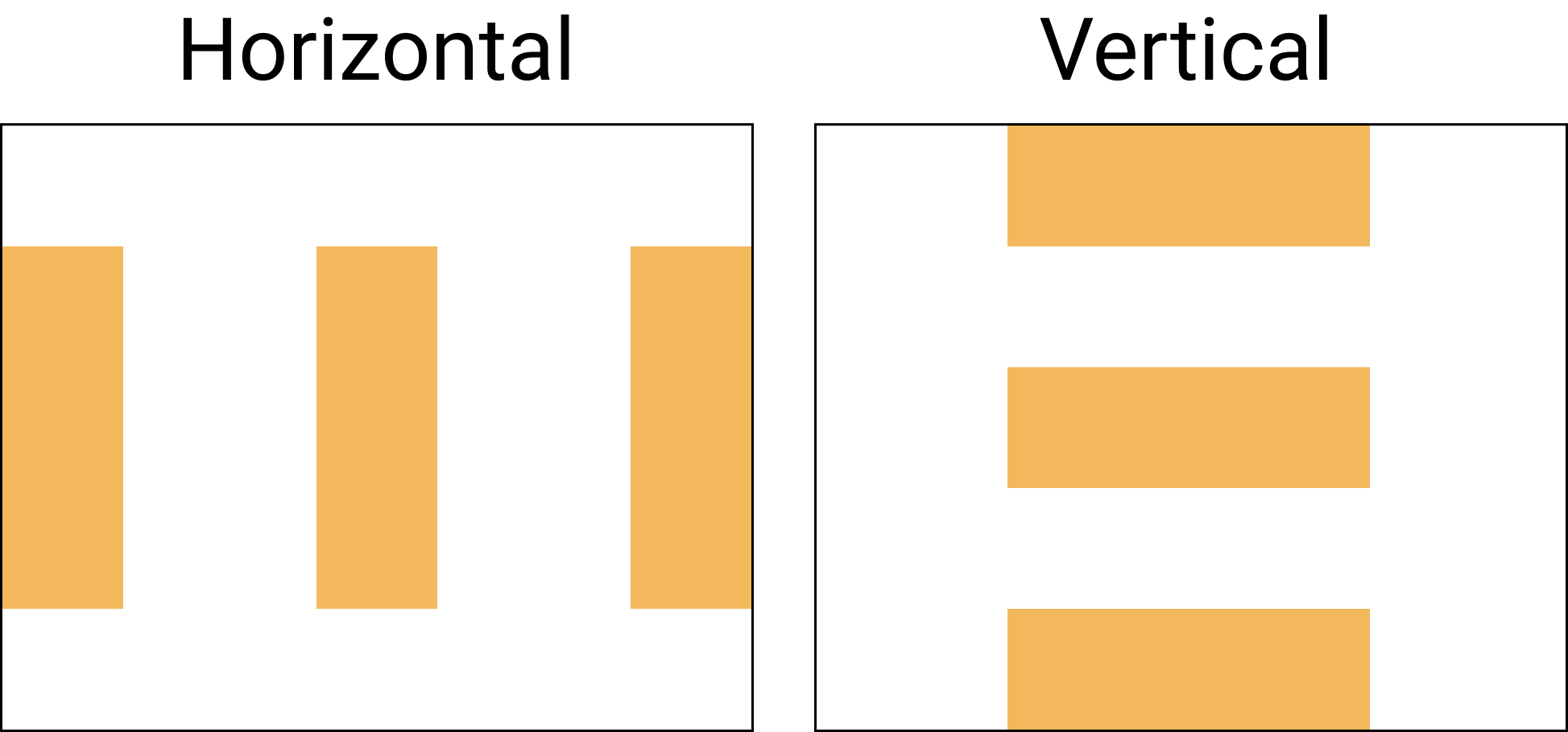
The SpaceAround arrangement places child elements across the main axis with half of the free space before the first and after the last child.
Modifiers
If you are not familiar with a modifier, you can read more in the official documentation.
The modifier is an ordered, immutable collection of modifier elements that decorate or add behavior to Compose UI elements. For example, backgrounds, padding, and click event listeners decorate or add behavior to rows, text, or buttons.
All modifiers discussed are used for the layout-related examples.
Set the content size with modifiers
The dp (density-independent pixels) is used for almost all modifiers with sizes. The dp extension function can be applied to any Int, Float, or Double value.
// Int
val height = 100.dp
// Float
val height = 90.0f.dp
// Double
val height = 100.0.dp
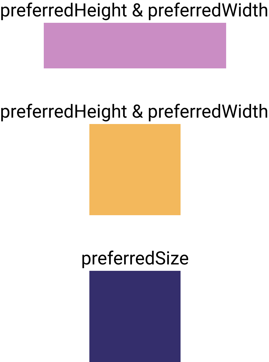
We can explicitly set the height, width, and size to the UI element using one of the following modifiers:
height(height: Dp)sets the UI element’s height to a preferred value.width(width: Dp)sets the UI element’s width to a preferred value.size(size: Dp)sets the height and width of an element to a similar size value.size(width: Dp, height: Dp)sets the height and with of an element.
We can combine multiple modifiers: modifierA().modifierB().
Let's use the height, width, and size modifiers in a few examples below.
// Example: height = 50.dp, width = 200.dp
Box(
    modifier = Modifier
        .height(50.dp)
        .width(200.dp)
        .background(Color(0xFFCA8DC4))
) {
    ...
}

// Example: height = 100.dp, width = 100.dp
Box(
    modifier = Modifier
        .height(100.dp)
        .width(100.dp)
        .background(Color(0xFF342E6C))
) {
    ...
}

// Example: size = 100.dp
Box(
    modifier = Modifier.size(100.dp)
        .background(Color.Yellow)
) {

}
Sometimes, we want to use all the available space of a container. We can do this with one of the following modifiers:
fillMaxHeight()fills the height of an element with the maximum height of a parent.fillMaxWidth()fills the width of an element with the maximum width of a parent.fillMaxSize()fills the height and width of an element with the maximum height and width of a parent.

Box(
    modifier = Modifier
        .size(height = 100.dp, width = 200.dp)
        .background(Color(0xFFCA8DC4))
) {
    Box(
        modifier = Modifier
            .height(70.dp)
            .fillMaxWidth()
            .background(Color(0xFF342E6C))
    ) {
        ...
    }
}
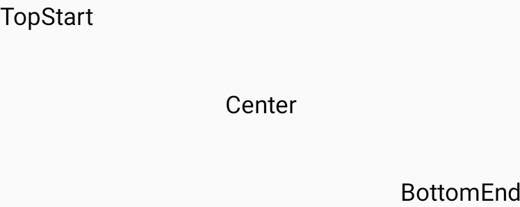
The "align" modifier
The align modifier allows us to set arrangement of children inside the Box Scope.
Box(
    modifier = Modifier.size(height = 120.dp, width = 300.dp)
) {
    Text(text = "TopStart", modifier = Modifier.align(Alignment.TopStart))
    Text(text = "TopCenter", modifier = Modifier.align(Alignment.TopCenter))
    Text(text = "TopEnd", modifier = Modifier.align(Alignment.TopEnd))

    Text(text = "CenterStart", modifier = Modifier.align(Alignment.CenterStart))
    Text(text = "Center", modifier = Modifier.align(Alignment.Center))
    Text(text = "CenterEnd", modifier = Modifier.align(Alignment.CenterEnd))

    Text(text = "BottomStart", modifier = Modifier.align(Alignment.BottomStart))
    Text(text = "BottomCenter", modifier = Modifier.align(Alignment.BottomCenter))
    Text(text = "BottomEnd", modifier = Modifier.align(Alignment.BottomEnd))
}
The "padding" modifier
The padding modifier allows us to add space around an element. We have three different options for adding a padding around an element:
padding(start: Dp = 0.dp, top: Dp = 0.dp, end: Dp = 0.dp, bottom: Dp = 0.dp)padding(horizontal: Dp = 0.dp, vertical: Dp = 0.dp)padding(all: Dp)
As you can see, different modifiers allow us to write less boilerplate code when we need to set similar padding around the elements or set the different horizontal and vertical paddings.
Box(
    modifier = Modifier
        .size(height = 120.dp, width = 200.dp)
        .background(Color(0xFFCA8DC4))
) {
    Box(
        modifier = Modifier
            .padding(horizontal = 16.dp, vertical = 8.dp)
            .fillMaxSize()
            .background(Color(0xFF342E6C))
    ) {
        ...
    }
}
Layouts
Building the UI of a modern mobile application, we need to combine multiple UI elements, and multiple available layouts help us with that.
Jetpack Compose supports the following layouts:
- Box
- Column
- Row
- ConstraintLayout
- Scaffold
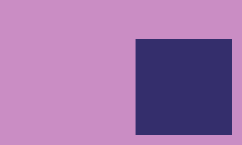
The "Box" layout
The "Box" layout stacks every child on top of each other. By default, the children will be placed at the Alignment.TopStart position.
@Composable
inline fun Box(
    modifier: Modifier = Modifier,
    contentAlignment: Alignment = Alignment.TopStart,
    propagateMinConstraints: Boolean = false,
    content: @Composable BoxScope.() -> Unit
)
Examples:
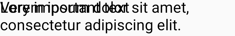
Box(
    modifier = Modifier.size(height = 120.dp, width = 300.dp)
) {
    Text(
        text = "Very important text",
        fontSize = 20.sp
    )
    Text(
        text = "Lorem ipsum dolor sit amet, consectetur adipiscing elit.",
        fontSize = 20.sp
    )
}
We can use the align modifier to set alignment for children elements.
Box(
    modifier = Modifier.size(height = 120.dp, width = 300.dp)
) {
    Text(text = "TopStart", modifier = Modifier.align(Alignment.TopStart))
    Text(text = "Center", modifier = Modifier.align(Alignment.Center))
    Text(text = "BottomEnd", modifier = Modifier.align(Alignment.BottomEnd))
}
The "Column" layout
The "Column" layout stacks children in a vertical sequence. Comparing this with available layouts in Android development, the closest one is a LinearLayout with vertical orientation. All child items will be arranged vertically at Top and aligned horizontally at Start, by default.
@Composable
inline fun Column(
    modifier: Modifier = Modifier,
    verticalArrangement: Arrangement.Vertical = Arrangement.Top,
    horizontalAlignment: Alignment.Horizontal = Alignment.Start,
    content: @Composable ColumnScope.() -> Unit
)
Examples:
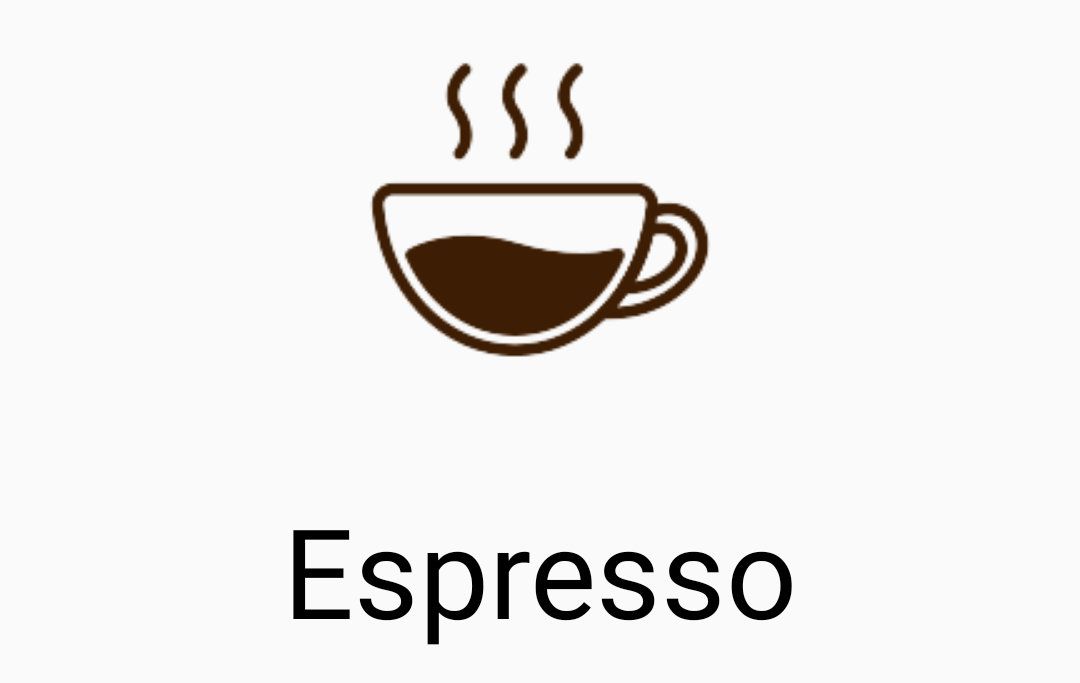
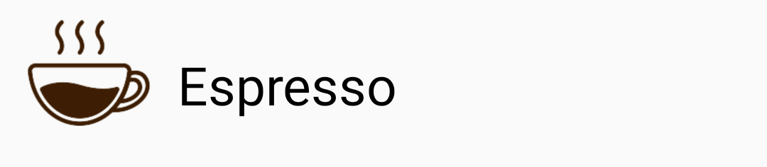
Column(
    horizontalAlignment = Alignment.CenterHorizontally,
    modifier = Modifier.fillMaxWidth()
) {
    Image(
        bitmap = ImageBitmap.imageResource(R.drawable.espresso_small),
        contentDescription = "Espresso"
    )
    Text(
        text = "Espresso",
        fontSize = 50.sp
    )
}
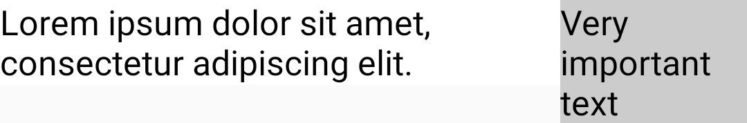
We can add different weights to children inside the "Column" layout by using the weight(weight: Float) modifier. Let's take a look at an example of when different weight can be helpful:
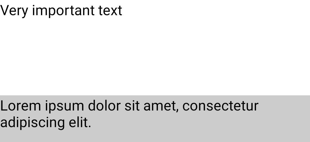
Column(modifier = Modifier.height(200.dp)){
    Text(
        text = "Very important text",
        fontSize = 20.sp,
        modifier = Modifier
            .fillMaxWidth()
            .weight(2f)
            .background(Color.White)
    )
    Text(
        text = "Lorem ipsum dolor sit amet, consectetur adipiscing elit.",
        fontSize = 20.sp,
        modifier = Modifier
            .fillMaxWidth()
            .weight(1f)
            .background(Color.LightGray)
    )
}
The "Row" layout
The "Row" layout stacks children in a horizontal sequence. Comparing it with available layouts in Android development, the closest one is a LinearLayout with a horizontal orientation. All child items will be aligned vertically at Top and arranged horizontally at Start, by default.
@Composable
inline fun Row(
    modifier: Modifier = Modifier,
    horizontalArrangement: Arrangement.Horizontal = Arrangement.Start,
    verticalAlignment: Alignment.Vertical = Alignment.Top,
    content: @Composable RowScope.() -> Unit
)
Examples:
Row(
    verticalAlignment = Alignment.CenterVertically,
    modifier = Modifier.fillMaxWidth()
) {
    Image(
        bitmap = ImageBitmap.imageResource(R.drawable.espresso_small),
        contentDescription = "Espresso",
        modifier = Modifier.size(100.dp)
    )
    Text(
        text = "Espresso",
        fontSize = 30.sp
    )
}
We can add different weights to children inside the "Column" layout using the weight(weight: Float) modifier. Let's take a look at an example of when different weight can be helpful:
Row(modifier = Modifier.height(200.dp)){
    Text(
        text = "Lorem ipsum dolor sit amet, consectetur adipiscing elit.",
        fontSize = 20.sp,
        modifier = Modifier
            .fillMaxWidth()
            .weight(3f)
            .background(Color.White)
    )
    Text(
        text = "Very important text",
        fontSize = 20.sp,
        modifier = Modifier
            .fillMaxWidth()
            .weight(1f)
            .background(Color.LightGray)
    )
}
Let's combine "Column" and "Row" layouts in one example.
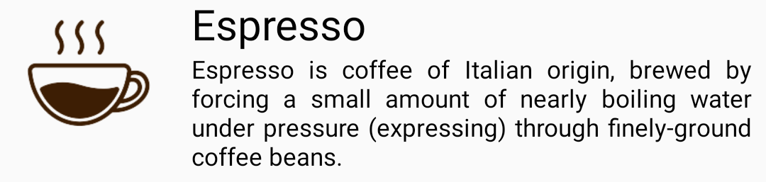
Row(
    verticalAlignment = Alignment.CenterVertically,
    modifier = Modifier.fillMaxWidth()
) {
    Image(
        bitmap = ImageBitmap.imageResource(R.drawable.espresso_small),
        contentDescription = "Espresso",
        modifier = Modifier.size(100.dp)
    )
    Column(
        modifier = Modifier.padding(horizontal = 8.dp)
    ) {
        Text(
            text = "Espresso",
            fontSize = 24.sp
        )
        Text(
            text = "Espresso is coffee of Italian origin, brewed by forcing a small amount of nearly boiling water under pressure (expressing) through finely-ground coffee beans.",
            style = TextStyle(textAlign = TextAlign.Justify)
        )
    }
}
The "ConstraintLayout" layout
The "ConstraintLayout" layout positions children according to the constraints between them. It's similar to the available "ConstraintLayout" for Android development.
@Composable
fun ConstraintLayout(
    modifier: Modifier = Modifier,
    content: @Composable ConstraintLayoutScope.() -> Unit
)
Let's try to rebuild the sample with a coffee card using "ConstraintLayout" instead of a combination of "Column" and "Row" layouts.
We can define constraints use the constrainAs modifier.
We can define constraints
ConstraintLayout(
    modifier = Modifier.fillMaxWidth()
) {
    val (logo, title, description) = createRefs()

    Image(
        bitmap = ImageBitmap.imageResource(R.drawable.espresso_small),
        contentDescription = "Espresso",
        modifier = Modifier
            .size(100.dp)
            .constrainAs(logo) {
                top.linkTo(parent.top)
            }
    )
    Text(
        text = "Espresso",
        fontSize = 24.sp,
        modifier = Modifier.constrainAs(title) {
            top.linkTo(parent.top)
            linkTo(start = logo.end, end = parent.end, startMargin = 8.dp, endMargin = 8.dp)
            width = Dimension.fillToConstraints
        }
    )
    Text(
        text = "Espresso is coffee of Italian origin, brewed by forcing a small amount of nearly boiling water under pressure (expressing) through finely-ground coffee beans.",
        style = TextStyle(textAlign = TextAlign.Justify),
        modifier = Modifier.constrainAs(description) {
            top.linkTo(title.bottom)
            linkTo(start = title.start, end = title.end)
            width = Dimension.fillToConstraints
        }
    )
}
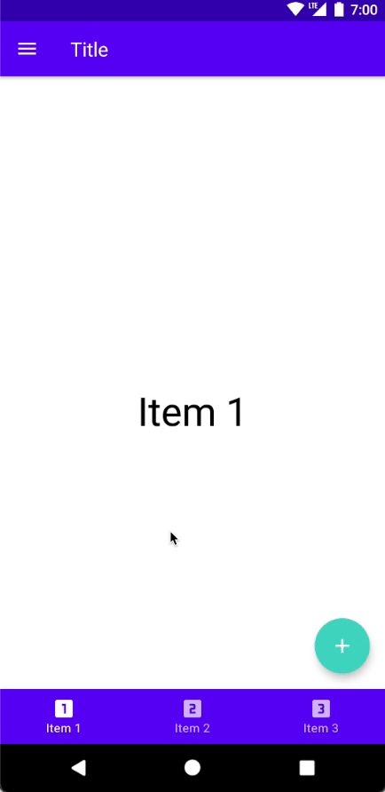
The "Scaffold" layout
The "Scaffold" layout contains a basic implementation of the material design app structure with the following components:
- TopBar
- BottomBar
- FloatingActionButton
- Drawer
@Composable
fun Scaffold(
    modifier: Modifier = Modifier,
    scaffoldState: ScaffoldState = rememberScaffoldState(),
    topBar: @Composable () -> Unit = emptyContent(),
    bottomBar: @Composable () -> Unit = emptyContent(),
    snackbarHost: @Composable (SnackbarHostState) -> Unit = { SnackbarHost(it) },
    floatingActionButton: @Composable () -> Unit = emptyContent(),
    floatingActionButtonPosition: FabPosition = FabPosition.End,
    isFloatingActionButtonDocked: Boolean = false,
    drawerContent: @Composable (ColumnScope.() -> Unit)? = null,
    drawerGesturesEnabled: Boolean = true,
    drawerShape: Shape = MaterialTheme.shapes.large,
    drawerElevation: Dp = DrawerDefaults.Elevation,
    drawerBackgroundColor: Color = MaterialTheme.colors.surface,
    drawerContentColor: Color = contentColorFor(drawerBackgroundColor),
    drawerScrimColor: Color = DrawerDefaults.scrimColor,
    backgroundColor: Color = MaterialTheme.colors.background,
    contentColor: Color = contentColorFor(backgroundColor),
    content: @Composable (PaddingValues) -> Unit
)
The scaffoldState: ScaffoldState provides a state for the Scaffold composable function.
@Stable
class ScaffoldState(
    val drawerState: DrawerState,
    val snackbarHostState: SnackbarHostState
)
- The
drawerStatecontains the state of the drawer. It can have theDrawerValue.OpenorDrawerValueClosedvalues. - The
snackbarHostStatereturns an instance ofSnackbarHostStateto show a snackbar inside theScaffold.
Let's build a few simple layouts with the "Scaffold" layout:
- Layout with "TopBar" and content area
- Layout with "TopBar", "BottomBar", "FloatingActionButton" and content area
The layout with "TopBar" and content area
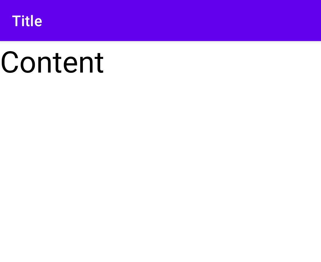
Scaffold(
    topBar = {
        TopAppBar(title = { Text(text = "Title") })
    },
    content = {
        Text(
            text = "Content",
            fontSize = 40.sp
        )
    }
)
The layout with "TopBar", "BottomBar", "Drawer", "FloatingActionButton" and content area
Let's start with the data class for combining information about navigation items; it includes a title and an icon. This data class helps us to store information for the bottom menu and navigation drawer.
data class NavigationItem(
    val title: String,
    @DrawableRes val iconRes: Int
)
Notes:
- A composable function recomposes after any changes of state. To remember the current state which can be recalculated and trigger recomposition we can use the
rememberfunction. So, to create a state for selected item need to use the following code:
val selectedItem = remember { mutableStateOf("Initial state") }- To change the
drawerState("open" or "close" navigation drawer) we need to usedrawerState.open()ordrawerState.close()functions which can be called from theCoroutineContext. So, we need to use the following code to create aCoroutineContext:
val scope = rememberCoroutineScope()
val bottomMenuItems = listOf(
    NavigationItem(title = "Item 1", iconRes = R.drawable.ic_one),
    NavigationItem(title = "Item 2", iconRes = R.drawable.ic_two),
    NavigationItem(title = "Item 3", iconRes = R.drawable.ic_three)
)

val drawerMenuItems = listOf(
    NavigationItem(title = "Section 1", iconRes = R.drawable.ic_one),
    NavigationItem(title = "Section 2", iconRes = R.drawable.ic_two),
    NavigationItem(title = "Section 3", iconRes = R.drawable.ic_three)
)

val selectedItem = remember { mutableStateOf(bottomMenuItems.first().title) }

/**
 * By default, drawer state is closed, but we can customize it.
 *
 * Closed drawer state: `rememberScaffoldState(drawerState = rememberDrawerState(initialValue = DrawerValue.Closed)`
 * Opened drawer state: `rememberScaffoldState(drawerState = rememberDrawerState(initialValue = DrawerValue.Open))`
 */
val scaffoldState = rememberScaffoldState()
val scope = rememberCoroutineScope()

Scaffold(
    scaffoldState = scaffoldState,
    drawerContent = {
        LazyColumn {
            items(drawerMenuItems) {
                ListItem(
                    text = { Text(text = "Category ${it.title}") },
                    icon = {
                        Icon(
                            painter = painterResource(id = it.iconRes),
                            contentDescription = it.title
                        )
                    }
                )
            }
        }
    },
    topBar = {
        TopAppBar(
            title = { Text(text = "Title") },
            navigationIcon = {
                IconButton(
                    onClick = {
                        scope.launch { scaffoldState.drawerState.open() }
                    }
                ) {
                    Icon(
                        painter = painterResource(id = R.drawable.ic_menu),
                        contentDescription = "Menu"
                    )
                }
            }
        )
    },
    content = {
        Box(
            contentAlignment = Alignment.Center,
            modifier = Modifier.fillMaxSize()
        ) {
            Text(
                text = selectedItem.value,
                fontSize = 40.sp,
                textAlign = TextAlign.Center
            )
        }
    },
    bottomBar = {
        BottomNavigation {
            bottomMenuItems.forEach { screen ->
                BottomNavigationItem(
                    selected = screen.title == selectedItem.value,
                    onClick = { selectedItem.value = screen.title },
                    label = { Text(screen.title) },
                    icon = {
                        Icon(
                            painter = painterResource(id = screen.iconRes),
                            contentDescription = null
                        )
                    }
                )
            }
        }
    },
    floatingActionButtonPosition = FabPosition.End,
    floatingActionButton = {
        FloatingActionButton(
            onClick = {
                scope.launch {
                    scaffoldState.snackbarHostState
                        .showSnackbar("Button clicked")
                }
            }
        ) {
            Icon(
                painter = painterResource(id = R.drawable.ic_add),
                contentDescription = "Add",
                tint = Color.White
            )
        }
    }
)
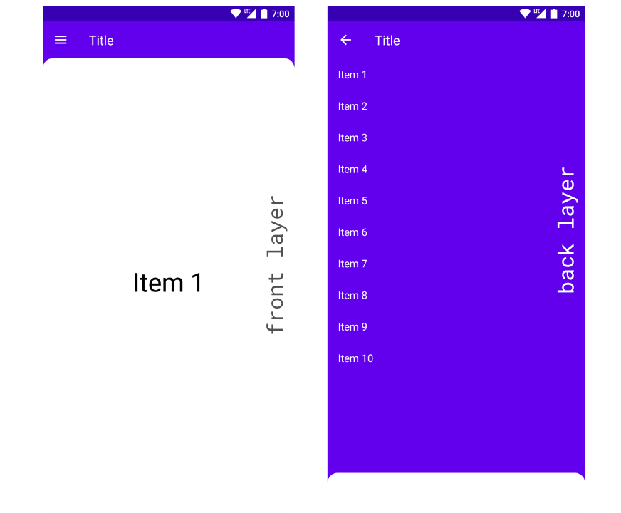
The "BackdropScaffold" layout
The "BackdropScaffold" layout contains a basic implementation of the material design backdrop.
The BackdropScaffold includes few components
- AppBar
- Back Layer Content
- Front Layer Content
fun BackdropScaffold(
    appBar: @Composable () -> Unit,
    backLayerContent: @Composable () -> Unit,
    frontLayerContent: @Composable () -> Unit,
    modifier: Modifier = Modifier,
    scaffoldState: BackdropScaffoldState = rememberBackdropScaffoldState(Concealed),
    gesturesEnabled: Boolean = true,
    peekHeight: Dp = BackdropScaffoldDefaults.PeekHeight,
    headerHeight: Dp = BackdropScaffoldDefaults.HeaderHeight,
    persistentAppBar: Boolean = true,
    stickyFrontLayer: Boolean = true,
    backLayerBackgroundColor: Color = MaterialTheme.colors.primary,
    backLayerContentColor: Color = contentColorFor(backLayerBackgroundColor),
    frontLayerShape: Shape = BackdropScaffoldDefaults.frontLayerShape,
    frontLayerElevation: Dp = BackdropScaffoldDefaults.FrontLayerElevation,
    frontLayerBackgroundColor: Color = MaterialTheme.colors.surface,
    frontLayerContentColor: Color = contentColorFor(frontLayerBackgroundColor),
    frontLayerScrimColor: Color = BackdropScaffoldDefaults.frontLayerScrimColor,
    snackbarHost: @Composable (SnackbarHostState) -> Unit = { SnackbarHost(it) }
)
The scaffoldState: BackdropScaffoldState provides a state for the BackdropScaffold composable function.
@ExperimentalMaterialApi
@Stable
class BackdropScaffoldState(
    initialValue: BackdropValue,
    animationSpec: AnimationSpec<Float> = SwipeableDefaults.AnimationSpec,
    confirmStateChange: (BackdropValue) -> Boolean = { true },
    val snackbarHostState: SnackbarHostState = SnackbarHostState()
) : SwipeableState<BackdropValue>(
    initialValue = initialValue,
    animationSpec = animationSpec,
    confirmStateChange = confirmStateChange
) {
   ...
}
The currentValue: BackdropValue of the BackdropScaffoldState can be represented by one of the following values
- The
Concealedindicates the back layer is concealed and the front layer is active. - The
Revealedindicates the back layer is revealed and the front layer is inactive.
Let's build a demo application with the BackdropScaffold composable function.
Notes:
- A composable function recomposes after any changes of state. To remember the current state which can be recalculated and trigger recomposition we can use the
rememberfunction. So, to create a state for selected item need to use the following code:
val selectedItem = remember { mutableStateOf("Initial state") }- To change the
scaffoldStatewe need to usescaffoldState.reveal()orcaffoldState.conceal()functions which can be called from theCoroutineContext. So, we need to use the following code to create aCoroutineContext:
val scope = rememberCoroutineScope()
val scope = rememberCoroutineScope()

val menuItems = listOf(
    "Item 1",
    "Item 2",
    "Item 3",
    "Item 4",
    "Item 5",
    "Item 6",
    "Item 7",
    "Item 8",
    "Item 9",
    "Item 10"
)
val selectedItem = remember { mutableStateOf(menuItems.first()) }
val scaffoldState = rememberBackdropScaffoldState(BackdropValue.Concealed)

BackdropScaffold(
    scaffoldState = scaffoldState,
    appBar = {
        TopAppBar(
            title = { Text("Title") },
            navigationIcon = {
                if (scaffoldState.isConcealed) {
                    IconButton(onClick = { scope.launch { scaffoldState.reveal() } }) {
                        Icon(
                            painter = painterResource(id = R.drawable.ic_menu),
                            contentDescription = "Open menu"
                        )
                    }
                } else {
                    IconButton(onClick = { scope.launch { scaffoldState.conceal() } }) {
                        Icon(
                            painter = painterResource(id = R.drawable.ic_arrow_back),
                            contentDescription = "Close menu"
                        )
                    }
                }
            },
            elevation = 0.dp,
            backgroundColor = Color.Transparent
        )
    },
    backLayerContent = {
        LazyColumn(
            modifier = Modifier.fillMaxSize()
        ) {
            items(menuItems) {
                ListItem(
                    text = { Text(text = it) },
                    modifier = Modifier.clickable {
                        selectedItem.value = it
                        scope.launch { scaffoldState.conceal() }
                    }
                )
            }
        }
    },
    frontLayerContent = {
        Box(
            contentAlignment = Alignment.Center,
            modifier = Modifier.fillMaxSize()
        ) {
            Text(
                text = selectedItem.value,
                fontSize = 40.sp,
                textAlign = TextAlign.Center
            )
        }
    }
)
Summary
Jetpack Compose provides possibilities for building complex layouts for Android applications using modifiers, alignments, arrangements, and layouts.
We explored only modifiers for setting the size of UI elements:
- The
height(height: Dp)sets a UI element’s height to the preferred value. - The
width(width: Dp)sets a UI element’s width to the preferred value. - The
size(size: Dp)sets an element’s height and width to a similar size value. - The
fillMaxHeight()fills the height of an element with the maximum height of a parent. - The
fillMaxWidth()fills the width of an element with a parent’s maximum width. - The
fillMaxSize()fills the height and width of an element with a parent’s maximum height and width.
Alignments and arrangements help us to position child elements inside the parent container.
The following layouts are available in Jetpack Compose:
- The "Box" layout stacks every child on top of each other.
- The "Column" layout stacks children in a vertical sequence.
- The "Row" layout stacks children in a horizontal sequence.
- The "ConstraintLayout" layout positions children according to the constraints between them.
- The "Scaffold" layout contains a basic implementation of the material design app structure.
- The "BackdropScaffold" layout contains a basic implementation of the material design backdrop.
Source code of all examples in this article.
Do not hesitate to ping me on Twitter if you have any questions.

