The TopAppBar is a commonly used component in Jetpack Compose as many screens use it. While developers commonly customize the TopAppBar. Material 3 library provides predefined variations to simplify development and follow Material Design guidelines.
In this article, we will explore:
- The different TopAppBar components offered by the Material 3 library.
- The default typography and height in each TopAppBar variant.
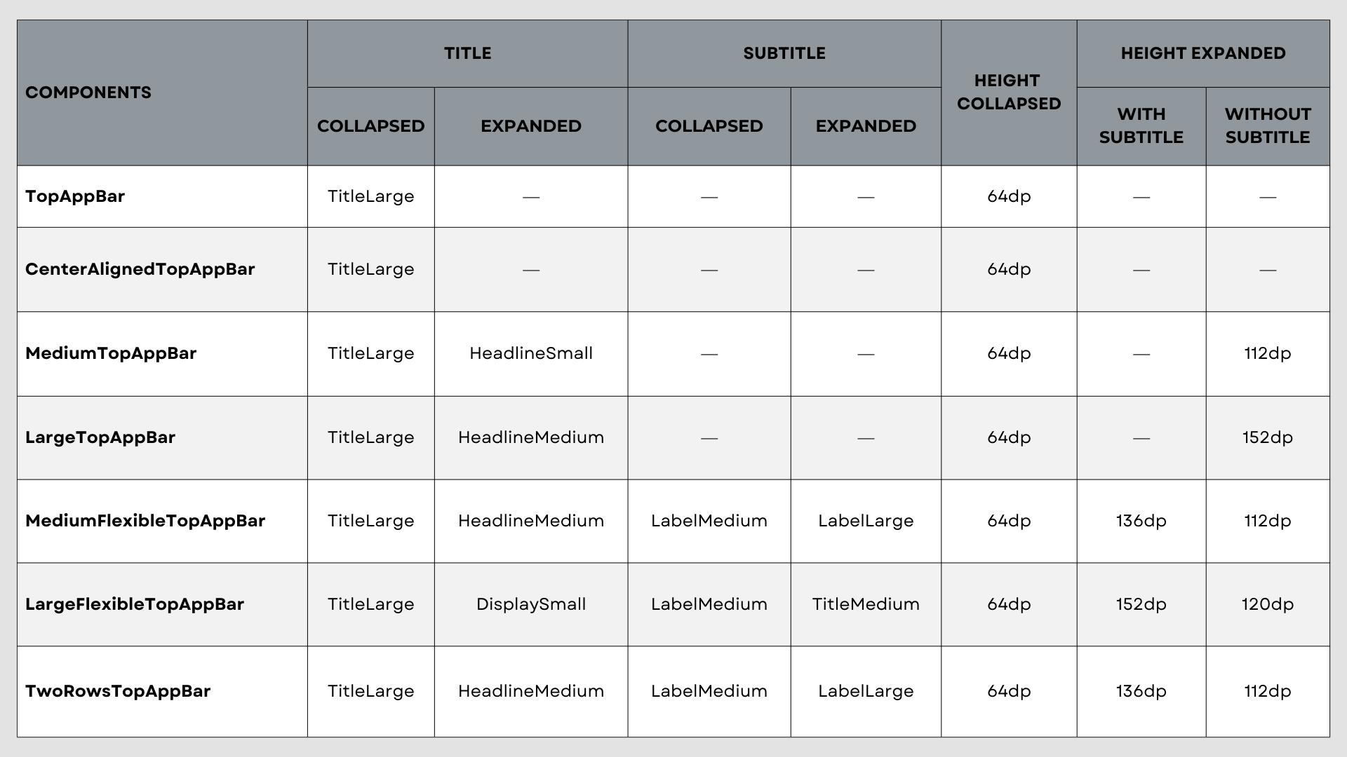
Let’s look at the default text styles for titles and subtitles, as well as the component height, to help choose the best TopAppBar components for your design and use case. These parameters can also be customized.
For easy comparison, I created a comprehensive table summarizing all the available options. Below, you’ll find detailed information about each TopAppBar variant, alongside with a basic example.
TopAppBar
The TopAppBar is the most widespread component.
| TopAppBar | |
|---|---|
| Title Text Style | TitleLarge |
| Height | 64dp |
@OptIn(ExperimentalMaterial3Api::class)
@Preview
@Composable
fun Demo_TopAppBar() {
    Scaffold(
        topBar = {
            TopAppBar(
                title = { Text("Title") },
                navigationIcon = {
                    IconButton(onClick = {}) {
                        Icon(Icons.AutoMirrored.Default.ArrowBack, "Back")
                    }
                },
                actions = {
                    IconButton(onClick = {}) {
                        Icon(Icons.Default.AttachFile, "Attach")
                    }
                    IconButton(onClick = {}) {
                        Icon(Icons.Default.MoreVert, "More")
                    }
                }
            )
        }
    ) { innerPadding ->
        Column(
            Modifier.fillMaxWidth().padding(innerPadding).verticalScroll(rememberScrollState())
        ) {
            Text(
                modifier = Modifier.padding(16.dp),
                text = remember { LoremIpsum().values.first() },
                fontSize = 16.sp
            )
        }
    }
}
CenterAlignedTopAppBar
Similar to the standard TopAppBar, but with one key difference: the title is horizontally centered.
| CenterAlignedTopAppBar | |
|---|---|
| Title Text Style | TitleLarge |
| Height | 64dp |
@OptIn(ExperimentalMaterial3Api::class)
@Preview
@Composable
fun Demo_CenterAlignedTopAppBar() {
    Scaffold(
        topBar = {
            CenterAlignedTopAppBar(
                title = { Text("Title") },
                navigationIcon = {
                    IconButton(onClick = {}) {
                        Icon(Icons.AutoMirrored.Default.ArrowBack, "Back")
                    }
                },
                actions = {
                    IconButton(onClick = {}) {
                        Icon(Icons.Default.AttachFile, "Attach")
                    }
                    IconButton(onClick = {}) {
                        Icon(Icons.Default.MoreVert, "More")
                    }
                }
            )
        }
    ) { innerPadding ->
        Column(
            Modifier.fillMaxWidth().padding(innerPadding).verticalScroll(rememberScrollState())
        ) {
            Text(
                modifier = Modifier.padding(16.dp),
                text = remember { LoremIpsum().values.first() },
                fontSize = 16.sp
            )
        }
    }
}
MediumTopAppBar and LargeTopAppBar
These components introduce dynamic behavior, allowing the components to expand and collapse. They can display titles, navigation icons, and actions.
| MediumTopAppBar | LargeTopAppBar | |
|---|---|---|
| Title Text Style (Collapsed) | TitleLarge | TitleLarge |
| Title Text Style (Expanded) | HeadlineSmall | HeadlineMedium |
| Collapsed Height | 64dp | 64dp |
| Expanded Height | 112dp | 152dp |
@OptIn(ExperimentalMaterial3Api::class)
@Preview
@Composable
fun Demo_MediumTopAppBar() {
    val scrollBehavior = TopAppBarDefaults.exitUntilCollapsedScrollBehavior()

    Scaffold(
        modifier = Modifier.nestedScroll(scrollBehavior.nestedScrollConnection),
        topBar = {
            MediumTopAppBar(
                title = { Text("Title") },
                navigationIcon = {
                    IconButton(onClick = {}) {
                        Icon(Icons.AutoMirrored.Default.ArrowBack, "Back")
                    }
                },
                actions = {
                    IconButton(onClick = {}) {
                        Icon(Icons.Default.AttachFile, "Attach")
                    }
                    IconButton(onClick = {}) {
                        Icon(Icons.Default.MoreVert, "More")
                    }
                },
                scrollBehavior = scrollBehavior
            )
        }
    ) { innerPadding ->
        Column(
            Modifier.fillMaxWidth().padding(innerPadding).verticalScroll(rememberScrollState())
        ) {
            Text(
                modifier = Modifier.padding(16.dp),
                text = remember { LoremIpsum().values.first() },
                fontSize = 16.sp
            )
        }
    }
}
MediumFlexibleTopAppBar and LargeFlexibleTopAppBar
These components add the capability to display subtitle alongside with titles, navigation icons, and actions.
| MediumFlexibleTopAppBar | LargeFlexibleTopAppBar | |
|---|---|---|
| Title Text Style (Collapsed) | TitleLarge | TitleLarge |
| Title Text Style (Expanded) | HeadlineMedium | DisplaySmall |
| Subtitle Text Style (Collapsed) | LabelMedium | LabelMedium |
| Subtitle Text Style (Expanded) | LabelLarge | TitleMedium |
| Collapsed Height | 64dp | 64dp |
| Expanded Height (with subtitle) | 136dp | 152dp |
| Expanded Height (without subtitle) | 112dp | 120dp |
@OptIn(ExperimentalMaterial3ExpressiveApi::class, ExperimentalMaterial3Api::class)
@Preview
@Composable
fun Demo_MediumFlexibleTopAppBar() {
    val scrollBehavior = TopAppBarDefaults.exitUntilCollapsedScrollBehavior()
    Scaffold(
        modifier = Modifier.nestedScroll(scrollBehavior.nestedScrollConnection),
        topBar = {
            MediumFlexibleTopAppBar(
                title = { Text("Title") },
                subtitle = { Text("Subtitle") },
                navigationIcon = {
                    IconButton(onClick = {}) {
                        Icon(Icons.AutoMirrored.Default.ArrowBack, "Back")
                    }
                },
                actions = {
                    IconButton(onClick = {}) {
                        Icon(Icons.Default.AttachFile, "Attach")
                    }
                    IconButton(onClick = {}) {
                        Icon(Icons.Default.MoreVert, "More")
                    }
                },
                scrollBehavior = scrollBehavior
            )
        }
    ) { innerPadding ->
        Column(
            Modifier.fillMaxWidth().padding(innerPadding).verticalScroll(rememberScrollState())
        ) {
            Text(
                modifier = Modifier.padding(16.dp),
                text = remember { LoremIpsum().values.first() },
                fontSize = 16.sp
            )
        }
    }
}
TwoRowsTopAppBar
This component also supports expanded and collapsed states. It includes title, subtitle, navigation icons, and actions. The TwoRowsTopAppBar component simplifies the management of different text strings for expanded and collapsed states compared to MediumFlexibleTopAppBar.
TwoRowsTopAppBar was added in version 1.4.0-alpha07.| TwoRowsTopAppBar | |
|---|---|
| Title Text Style (Collapsed) | TitleLarge |
| Title Text Style (Expanded) | HeadlineMedium |
| Subtitle Text Style (Collapsed) | LabelMedium |
| Subtitle Text Style (Expanded) | LabelLarge |
| Collapsed Height | 64dp |
| Expanded Height (with subtitle) | 136dp |
| Expanded Height (without subtitle) | 112dp |
@OptIn(ExperimentalMaterial3Api::class, ExperimentalMaterial3ExpressiveApi::class)
@Preview
@Composable
fun Demo_TwoRowsTopAppBar() {
    val scrollBehavior = TopAppBarDefaults.exitUntilCollapsedScrollBehavior()
    Scaffold(
        modifier = Modifier.nestedScroll(scrollBehavior.nestedScrollConnection),
        topBar = {
            TwoRowsTopAppBar(
                title = { expanded ->
                    Text(
                        text = if (expanded) "Expanded Title" else "Collapsed Title",
                        maxLines = 1,
                        overflow = TextOverflow.Ellipsis
                    )
                },
                subtitle = { expanded ->
                    Text(
                        text = if (expanded) "Expanded Subtitle" else "Collapsed Subtitle",
                        maxLines = 1,
                        overflow = TextOverflow.Ellipsis
                    )
                },
                navigationIcon = {
                    IconButton(onClick = { /* doSomething() */ }) {
                        Icon(
                            imageVector = Icons.AutoMirrored.Filled.ArrowBack,
                            contentDescription = "Localized description"
                        )
                    }
                },
                scrollBehavior = scrollBehavior
            )
        }
    ) { innerPadding ->
        Column(
            Modifier.fillMaxWidth().padding(innerPadding).verticalScroll(rememberScrollState())
        ) {
            Text(
                modifier = Modifier.padding(16.dp),
                text = remember { LoremIpsum().values.first() },
                fontSize = 16.sp
            )
        }
    }
}
Conclusion
By exploring different TopAppBar variants, we've seen that Material 3 offers pre-built solutions for many common use cases.
Understanding these predefined options saves development time and effort. Instead of reinventing the wheel and customizing the basic TopAppBar for each use case, you can leverage the pre-built solutions provided by the Material 3 library.
The next time, explore the available options in the Material 3 library. It may save you time and you will already use a polished solution.

