Introduction
Modern applications use many Views or UI components (the names can differ from technology to technology, but the idea behind them is similar). We want to extract part of the UI to a specific component that can be reused in the future.
All technologies provide a set of UI elements: Button, Text, Input, etc. In addition to that, we can find libraries with predefined components. One of the most popular libraries in the mobile development world is the "Material Components" library. However, it still does not cover all cases of modern application because they are used in different fields of human life, such as productivity, finance, medicine, sport, etc.
I saw many examples when developers create complex UI elements (payment card) as part of the screen instead of a custom component.
The UI components should not always be created, especially if you want to use only once. If we copy part of the layout to another screen, we probably need to extract it to a separate component.
In this article, we will talk about the benefits of creating custom UI components.
Types of UI Components
I want to start with different types of UI components:
- Stateful components - keep track of changing internal state
- Stateless components - do not have their state and get all data from outside
Both stateful and stateless components are reusable. However, the stateless components can be used in a broader range of scenarios. In terms of testability, the stateless functions are much simpler to tests.
Let's take a look at the benefits of a "Counter" component implemented as stateful and stateless components.

Stateful implementation:
- The "Counter" has the default value because it's part of the component's internal state. We can also have a case when we want to use a different default value.
- The minimum and maximum values are part of the internal implementation of the component, so we cannot configure it from the outside.
- The implementation of increment and decrement actions is part of internal implementation — we cannot configure it from the outside. When we want to test the incrementing value when the max value is achieved, we should tap on the increment button until a max value is achieved.
Stateless implementation:
- The default value of "Counter" is configurable.
- The maximum and minimum values are configurable. So, we can pass them from the outside.
- We can customize the behavior for increment and decrement actions.
- We can easily test behavior when the user achieves the maximum value and taps on the increment button.
Now we’ve covered basic information about different types of UI components, we can look at the benefits of building custom elements instead of part of the screen without extracting them to custom components.
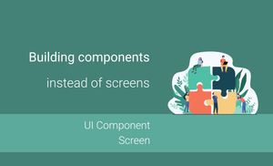
Benefits of building components instead of screens
Let's take a look at the benefits of building components instead of screens.
Reusability
When we build UI components, they can be used in many other screens or apps. One of the best examples of a predefined set of UI components is the "Material Components" library that is used in huge amounts of Android projects.
You can build stateful or stateless components and they can still be reusable. However, of course, stateless components can be reused more often.
We can have a separate team that is working on such a library while all other teams can use it in different modules or projects, because apps from the same company often have a similar look and feel.
The benefit of this approach is that all teams can contribute to such a library and new components will be available for everyone.
Small codebase
Almost every UI component is pretty tiny compared with the codebase of the feature.
In many cases, most components can be created in a couple of hours or a day. However, we always have exceptions, and we can require more time to build more complex components.
Easy to test
The repository with the component library has a "Component Gallery" application (if it's extracted to a separate repository) that includes a demo of customization options for all components in the library. It's a pretty handy way to check if a component supports a specific feature or to find a proper UI component without checking the application's source code.
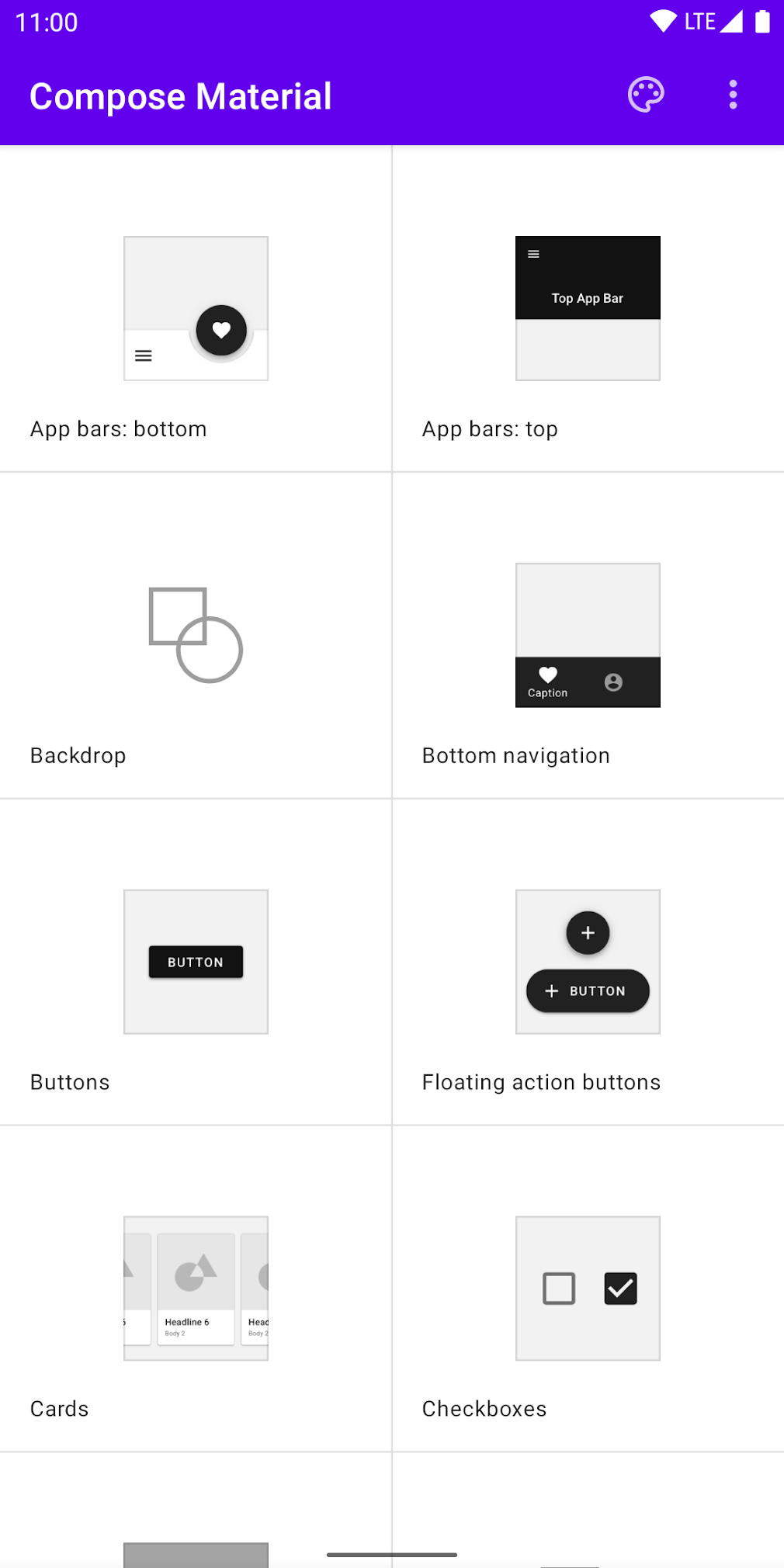
The "Compose Material Catalog" applications can be downloaded here.
The "Component Gallery" helps to save some time when we want to test such components manually or by using automated test cases of specific components because of the following reasons:
- The compilation time of "Component Gallery" applications is much shorter than the compilation time of the whole application with business logic.
- All customization options are already available in the application on one screen, so we don't need to spend additional time navigating between the different screens of the application.
We should try to avoid testing UI components over End-To-End scenarios.
- When we want to verify app behavior, we can use a production app.
- When we want to check the possibility of a specific UI component, we shouldn't load read data from the back end, spend additional time on adding data to a database, or move from one screen to another.
We can test such components’ behavior, feel, and look with screenshot or UI tests (if we can interact with such components).
Separation between UI and business logic
The stateless components don't have any internal business logic inside. So, we can configure actions of such components from the outside. The behavior of the same components can be different for every case.
It motivates developers to create as generic components as possible.
Summary
Building separate UI components has a lot of benefits:
- We can reuse components on multiple screens or even multiple projects.
- We don't need to test UI elements by running the application by adding data to the database, fetching data from the back end, etc.
- UI components can be easily tested using screenshot tests or UI tests (if a component has a specific behavior).
- The "Component Gallery" app helps check which components are available and allows you to see all their customization examples.

