Jetpack Compose is a modern toolkit for building native UI for Android applications. It was announced at Google I/O 2019. It is a new approach based on DSL and allows developers to create UI. Ideally, it should help us to write less code and have simpler and more maintainable UI.
Android Studio 4.0 is one of the requirements for using Jetpack Compose. Android Studio supports Preview mechanism for composable functions. It means that we can see changes in UI without recompiling the whole application.
Jetpack Compose artifacts
Jetpack Compose distributed with multiple dependencies and all artifacts can be split into two groups: core and ui.
Let’s start with the cdependencies:
- core
- The "AndroidX Compose Runtime" contains API for work with Jetpack Compose.
- The "AndroidX Compose Compiler" contains the Kotlin compiler for Jetpack Compose.
- ui
- The "AndroidX UI Core" contains core classes, enums and interfaces for rendering UI components;
- The "AndroidX UI Framework" contains framework for building UI components;
- The "AndroidX UI Layout" contains base components for building layouts, like Column, Row, etc;
- The "AndroidX UI Platform" contains internal implementation that allows separation of android implementation from host-side tests;
- The "AndroidX UI Text" contains base classes for customizing text, like TextStyle, ParagraphStyle, TextRange, etc;
- The "AndroidX UI Vector" contains base classes for working with vector images;
- The "AndroidX UI Animation" contains API for working with animations;
- The "AndroidX UI Material" contains a set of UI components: Text, Buttom, AlertDialog, etc;
- The "AndroidX UI Unit" contains a set of classes for working with units, like Density, Dp, Px, etc;
- The "AndroidX UI Animation Core" contains core classes for building animation API;
- The "AndroidX UI Foundation" contains a set of core components which are used for UI components, used as a dependency for Material library;
- The "AndroidX UI Geometry" contains classes related to dimensions without units;
- The "AndroidX UI Android Text" contains Android implementation of Text;
- The "AndroidX UI Tooling" contains a set tools which are needed for Jetpack Compose;
- The "AndroidX UI Graphics" contains a set of classes needed for drawing components;
- The "AndroidX UI Test" contains a framework for testing Jetpack Compose apps;
- The "AndroidX UI Util" contains classes and extensions functions used by other modules.
How to set up the project
First of all, we should add all dependencies for Jetpack Compose:
dependencies {
    ...
    implementation 'androidx.compose:compose-compiler:0.1.0-dev04'
    implementation 'androidx.compose:compose-runtime:0.1.0-dev04'
    implementation 'androidx.ui:ui-layout:0.1.0-dev04'
    implementation 'androidx.ui:ui-framework:0.1.0-dev04'
    implementation 'androidx.ui:ui-layout:0.1.0-dev04'
    implementation 'androidx.ui:ui-foundation:0.1.0-dev04'
    implementation 'androidx.ui:ui-animation:0.1.0-dev04'
    implementation 'androidx.ui:ui-tooling:0.1.0-dev04'
    implementation 'androidx.ui:ui-material:0.1.0-dev04'
    ...
}
Note:
- All dependencies have the same version. Right now it's a
0.1.0-dev04version. I recommend creating a const with a version of use for all Jetpack Compose dependencies; - Jetpack Compose doesn’t use kapt (Kotlin Annotation Processing).
The next step is adding buildFeatures and composeOptions sections with the same version that all the dependencies have.
android {
    ...
    buildFeatures {
        compose true
    }
    composeOptions {
        kotlinCompilerExtensionVersion "0.1.0-dev04"
    }
}
The final recommendation is to add the following code
android {
   ...
   compileOptions {
      sourceCompatibility JavaVersion.VERSION_1_8
      targetCompatibility JavaVersion.VERSION_1_8
   }
   kotlinOptions {
      jvmTarget = "1.8"
   }
}
Demo
Before starting to work with Jetpack Compose we need to understand @Composable and @Preview annotations:
- The
@Composableannotation allows us to create UI components with Jetpack Compose. - The
@Previewannotation can be applied to composable functions to show them in the Android Studio preview.
Let’s create a new Activity and use Jetpack Compose for creating a simple UI.
class MainActivity : AppCompatActivity() {

   override fun onCreate(savedInstanceState: Bundle?) {
       super.onCreate(savedInstanceState)
       setContent {
           Text(text = "Hello, World")
       }
   }
}
As a result, we will have an application with "Hello, World" text.
Let's try to create a simple application with a static list of coffee drinks.
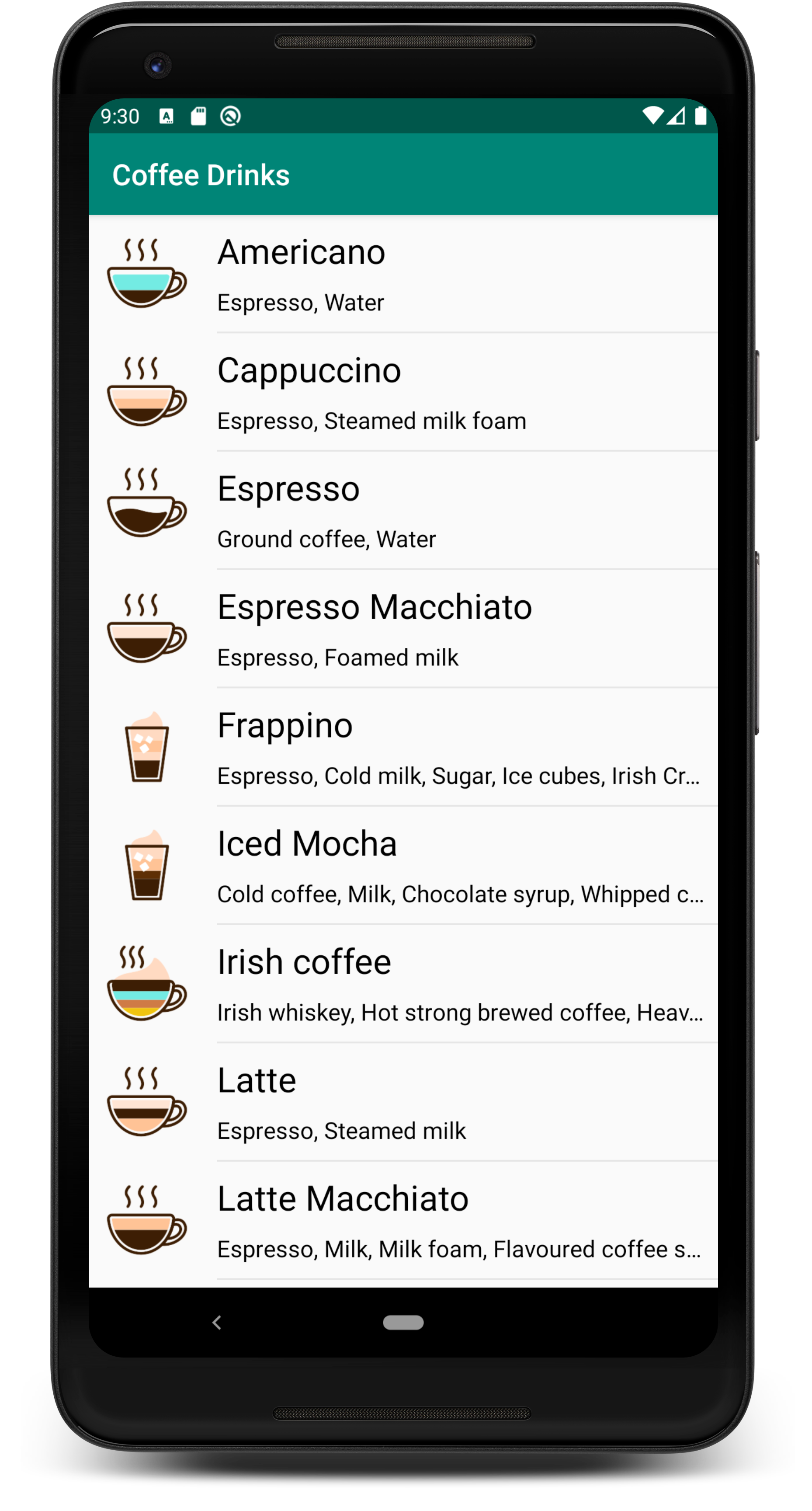
First of all, we can create a class to store data about coffee drinks.
data class CoffeeDrink(
    val name: String,
    @DrawableRes val imageUrl: Int,
    val description: String,
    val ingredients: String
)
The next step is to create a constant with a list of coffee drinks.
fun getCoffeeDrinks(): List<CoffeeDrink> {
    return listOf(
        CoffeeDrink(
            name = "Americano",
            imageUrl = R.drawable.americano_small,
            ingredients = "Espresso, Water"
        ),
        CoffeeDrink(
            name = "Cappuccino",
            imageUrl = R.drawable.cappuccino_small,
            ingredients = "Espresso, Steamed milk foam"
        ),
        CoffeeDrink(
            name = "Espresso",
            imageUrl = R.drawable.espresso_small,
            ingredients = "Ground coffee, Water"
        )
        ...
    )
}
Let's create a composable function for rendering a coffee drinks item and a function with @Preview annotation for checking the result inside IDE without recompiling the application:
@Composable
fun CoffeeDrinkCard(
    coffeeDrink: CoffeeDrinkModel
) {
    Row {
        Container(modifier = LayoutSize(80.dp), alignment = Alignment.Center) {
            DrawImage(image = imageResource(coffeeDrink.imageUrl))
        }
        Container(
            alignment = Alignment.TopLeft,
            modifier = LayoutFlexible(1f)
        ) {
            Column {
                CoffeeDrinkTitle(title = coffeeDrink.name)
                CoffeeDrinkIngredient(ingredients = coffeeDrink.ingredients)
            }
        }
    }
}

@Preview
@Composable
fun previewCard() {
    CoffeeDrinkCard(
        coffeeDrink = getCoffeeDrinks().first()
    )
}

The Row and Column functions allow us to position in rows and columns. It allows the creation of a complex layout by combining them. A similar option was available previously with LinearLayout.
The final step is to create a composable function for rendering a list of coffee drinks, preview functions and call a composable function inside onCreate#setContent function.
class MainActivity : AppCompatActivity() {

   override fun onCreate(savedInstanceState: Bundle?) {
       super.onCreate(savedInstanceState)
       setContent {
           CoffeeDrinksList(coffeeDrinks)
       }
   }

    @Composable
    fun CoffeeDrinkList(
        coffeeDrinks: List<CoffeeDrink>
    ) {
        VerticalScroller {
            Column {
                for (coffee in coffeeDrinks) {
                    Ripple(bounded = true) {
                        Container {
                            Column {
                                CoffeeDrinkCard(
                                    coffeeDrink = coffee
                                )
                                Opacity(0.08f) {
                                    Divider(modifier = LayoutPadding(left = 88.dp), color = Color.Black)
                                }
                            }
                        }
                    }
                }
            }
        }
    }

    @Preview
    @Composable
    fun previewCoffeeDrinkList(coffeeDrinks: ModelList<CoffeeDrinkModel>) {
        CoffeeDrinkList(
            coffeeDrinks = getCoffeeDrinks()
        )
    }
}
After the small demonstration of Jetpack Compose, you may have many questions, and I'll try to answer a few of them:
- How to work with string resources? We can work with string resources as we worked previously using the
getString(R.string.any_string)function; - How to support different screen sizes? We have access to the device configuration, and we can use the if-else statement inside composable functions;
- How to change the state of components? We can create a model class with
@Modelannotation, and after changes in these objects, components will be re-drawn
Summary
Jetpack Compose allows us to create composable functions for building UI with DSL. The current version is 0.1.0-dev04, and the API may change a lot. After the next developer release, some of these functions may be deprecated or removed completely as it was between 0.1.0-dev03 and 0.1.0-dev04 versions.
However, even right now, we can see a new vision of building Android UI. This approach has the following benefits compared with the classic approach (XML files):
- "UI Preview" feature of Android Studio allows us to save a lot of time and helps to avoid re-compile application for checking UI changes;
- Splitting huge components into small composable functions allows us to debug and change them easily in isolation;
- Naming is a significant part of Jetpack Compose because of implementing complex UI, we will create many small functions;
- We have a developer release right now, and API may change from version to version.
Let’s try to scan UI with Layout Inspector.
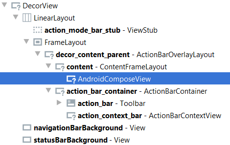
As you can see, we have one composable view. This means that we will have additional API for testing UI. Right now you can find available API in the "ui-test" library.
This is the first article from a series about Jetpack Compose. During this series, we will build and test applications. Next time we will talk about the state for composable function and possible ways of re-drawing the components. Stay tuned.
GitHub project (source code can change): JetpackComposeWorkshop.

