Introduction
Mobile apps have limited space for displaying content on the screen. The component which helps us to save space and show a list of options to choose from is the dropdown menu. The "Material 3" library contains a few implementations of the dropdown menu. Besides that, the cascade library simplifies building nested pop-up menus in the Jetpack Compose.
In this article, we will explore:
- The difference between
DropdownMenuandExposedDropdownMenuBox - The possibilities of the "cascade" library
- How to customize dropdown components
- How to interact with
DropdownMenu,ExposedDropdownMenuBox, andCascadeDropdownMenuin UI tests.
The content of this article is based on the dependencies with the following versions:
- androidx.compose.material3:material3:1.0.1 (BOM: 2023.01.00)
- me.saket.cascade:cascade-compose: 2.0.0-rc01
Creating a DropDown menu in Jetpack Compose
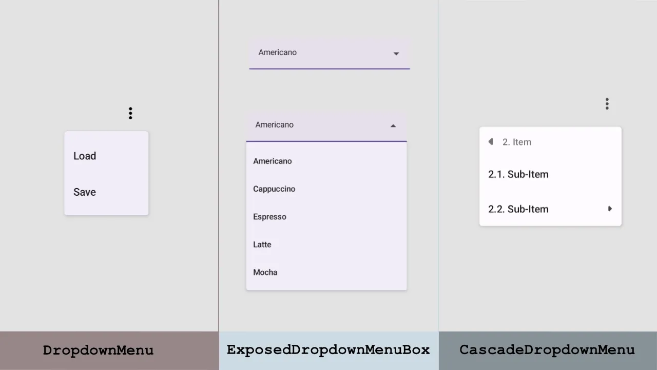
There are multiple implementations of the dropdown menu in Jetpack Compose, and all of them are part of the "androidx.compose.material3" package:
- The
DropdownMenurepresents a pop-up with multiple choices and will use a position of parent to appear on the screen. - The
ExposedDropdownMenuBoxdisplays the selected item and an expandable list of options.
If we want to create a nested dropdown menu, we can use the "cascade" library, which allows us to create the CascadeDropdownMenu. Alternatively, custom nested "DropdownMenu" implementation can be done based on the DropdownMenu component.
Creating a DropDownMenu
Let's create a composable function with a "More" menu. The DropDownMenu will appear when we click on the "More" menu icon. Every DropdownMenu component may have multiple DropdownMenuItem options.
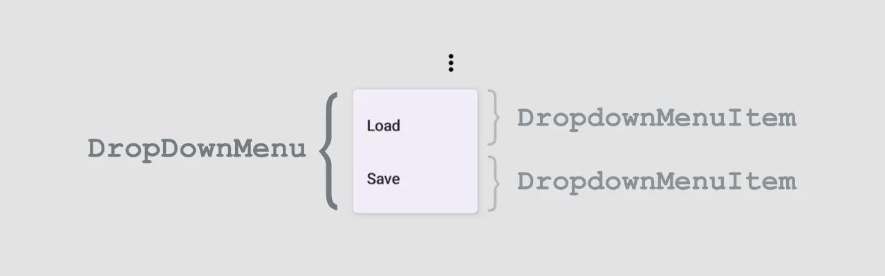
Let's implement the DropDownMenu with "Load" and "Save" options.
@Composable
fun Demo_DropDownMenu() {
    val context = LocalContext.current
    var expanded by remember { mutableStateOf(false) }

    Box(
        modifier = Modifier.fillMaxWidth()
            .wrapContentSize(Alignment.TopEnd)
    ) {
        IconButton(onClick = { expanded = !expanded }) {
            Icon(
                imageVector = Icons.Default.MoreVert,
                contentDescription = "More"
            )
        }

        DropdownMenu(
            expanded = expanded,
            onDismissRequest = { expanded = false }
        ) {
            DropdownMenuItem(
                text = { Text("Load") },
                onClick = { Toast.makeText(context, "Load", Toast.LENGTH_SHORT).show() }
            )
            DropdownMenuItem(
                text = { Text("Save") },
                onClick = { Toast.makeText(context, "Save", Toast.LENGTH_SHORT).show() }
            )
        }
    }
}
The DropdownMenu composable function contains the content: @Composable ColumnScope.() -> Unit parameter which allows us to add any composable code inside the pop-up. This means that we can add not only the DropdownMenuItem, but also easily add dividers between items.
DropdownMenu(...) {
    DropdownMenuItem(...)
    Divider()
    DropdownMenuItem(...)
}
In addition to that, the DropdownMenuItem composable function has the enabled: Boolean = true and it allows us to disable any items.
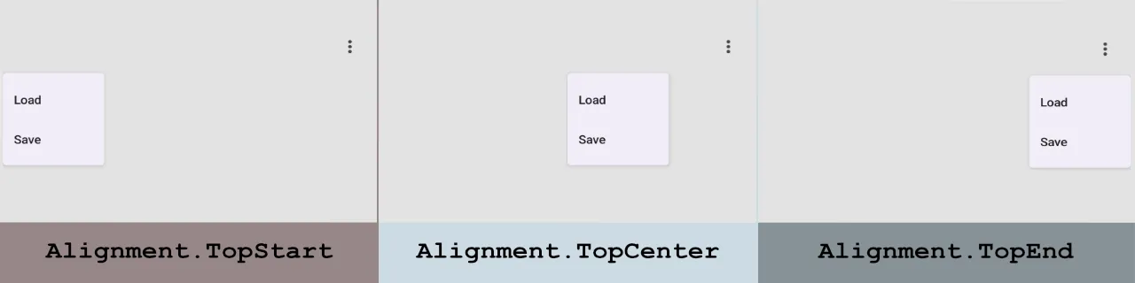
Let's take a look at the position of the DropDownMenu when the parent layout uses different alignment options.
More information about customization of the DropDownMenuItem can be found in the next chapter.
Creating an ExposedDropdownMenuBox
The ExposedDropdownMenuBox allows us to create a dropdown menu component with a TextField which shows the selected item.
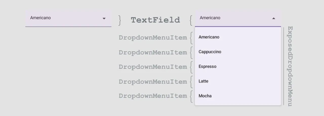
Let's implement the ExposedDropdownMenuBox component with a list of coffee drinks.
@Composable
fun Demo_ExposedDropdownMenuBox() {
    val context = LocalContext.current
    val coffeeDrinks = arrayOf("Americano", "Cappuccino", "Espresso", "Latte", "Mocha")
    var expanded by remember { mutableStateOf(false) }
    var selectedText by remember { mutableStateOf(coffeeDrinks[0]) }

    Box(
        modifier = Modifier
            .fillMaxWidth()
            .padding(32.dp)
    ) {
        ExposedDropdownMenuBox(
            expanded = expanded,
            onExpandedChange = {
                expanded = !expanded
            }
        ) {
            TextField(
                value = selectedText,
                onValueChange = {},
                readOnly = true,
                trailingIcon = { ExposedDropdownMenuDefaults.TrailingIcon(expanded = expanded) },
                modifier = Modifier.menuAnchor()
            )

            ExposedDropdownMenu(
                expanded = expanded,
                onDismissRequest = { expanded = false }
            ) {
                coffeeDrinks.forEach { item ->
                    DropdownMenuItem(
                        text = { Text(text = item) },
                        onClick = {
                            selectedText = item
                            expanded = false
                            Toast.makeText(context, item, Toast.LENGTH_SHORT).show()
                        }
                    )
                }
            }
        }
    }
}
By default the TextField is an editable component, but in our case we want to have a non-editable field. If you want to implement the searchable dropdown menu, you can take a look at the example in the next section.
The ExposedDropdownMenuBox has the default implementation of the trailing icon (ExposedDropdownMenuDefaults.TrailingIcon(expanded = expanded)). In the example above, we used it as a value for the trailingIcon property.
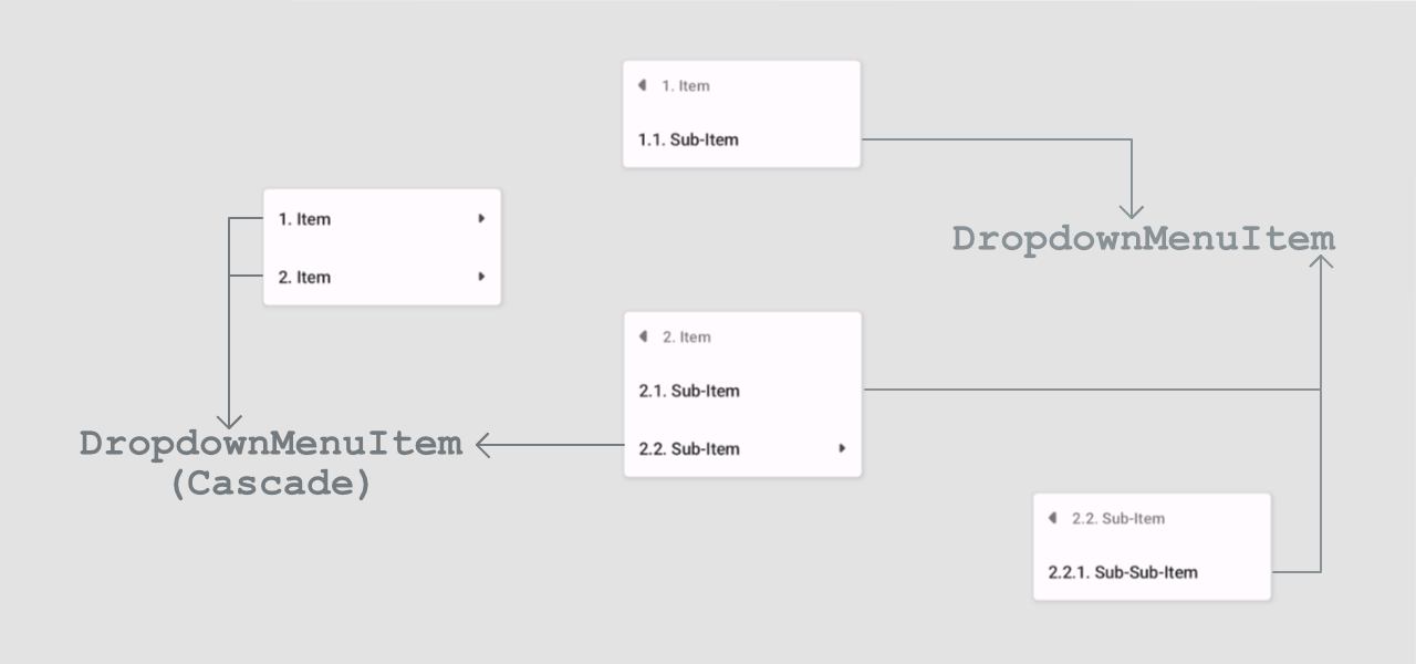
Creating a CascadeDropdownMenu
The cascade library allows us to create nested dropdown menus. It provides components both for Jetpack Compose and View.
The first step is to add dependencies.
dependencies {
    ...
    // View
    implementation "me.saket.cascade:cascade:2.0.0-rc01"
    // Jetpack Compose
    implementation "me.saket.cascade:cascade-compose:2.0.0-rc01"
}
The next step is to create a nested dropdown menu. If we want to use the CascadeDropdownMenu we will have the following structure:
When we implement the CascadeDropdownMenu, we use two different DropdownMenuItem composable functions:
- The
DropdownMenuItemfrom the "cascade" library is used when we want to add another level of nesting. - The
DropdownMenuItemfrom the "material 3" is used for non-nesting items.
@Composable
fun Demo_CascadeDropdownMenu() {
    val context = LocalContext.current
    var expanded by remember { mutableStateOf(false) }

    Scaffold(
        topBar = {
            TopAppBar(
                title = { },
                actions = {
                    IconButton(onClick = { expanded = !expanded }) {
                        Icon(
                            imageVector = Icons.Default.MoreVert,
                            contentDescription = "More menu"
                        )
                    }
                }
            )
        }
    ) { paddingValues ->
        Box(
            modifier = Modifier
                .fillMaxWidth()
                .padding(paddingValues)
                .wrapContentSize(Alignment.TopEnd)
        ) {
            CascadeDropdownMenu(
                expanded = expanded,
                onDismissRequest = { expanded = false }
            ) {
                DropdownMenuItem(
                    text = { Text(text = "1. Item") },
                    children = {
                        DropdownMenuItem(
                            text = { Text(text = "1.1. Sub-Item") },
                            onClick = {
                                expanded = false
                                Toast.makeText(context, "1.1. Sub-Item", Toast.LENGTH_SHORT).show()
                            }
                        )
                    }
                )
                DropdownMenuItem(
                    text = { Text(text = "2. Item") },
                    children = {
                        DropdownMenuItem(
                            text = { Text(text = "2.1. Sub-Item") },
                            onClick = {
                                expanded = false
                                Toast.makeText(context, "2.1. Sub-Item", Toast.LENGTH_SHORT).show()
                            }
                        )
                        DropdownMenuItem(
                            text = { Text(text = "2.2. Sub-Item") },
                            children = {
                                DropdownMenuItem(
                                    text = { Text(text = "2.2.1. Sub-Sub-Item") },
                                    onClick = {
                                        expanded = false
                                        Toast.makeText(context, "2.2.1. Sub-Sub-Item", Toast.LENGTH_SHORT).show()
                                    }
                                )
                            }
                        )
                    }
                )
            }
        }
    }
}
More information about customization of the DropdownMenuItem from the "cascade" library can be found in the next chapter.
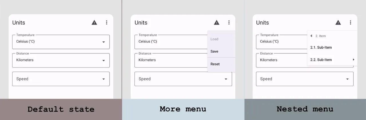
Customizing of the dropdown menu
After creatin the DropdownMenu, ExposedDropdownMenuBox, and CascadeDropdownMenu we see that many of these components use the same base composable function - DropdownMenuItem.
Customizing the DropDownMenuItem
The DropdownMenuItem is one of the core components for the dropdown menu in the Jetpack Compose. We can customize it by changing configuration options and showing which item is selected when we expand the ExposedDropdownMenuBox.
Let's explore both options.
Configuration options
The DropdownMenuItem from the "material 3" library has many more customization options than the component from the "material" library.The contentPadding allows customized default padding of the item. By default, it has only horizontal padding equal to 12.dp.
To set both leading and trailing icons to the item, we can use the leadingIcon and trailingIcon properties.
DropdownMenuItem(
    ...
    leadingIcon = {
        Icon(
            imageVector = Icons.Default.Image,
            contentDescription = ...
        )
    },
    trailingIcon = {
        Icon(
            imageVector = Icons.Default.MoreVert,
            contentDescription = ...
        )
    }
)
The colors: MenuItemColors property sets the colors for the text and icons in enabled and disabled states.
@Immutable
class MenuItemColors internal constructor(
    private val textColor: Color,
    private val leadingIconColor: Color,
    private val trailingIconColor: Color,
    private val disabledTextColor: Color,
    private val disabledLeadingIconColor: Color,
    private val disabledTrailingIconColor: Color,
) { ... }
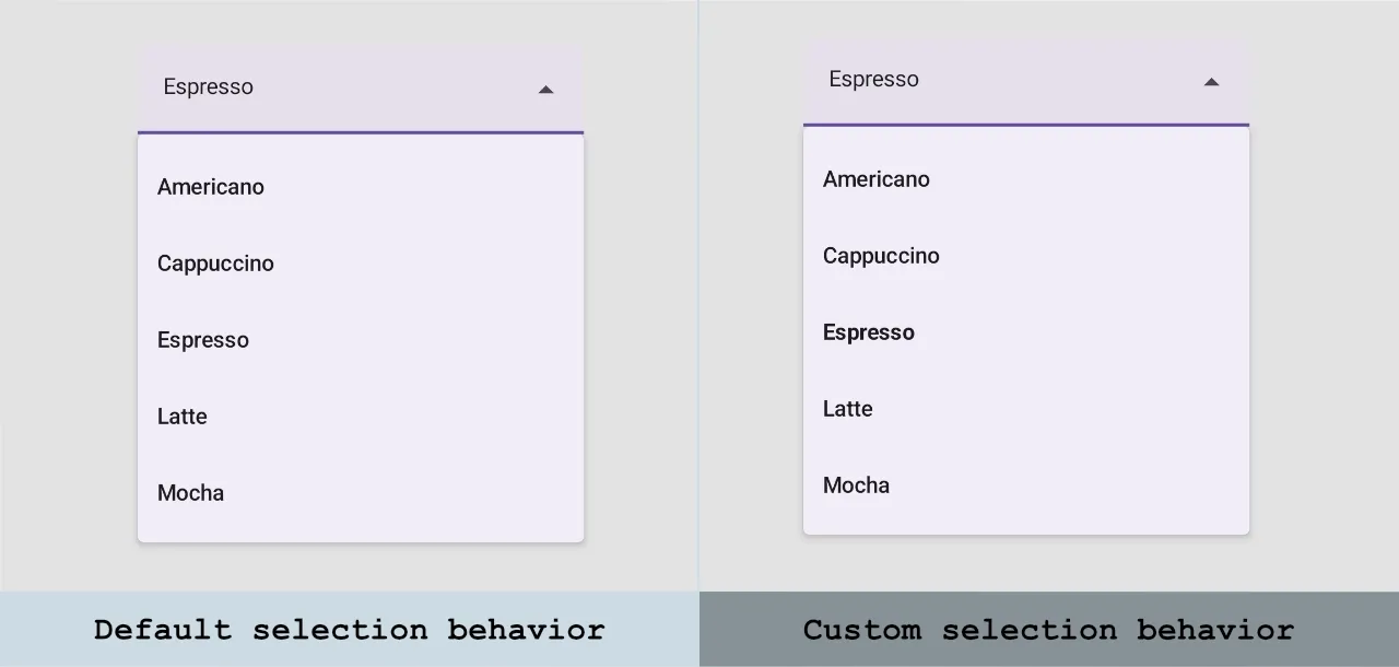
Changing style of selected menu item
We can style a selected item inside the ExposedDropdownMenu to show which option is already selected. For the demonstration, I will apply the FontWeight.Bold to the selected item.
@Composable
fun Demo_ExposedDropdownMenuBox_SelectionStyling() {
    val context = LocalContext.current
    val coffeeDrinks = arrayOf("Americano", "Cappuccino", "Espresso", "Latte", "Mocha")
    var expanded by remember { mutableStateOf(false) }
    var selectedItemIndex by remember { mutableStateOf(0) }

    ExposedDropdownMenuBox(
        expanded = expanded,
        onExpandedChange = { expanded = !expanded },
        modifier = Modifier.padding(16.dp),
    ) {
        TextField(
            value = coffeeDrinks[selectedItemIndex],
            onValueChange = {},
            readOnly = true,
            trailingIcon = { ExposedDropdownMenuDefaults.TrailingIcon(expanded = expanded) },
            modifier = Modifier.menuAnchor()
        )

        ExposedDropdownMenu(
            expanded = expanded,
            onDismissRequest = { expanded = false }
        ) {
            coffeeDrinks.forEachIndexed { index, item ->
                DropdownMenuItem(
                    text = {
                        Text(
                            text = item,
                            fontWeight = if (index == selectedItemIndex) FontWeight.Bold else null
                        )
                    },
                    onClick = {
                        selectedItemIndex = index
                        expanded = false
                        Toast.makeText(context, item, Toast.LENGTH_SHORT).show()
                    }
                )
            }
        }
    }
}
Customizing the DropDownMenu
The DropdownMenu has two customization properties:
offset: DpOffsetproperties: PopupProperties
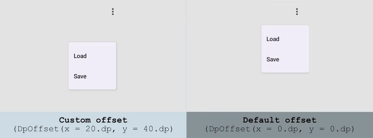
To customize the position of the DropdownMenu pop-up on the screen, we can use the offset property.
DropdownMenu(
    expanded = expanded,
    onDismissRequest = { expanded = false },
    offset = DpOffset(x = 20.dp, y = 40.dp)
) {
    ...
}
We can change default behavior of the DropdownMenu by changing the properties: PopupProperties parameter. Let's take a look at the default parameters of the PopupProperties class.
@Immutable
class PopupProperties @ExperimentalComposeUiApi constructor(
    val focusable: Boolean = false,
    val dismissOnBackPress: Boolean = true,
    val dismissOnClickOutside: Boolean = true,
    val securePolicy: SecureFlagPolicy = SecureFlagPolicy.Inherit,
    val excludeFromSystemGesture: Boolean = true,
    val clippingEnabled: Boolean = true,
    val usePlatformDefaultWidth: Boolean = false
)
Customizing the DropdownMenuItem (Cascade)
When we create the nested dropdown menu using the Cascade library, we use the DropdownMenuItem which is different from a component with a similar name from the "Material 3" library.
The contentPadding allows customized default padding of the item. By default, it has only horizontal padding for 12.dp.
To set both leading and trailing icons to the item, we can use the leadingIcon and trailingIcon properties.
The colors: MenuItemColors property sets the colors for the text and icons in enabled and disabled states.
@Immutable
class MenuItemColors internal constructor(
    private val textColor: Color,
    private val leadingIconColor: Color,
    private val trailingIconColor: Color,
    private val disabledTextColor: Color,
    private val disabledLeadingIconColor: Color,
    private val disabledTrailingIconColor: Color,
) { ... }
To set a customized the header for the children, we can use the childrenHeader property.
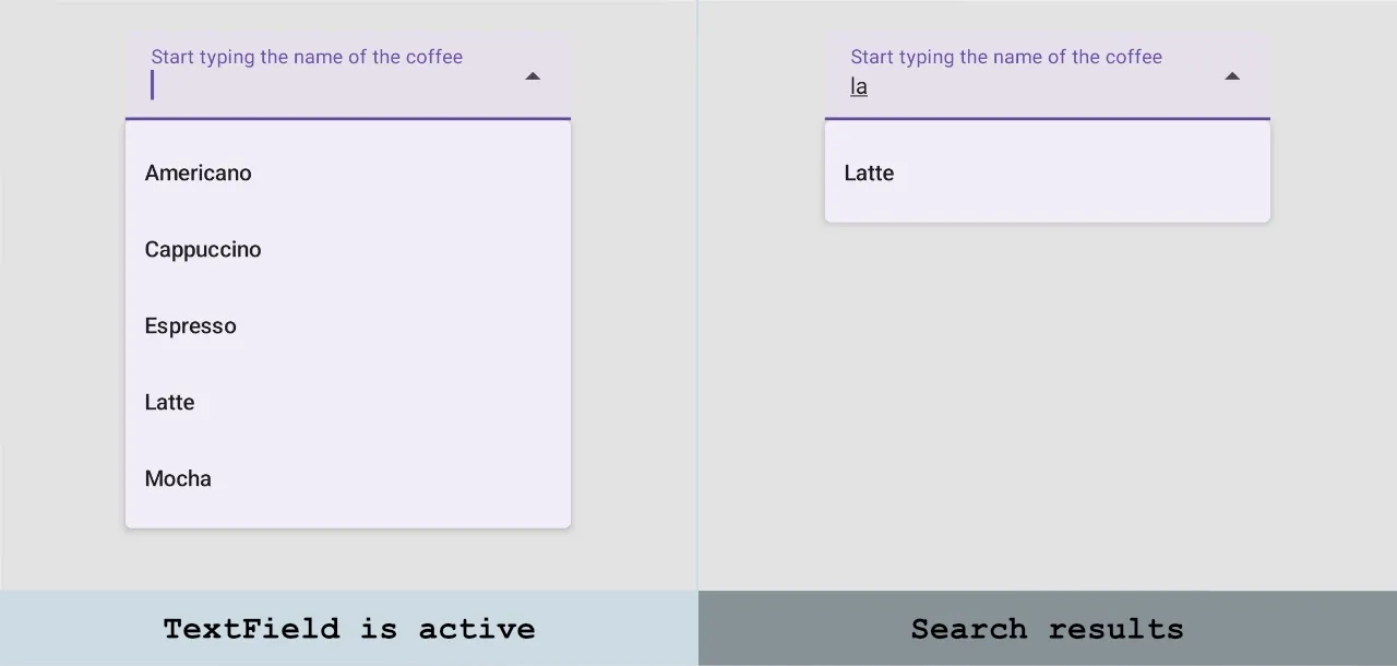
Creating a searchable dropdown menu
Implementing of the searchable dropdown menu is pretty similar to implementing the dropdown menu.
There are few differences:
- The
TextFieldinside theExposedDropdownMenuBoxshould be editable, so we shouldn't addreadOnly = true. - The
onDismissRequestin theExposedDropdownMenushould be empty. We shouldn't hide the menu when the user enters/removes any character. - For the sake of simplicity, the filtering logic is placed inside the composable function. I recommend, extracting the filtering logic to another place, for example, to the
ViewModel.
@Composable
fun Demo_SearchableExposedDropdownMenuBox() {
    val context = LocalContext.current
    val coffeeDrinks = arrayOf("Americano", "Cappuccino", "Espresso", "Latte", "Mocha")
    var expanded by remember { mutableStateOf(false) }
    var selectedText by remember { mutableStateOf("") }

    Box(
        modifier = Modifier
            .fillMaxWidth()
            .padding(32.dp)
    ) {
        ExposedDropdownMenuBox(
            expanded = expanded,
            onExpandedChange = {
                expanded = !expanded
            }
        ) {
            TextField(
                value = selectedText,
                onValueChange = { selectedText = it },
                label = { Text(text = "Start typing the name of the coffee") },
                trailingIcon = { ExposedDropdownMenuDefaults.TrailingIcon(expanded = expanded) },
                modifier = Modifier.menuAnchor()
            )

            val filteredOptions =
                coffeeDrinks.filter { it.contains(selectedText, ignoreCase = true) }
            if (filteredOptions.isNotEmpty()) {
                ExposedDropdownMenu(
                    expanded = expanded,
                    onDismissRequest = {
                        // We shouldn't hide the menu when the user enters/removes any character
                    }
                ) {
                    filteredOptions.forEach { item ->
                        DropdownMenuItem(
                            text = { Text(text = item) },
                            onClick = {
                                selectedText = item
                                expanded = false
                                Toast.makeText(context, item, Toast.LENGTH_SHORT).show()
                            }
                        )
                    }
                }
            }
        }
    }
}
Testing the DropDown menu
We explored how to create different dropdown menus. Let's take a look at the UI testing of these components.
We will explore how to test a "Units" screen. It mostly has valid data and a few test components which are added only for demo purposes, but you can find them in different parts of the application.
For the sake of simplicity, I use hard-coded strings instead of resources in UI tests, but I recommend using string resources (R.string.moreMenu_contentDescription). You can read more about using string resources tests in the Get String resources in Jetpack Compose Tests article.
Exploring a Node Tree
If you want to explore a node tree on the screen, you can use a few approaches:
- Use the "Layout Inspector" tool
- Print a node tree to the logs.
To run the layout inspector, you need to select "Tool > Layout Inspector" when the app is running on a device or emulator.
To print a node tree to the logs, you need to add the following code. It can be added to UI tests, too.
// Print a merged nodes tree with all nodes
// Use parameter to print merged or unmerged tree
onRoot(useUnmergedTree = false)
    .printToLog("MERGED")

// Print a node for a specific node
onNode(keyIsDefined(SemanticsProperties.IsPopup))
    .printToLog("POPUP")
Interaction with the DropDownMenu
When we want to open DropDownMenu components, we usually need to click on an icon. Let's take a look at an example from the "Units" screen.
Let's explore the following cases:
- Click on the "More" icon.
- Verify available options.
- Interact with options.
To click on the icon with a "More menu" content description, we can use the following code:
onNodeWithContentDescription("More menu")
        .performClick()
The next step is to verify that the component is displayed:
onNode(hasText("Save"))
    .assertIsDisplayed()
However, you can have a situation where you want to find a component only at pop-up. If we want to find a pop-up, we need to find a note that has the key: SemanticsProperties.IsPopup. To find specific text on a pop-up, we can use the following code snippet:
onNode(hasText("Save").and(hasAnyAncestor(keyIsDefined(SemanticsProperties.IsPopup))))
    .assertIsDisplayed()
The DropdownMenu can have items which are disabled. To verify that an item is disabled, we can use the assertIsNotEnabled() assertion, and if we want to be sure that item is enabled, we can use the assertIsEnabled() assertion.
onNode(hasText("Load").and(hasAnyAncestor(keyIsDefined(SemanticsProperties.IsPopup))))
    .assertIsNotEnabled()
To close a pop-up, we can emulate pressing the "back" button. If you use an Espresso framework, we can use Espresso.back().Interaction with the ExposedDropdownMenuBox
To find an ExposedDropdownMenuBox component in UI tests, we can use the content description because it has a "Dropdown menu" content description.
You can find more details about node trees by using "Layout Inspector" or printing a node tree to the logs.
We can have an ExposedDropdownMenuBox with a read-only or editable TextField.
To interact with an ExposedDropdownMenuBox, we can click on the dropdown menu:
onNodeWithContentDescription("Dropdown menu")
    .performClick()
If we have multiple ExposedDropdownMenuBox on the screen, we can find all of them and interact with a specific component by index:
onAllNodes(hasContentDescription("Dropdown menu"))[0]
    .performClick()
Alternatively, we can find a ExposedDropdownMenuBox with a specific selected item:
onNode(hasText("Celsius (°C)"))
    .performClick()
If you have a searchable ExposedDropdownMenuBox component, we can type a specific text into the TextField:
onNode(hasText("Speed"))
    .performTextInput("Kilometer")
The next step is to verify that the component has a specific option:
onNode(hasText("Kilometer/Hour").and(hasAnyAncestor(keyIsDefined(SemanticsProperties.IsPopup))))
    .assertIsDisplayed()
To close a pop-up, we can emulate pressing the "back" button. If you use an Espresso framework, we can use Espresso.back().Interaction with the CascadeDropdownMenu
When we want to open CascadeDropdownMenu components, we usually need to click on an icon.
Let's explore the following cases:
- Click on the "Nested menu" icon.
- Verify available options.
- Interact with options.
To click on the icon with a "Nested menu" content description, we can use the following code:
onNodeWithContentDescription("Nested menu")
        .performClick()
The next step is to verify that the component is displayed inside the pop-up:
onNode(hasText("1. Item").and(hasAnyAncestor(keyIsDefined(SemanticsProperties.IsPopup))))
    .assertIsDisplayed()
To navigate in the nested menu, we will click on a node with specific text.
onNode(hasText("1. Item").and(hasAnyAncestor(keyIsDefined(SemanticsProperties.IsPopup))))
    .performClick()
To close a pop-up, we can emulate pressing the "back" button. If you use an Espresso framework, we can use Espresso.back().Conclusion
There are multiple implementations of dropdown menus available in the "Material 3" library:
- The
DropdownMenurepresents a pop-up with menu items. - The
ExposedDropdownMenuBoxrepresents an expandable list of options.
In addition to that, we can use the nested dropdown menu which is available in the cascade library.
When we want to find these components in UI tests, we can use a content description and text values. To dismiss the pop-up, we can emulate pressing the "back" button using the Espresso.back() function if we use the Espresso framework.

