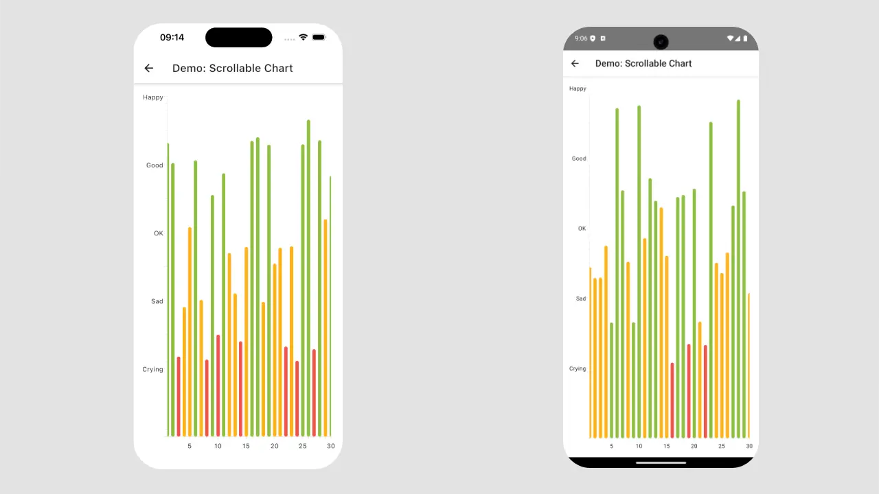
The "koalaplot" library got an update "v0.7.0" which added zoom and pan support for all platforms for XYGraph component. These changes allow us to create scrollable charts in Compose Multiplatform which will be available for Android, iOS, Web and Desktop platforms.
In this article, we will create a "Vertical Bar Chart" which will work on all platforms.
LinearAxisModels.If you like learning through videos, this is for you:
Setting up the project
To create the "Vertical Bar Chart", let's start with creating the generating Compose Multiplatform project, using the Kotlin Multiplatform Wizard website.

The next step is to add the library to the project. To do so, we need to library definition and version to the gradle/libs.versions.toml file:
[versions]
...
koalaplot-core = "0.7.0"

[libraries]
...
koalaplot-core = { module = "io.github.koalaplot:koalaplot-core", version.ref = "koalaplot-core" }

...
And, we need to add dependency to the composeApp/build.gradle.kts file:
...
kotlin {
         sourceSets {
        ...
        commonMain.dependencies {
                ...
                implementation(libs.koalaplot.core)
        }
        ...
    }
}
...
Afterwards, we need to sync the project.
Creating a Chart
Let's create a chart which has a lot of data on the "X-axis". For example, let's create the "Average Daily Mood" chart for a month which has 30 days. This chart will use fake data, and we will use this function to generate fake data instead of getting data from the database.
data class DemoDailyMood(
    val dayOfMonth: Int,
    val happiness: Float
)

private fun generateChartData(numDays: Int = 30) = (1..numDays).map { day ->
    DemoDailyMood(day, Random.nextFloat() * (5f - 1f) + 1f)
}
Next, we’ll create a composable function to generate a chart. This function will use a chart component that needs separate data for the X-axis and Y-axis. So, we’ll provide this data to the composable function as parameters.
@OptIn(ExperimentalKoalaPlotApi::class)
@Composable
fun DailyMoodChart(
    modifier: Modifier = Modifier,
    xData: List<Int>,
    yData: List<Float>
) {
    ChartLayout(
        modifier = modifier.padding(16.dp),
    ) {
        val xAxisModel = rememberIntLinearAxisModel(1..xData.size)
        val yAxisModel = rememberFloatLinearAxisModel(0f..5f)

        XYGraph(
            xAxisModel = xAxisModel,
            yAxisModel = yAxisModel,
            yAxisLabels = { value ->
                when (value) {
                    1.0f -> "Crying"
                    2.0f -> "Sad"
                    3.0f -> "OK"
                    4.0f -> "Good"
                    5.0f -> "Happy"
                    else -> ""
                }
            }
        ) {
            VerticalBarPlot(
                xData = xData,
                yData = yData,
                barWidth = 0.6f,
                bar = {
                    val color = when (yData[it]) {
                        in 0f..1.65f -> Color(0xFFF2554A)
                        in 1.66f..3.3f -> Color(0xFFFFB31A)
                        else -> Color(0xFF8FBF41)
                    }

                    DefaultVerticalBar(
                        brush = SolidColor(color),
                        shape = RoundedCornerShape(100)
                    )
                }
            )
        }
    }
}
When you add the DailyMoodChart to the screen, you’ll notice that there is too much data. As a result, the chart becomes almost unreadable on mobile devices.

This is how we can add it to the screen:
@Composable
fun ScrollableChartScreen(onBack: () -> Unit) {
    val data = generateChartData()
    val xValues = data.map { it.dayOfMonth }
    val yValues = data.map { it.happiness }

    Scaffold(topBar = { TopAppBar(...) }) {
        DailyMoodChart(
            xData = xValues,
            yData = yValues
        )
    }
}
We created data inside the composable function for simplicity. Ideally, it should be done outside and passed as a state to the function.
Adding Scroll Functionality
We can improve the situation by zooming in on a specific part of the chart. Instead of displaying all the data, we can show data from the first day to the 15th day of each month. This way, the user can interact with the chart and scroll horizontally.
To achieve this, we can use the setViewRange function for the “X-axis”. Additionally, we need to enable the pan gesture for both the xAxisModel and XYGraph components.
@OptIn(ExperimentalKoalaPlotApi::class)
@Composable
fun DailyMoodChart(
    modifier: Modifier = Modifier,
    xData: List<Int>,
    yData: List<Float>
) {
    ChartLayout(
        modifier = modifier.padding(16.dp),
    ) {
        val xAxisModel = rememberIntLinearAxisModel(
            range = 1..xData.size,
            allowPanning = true
        ).apply { setViewRange(1..15) }
                ...

        XYGraph(
            ...,
            panEnabled = true
        ) {
            ...
        }
    }
}
To have a vertically scrollable chart, you can use the same approach for yAxisModel instead of xAxisModel.
Note: To add zoom functionality to the chart, update the zoomEnabled parameter of the XYGraph component. Remember to enable it for the LinearAxisModel values as well. You can also choose to enable zoom for either the X-axis or Y-axis separately by updating the allowIndependentZoom property of the XYGraph component.
You can find the source code here.
Conclusion
The "koalaplot:0.7.0" release offers a scrollable chart option for Kotlin Multiplatform projects. This means you can create a component once and use it on Android, iOS, Desktop, and Web versions of your application.
However, the current solution only works with linear axis models. It does not work for the CategoryAxisModel.
The setViewRange function lets us zoom to a specific range. When combined with the pan gesture, you can create charts that can be scrolled.


