Recently, I wrote few articles about testing, but right now I would like to talk to you about very useful thing that called Password Toggle. This part of component started being available from Android Support Library 24.2.0.
Nowadays many applications use "Log In" option and this component allows you do it very simply with material design specification with one simple component without any additional styles and custom components.
First of all, you need to add or update dependency for design support library:
dependencies {
    ...
    compile 'com.android.support:design:24.2.0'
}
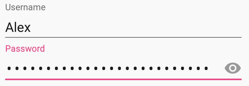
The main idea here is to use TextInputEditText component for displaying password visibility field. The TextInputEditText component has few different types for displaying password:
textPasswordnumberPasswordtextVisiblePasswordtextWebPassword
We can also use few different XML attributes for password visibility.
passwordToggleContentDescription– a string can be set as content description;passwordToggleDrawable– an icon can be set as visibility toggle icon;passwordToggleEnabled– a boolean value can be set as enable parameter;passwordToggleTint– a color can be set as tinted visibility toggle;passwordToggleTintMode– a blended mode can be applying to background tint.
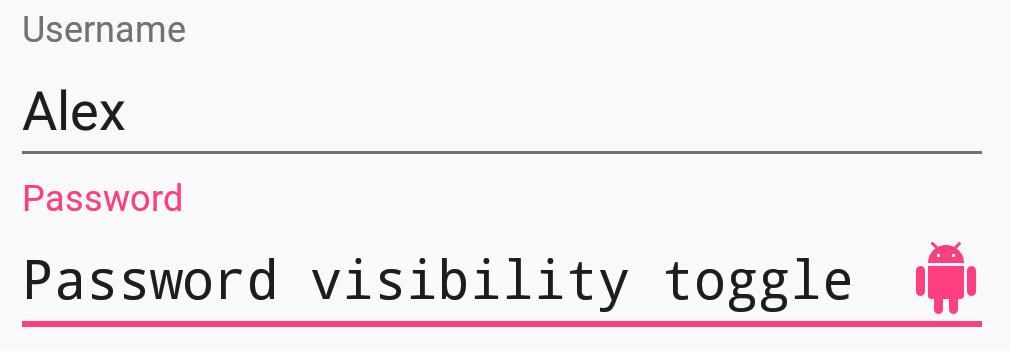
I also recommend to use a TextInputEditText inside the TextInputLayout.
Example:
<LinearLayout xmlns:android="http://schemas.android.com/apk/res/android"
    xmlns:app="http://schemas.android.com/apk/res-auto"
    android:layout_width="match_parent"
    android:layout_height="match_parent"
    android:layout_marginTop="@dimen/activity_vertical_margin"
    android:layout_marginLeft="@dimen/activity_horizontal_margin"
    android:layout_marginRight="@dimen/activity_horizontal_margin"
    android:layout_marginBottom="@dimen/activity_vertical_margin">

    <android.support.design.widget.TextInputLayout
        android:layout_width="match_parent"
        android:layout_height="wrap_content"
        app:passwordToggleContentDescription="@string/description"
        app:passwordToggleDrawable="@drawable/custom_toggle"
        app:passwordToggleEnabled="true"
        app:passwordToggleTint="@color/colorAccent">

        <android.support.design.widget.TextInputEditText
            android:layout_width="match_parent"
            android:layout_height="wrap_content"
            android:hint="@string/password"
            android:inputType="textPassword"/>
    </android.support.design.widget.TextInputLayout>
</LinearLayout>
Thank you for your time.
Have a nice day.

